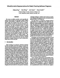
University of Glasgow / Glasgow School of Art. Digital Design Studio ... and efficient interface for a novel automotive Head-Up Display system. In particular, the proposed ..... and The Modern Church, J.H.. Jansen Publisher, Cleveland, Ohio, USA.
Symbolic vs Alphanumeric Representations in Human Machine Interface Design V. Charissis and M. Patera University of Glasgow / Glasgow School of Art Digital Design Studio, Glasgow, UK
Abstract This paper presents a study towards articulating what it is considered to be a simple, prompt and efficient interface for a novel automotive Head-Up Display system. In particular, the proposed interface aims to improve the driver's spatial awareness and response times under low visibility weather conditions. The effectiveness of such Human Machine Interface (HMI) relies on the ability of the system to convey crucial information to the driver in a timely manner. Initial user trials have shown that the system delivers on its promise for an
efficient, non-distracting information display conduit. Finally, the paper further outlines the evolution of the HMI design as a result of ongoing evaluation and user trials and offers suggestions for further research and a tentative plan for future work.
1.
Introduction
Communication amongst humans and machines can be hindered when vital information is indistinguishable or invisible to the user. However, by following the mass production trends, the majority of automotive interfaces fall into the category of non-intuitive designs. Prior to commencing the design and modelling of the interface components, we proceeded in a series of user-tests that aimed to identify the appropriate method for conveying vehicle’s information to the driver. A comparative study demonstrated the characteristics of symbolic versus alphanumeric representations rendering the first as the most capable for establishing a robust and swift communication with the user. The choice of visual feedback is essential for
developing an automotive navigation/guidance interface since comprehensible and accurate information can affect and alter a situation from imminent collision to accident avoidance. Overall, the paper is organised as follows: The next Section offers a succinct overview of the differences between alphanumeric and symbolic representations. In turn the Section 3 elaborates on the symbols utilisation and contribution in interface design. Section 4 highlights the importance of the simplicity in the overall interface design so as to improve humanmachine communication. Subsequently, the Section 5 contains a detailed illustration of the HUD design philosophy and implementation process. Finally the paper concludes with an outline of the important design aspects investigated during this study with regard to symbolic representations in HMI designs and presents a tentative plan for future work.
2.
Alphanumeric vs. Symbolic Representation
Alphanumeric interfaces have been heavily used in the last decades as description method for real-time navigation. This reflects the original military origins of the HUD design as a mean of increasing targeting accuracy of military aircraft. Despite the fact that these interfaces serve a particular and well-defined purpose in that environment, their non-adjusted deployment in the automotive field can be inappropriate. A number of tests have shown that HUDs overloaded with information, especially those using textual output, can create the effect known as cognitive capture (Ward & Parkes, 1995). The term cognitive capture describes the lack of attention and consequently situational awareness when switching from the HUD interface to the actual driving environment and vice versa (Gish & Staplin, 1995). It could be argued that alphanumeric information can be much more suitable in some cases e.g. defining exactly the vehicle’s coordinates in a navigation system. On the other hand, the amount of information that drivers need to process in this manner can substantially delay their reaction to a possible collision incident. Comparative studies of symbols and alphanumeric data in HUDs have conclusively demonstrated that symbols are interpreted much faster by humans (Shekhar et al. 1991).
Thus, symbolic representation is a significantly faster way to provide the user with information that would otherwise need a considerable number of words to be described. Provided that letters are primal symbolic representations of sounds (Daniels & Bright, 1996), any word has definitely more symbols than an iconic symbol which can include the same meaning in only one entity. Humans, initially try to focus, to read and understand, and then to react. For reducing or even eliminating visual clutter, the conformal type of symbology for navigation information has been proposed. In short, conformal symbology simulates the visual transformations of external objects to give observers the perception that the symbology is part of the external scene (Gish & Staplin, 1995). By this approach, it is also feasible to achieve minimal interference between the projected information and the critical details in the actual road scene. The final HUD design developed for this research utilises simple geometric shapes as symbols in order to minimize the effect of cognitive capture and issues associated with it. Additionally, the symbols have been colour-coded depending on the vehicle’s distance to the object of interest (a road turn or other vehicles for example). Symbol size variability also indicates the speed of the vehicle in relation to the lead vehicles (i.e. indicates the pace of approach). A detailed discussion on this is included in the following section. A comparative example of alphanumeric representation versus conformal symbology is depicted below in Figure 1.
Figure 1: (a) alphanumeric VS (b) symbolic representations
3.
Symbols in Interface Design
In order to design an interface design that incorporates symbolic representations it is necessary to define the borderlines between symbols and icons. The use of symbolism can assist users to apprehend complex information. To this end, Webber suggests that: “A symbol is a story or picture told or presented by a familiar sign that may be read at a glance” (Webber, 1927). Hence, any image, after a process of extensive simplification of shape details and colours, can be effectively transformed to symbol as illustrated in Figure 2. The intermediate transformation stages between an image and a symbol are effectively known as icons. In the interface under investigation images from the surrounding scene (i.e. vehicles, barriers, lanes) have been directly represented in a symbolic form to avoid overwhelmingly complicated shapes and colours that would demand more visual attention (i.e. a stylised outline of the real-life object). In a typical iconic representation the eye would investigate the details of the icon distracting the user from the main task of driving. Similarly, an unrecognisable or abstract symbol would have the same effects, as the driver would require more time in order to interpret or identify the meaning of it. A compilation of iconic representations in symbolic form would therefore be the ideal visualisation of information.
Figure 2: Example of simplification sequence from image to icon and finally to symbol
4.
Simplicity of Representation
A flexible and easily comprehensible HUD interface that incorporates symbols depends largely on the simplicity of the representation of the real events and objects. Although contemporary instrumentation panels entice the customer with aesthetically appealing simplified interfaces, real-life usability proves the contrary. In both cases, simplicity is a considerably difficult task to achieve as over-simplified systems could be equally annoying for the user. A recent example is the BMW’s i-drive system which imposed simplicity through a generic deduction of buttons, monitors and LEDs. While the overall design provides the driver with a spacious minimal dashboard, the operational complexity of the interface has been substantially raised as all the functionalities have been assigned to a central rotating button as presented in Figure 3a. Over-simplification had a negative impact on the vehicle models equipped with this interface and forced the company to release versions in which some of the functionalities have been placed in their initial positions. At the antipode is the contemporary Mercedes vehicle which has an overwhelmingly equipped dashboard that requires a considerable amount of time to identify and utilise the panel’s functionalities (Figure 3b). Therefore, depending on the situation or level of the menu-structure, some interfaces need to be carefully redesigned in order to achieve simplicity. Simplicity could be broadly defined as the absence of unnecessary elements and that could be implemented through thoughtful thinking (Maeda, 2006). A misconception of simplicity can be translated as boring or shallow. Imposingly simplicity is hard to be achieved as it reflects the essence of any information provided. The philosophy of simple interface design is easily understandable therefore it adheres to the logic of “simple and effective”. During the simplification process of the incoming data and their presentation to the user, a coherent hierarchy irrelevantly to the complexity of the original information has to be followed. It is of major importance that coherence and logically expected reactions are enhanced and promoted by the interface.
Figure 3: (a) BMW oversimplified i-Drive and (b) Mercedes cluttered central instrumentation panel
Therefore simplicity in the automotive interfaces has to be the mean of transferring essential information to the driver so as to minimise distraction from overwhelmingly presented visual cues. In Human Machine Intercation, simplicity does not imply a design style; it stands for effective and solid piece of information provided in timely manner. However, this can be commonly misinterpreted as reduction. On the contrary, simplicity requires solemn thought and considerable effort as Almqvist et al. state: "A modern paradox is that it's simpler to create complex interfaces because it's so complex to simplify them." (Almqvist et al. 2000).
5.
Proposed HUD Symbology
The interface design presented in this paper addresses primarily the problem of spatial and situational awareness under low visibility conditions. In adverse weather conditions, drivers’ response times are predominantly associated with comprehension of the current situation and possible options/solutions available. In this vein, the proposed interface adheres to the dictum of the three stages of human understanding namely: see → analyse → react. Following the above sequence of events during the processing of an alert (Smith et al. 2003), it was useful for this study to cluster them in these three main aforementioned categories. Consequently this three-tier categorisation (see, analyse, react) was also utilised to define the design characteristics of the proposed interface components. A correlation between human knowledge assimilation, collision stages and symbolic representation of the collision stages is offered in Figure 4.
Figure 4: Correlation between (a) human knowledge assimilation, (b) collision stages and (c) symbolic representation of the collision stages
Each category relates mutually to a different phase of human understanding and knowledge forming. Notably, during a potential accident, any information provided should be comprehended in milliseconds by the human brain in order to allow for effective reaction in the face of impending danger. Therefore a piece of information should be selected according to its relative significance at that particular moment otherwise “processing-bottlenecks” can create an impediment to human reactions (Endsley et. al. 2003). This observation drives the following considerations on the development of the HMI elements that notify the driver of the potential dangers present under low visibility conditions. Notably, instant comprehension of a symbol’s meaning can effectively reduce or even by-pass completely the time-consuming analysing/thinking period. To this end Jung et al. (1964, pp 256) observed that a person “never perceives anything fully or comprehends anything completely”. In the same work, the author further notes that collection of information through the senses may provide a wealth of different sensor conduits (hearing, touching, and so on) but it still remains questionable to what degree the incoming data are taken into account. As such, “seeing” is not always “believing”, as the human agent may ignore the data received by its own “sensors”. As an intuitive example, one may consider a vehicular interface that provides predominantly visual information in an attention-demanding environment (i.e. under low visibility conditions), where the driver can easily miss information cues; in such a case it
is crucial to highlight the absolutely necessary information in a distinguishable and timely manner. In view of designing the proposed HUD display four pieces of information were identified as the most vital for collision avoidance in motorways, namely lane recognition (pathway symbol), lead vehicle detection (b1 & b2), sharp turn notification and traffic warning (depicted in Fig. 5). In particular the above information reflects the main obstacles that may be involved in a collision in a motorway environment under low visibility (e.g. lead vehicles and traffic congestion are typically the expected objects on a motorway). Furthermore the sharp turn, lane width and lane trajectory are structural characteristics of the road that can affect the driving behaviour if they are misjudged or neglected. The aforementioned pieces of information are, in turn, visually represented in the HUD design by four symbols (Figure 5). Prior to commencing the design and modelling of these four symbols, valuable comments were gathered from drivers during informal interviews (Charissis & Papanastasiou, 2006).
Figure 5: (a) Lane recognition (pathway symbol), (b1) lead vehicle detection (b2) lead vehicle detection in the same lane, (c) sharp turn notification and (d) traffic warning
Notably, special care was taken to prioritise incoming information according to the level of importance and then display the most relevant cues promptly and predominantly. To exemplify the significance of this prioritisation, consider that it would be inappropriate during an imminent collision for the HUD to indicate for instance the engine oil-temperature. In this case, even if a potential engine failure was fast approaching, the top priority for the system should be to inform the driver about a potential collision and suggest possible avoidance manoeuvres. As soon as the life-threatening situation has been overcome, the mechanical or infotainment issues could then be indicated. The shape and functionality of the symbols have
been modelled according to the most relevant real-time data that offer information on other objects in close proximity as well as road characteristics. Defining the type and significance of information (quality) is the first step to providing sufficient and vital information to the driver. The evaluation trials of 40 users demonstrated that drivers could process the incoming information effectively (through the symbolic HUD representations) without affecting their response time to a potential accident scenario.
6. Conclusions This paper presented a novel design approach for an automotive full-windshield HUD interface which aims to improve the driver's spatial awareness and response times in nearzero visibility conditions. In its final form, the prototype interface design aims to present information in a timely and intuitive manner. Following the design mantra of distilling and simplifying (visually) the incoming information (derived from the vehicle’s sensors) (Charissis & Papanastasiou, 2006b) the HUD’s design aims to minimise visual clutter and consequently the cognitive capture effect. In particular, this paper offered a description of the HUD interface elements that are based on minimalist visual representations of real objects. Evidently a simplification of the visual cues can potentially shorten the learning curve and offer a compact form of interactive guidance for motorway environments. In our future plans we intent to investigate further new symbolic representations and expand the interactivity of the system with the use of direct manipulation interface techniques.
References Almqvist, P., (2000), Fragments of Time, A List Apart Magazine, Issue 64, Available from: http://alistapart.com/articles/fragments [accessed 13 August 2004]. Charissis, V., and Papanastasiou, S., (2006), Design and Evaluation of an Automotive FullWindshield Head-Up Display interface: Low visibility Guidance and Navigation,
in Proceedings of the Visualisation, Imaging and Image Processing, VIIP'06, Palma de Mallorca, Spain. Charissis, V., and Papanastasiou, S., (2006b), Exploring the ad hoc network requirements of an Automotive Head-Up Display Interface, in Proceedings of: 5th International Conference on Communication Systems, Networks and Digital Signal Processing, CSNDSP’06 (IEEE), Patras, Greece. Daniels, P.T., and Bright W., (1996), The World's Writing Systems, Oxford University Press, ISBN 0-19-507993-0. Endsley, M. R., Bolte, B., and Jones, D. G., (2003), Designing for Situation Awareness: An Approach to User-Centered Design, Taylor & Francis, New York. Gish, K. W., Staplin, L., (1995), Human Factors Aspects of Using Head UP Displays in Automotbiles: A Review of the Literature, US Department of Transport, National Highway Traffic Safety Administration (NHTSA), Report No DOT HS 808 320 Washington, DC.USA Jung, C., G., (1964), Man and his Symbols, Ferguson Publishing, New York, USA., pp 256. Maeda, J., (2006), The Laws of Simplicity: Design, Technology, Business, Life, Cambridge, Massachusetts, MIT press. Shekhar S, Coyle MS, Shargal M, Kozak JJ, Hancock PA (1991) Design and Validation of Head Up displays for Navigation in IVHS, IN proceedings of the Vehicle Navigation and Information System Conference, Warrendale, US. pp 537-542. Smith, D. L., Najm, W. G., Lam, A. H., (2003), Analysis of Braking and Steering Performance in Car-Following Scenarios, Society of Automotive Engineers. Ward, N. J., and Parkes, A. M., (1995), The Effect of Automotive Head-Up Display on Attention to Critical Events in Traffic, in Proceedings of the International Conference on Experimental Analysis and Measurement of Situation Awareness, Daytona Beach, Florida, USA. Webber F. R., (1927), Church Symbolism: An Explanation of the Most Important Symbols of the Old and New Testament, The Primitive, The Mediaeval and The Modern Church, J.H. Jansen Publisher, Cleveland, Ohio, USA.