development and refinement of its evaluation methodology c The Authors 2016. This is ... A recent study on mobile phone usage illustrates for example in how ...
Evaluating Information Visualization on Mobile Devices Gaps and Challenges in the Empirical Evaluation Design Space Kerstin Blumenstein, Christina Niederer, Markus Wagner, Grischa Schmiedl, Alexander Rind, Wolfgang Aigner St. Poelten University of Applied Sciences, Austria
[first].[last]@fhstp.ac.at ABSTRACT With their increasingly widespread use, mobile devices have become a highly relevant target environment for Information Visualization. However, far too little attention has been paid to evaluation of interactive visualization techniques on mobile devices. To fill this gap, this paper provides a structured overview of the commonly used evaluation approaches for mobile visualization. For this, it systematically reviews the scientific literature of major InfoVis and HCI venues and categorizes the relevant work based on six dimensions circumscribing the design and evaluation space for visualization on mobile devices. Based on the 21 evaluations reviewed, reproducibility, device variety and usage environment surface as the three main issues in evaluation of information visualization on mobile devices. To overcome these issues, we argue for a transparent description of all research aspects and propose to focus more on context of usage and technology.
CCS Concepts •Human-centered computing → Visualization design and evaluation methods;
Keywords information visualization, mobile, evaluation
1.
INTRODUCTION
As mobile phones, tablets and other portable devices become increasingly common, there is growing interest to use these devices for Information Visualization (InfoVis), the interactive visual exploration and communication of data. Usage scenarios for mobile InfoVis range from natural disaster management [52] to healthcare [10] or Casual Information Visualization [40]. While the visualization community as a whole has in recent years engaged significantly in the development and refinement of its evaluation methodology
(e.g., [15, 25, 31, 35]), there was no particular consideration of the needs for evaluating mobile InfoVis. In 1998, Johnson [26] already tried to encourage to focus on methods for evaluating mobile devices and their applications. He criticized that traditional usability laboratories were not able to simulate important aspects like environmental influences, the usage environment or simultaneously performed user activities. Those aspects are even more important nowadays. A recent study on mobile phone usage illustrates for example in how many different environments mobile phones are used [23]. A large majority of more than 80% of the respondents stated to use them in each of the most important usage environments: at home, on the way, at the caf´e, shop or restaurant and on public transport. These environments vary significantly, so context of usage is very important. Mobile phones are often used in scenarios with fragmented attention and of course applications for mobile devices need be tested in such settings. In this survey paper we concentrate on the evaluation aspects in InfoVis for mobile devices and provide an overview of approaches in the scientific literature presented at conferences. We conducted a systematic literature research and categorized the found approaches along six main categories in order to identify trends, gaps and challenges. The structure of this paper is as follows: In Section 2 we discuss related work concerning visualization on mobile devices and evaluation for mobile applications. We describe the method for this survey in Section 3. In Section 4 & 5 we present the visualization space as well as the evaluation space of found literature. Afterwards we discuss the gaps and challenges in Section 6. Finally, we conclude our work in Section 7 and outline future work.
2.
2.1
c The Authors 2016. This is the author’s version of the work. It is
posted here for your personal use. Not for redistribution. The definitive version was published in Proceedings of the 2016 Workshop on Beyond Time And Errors: Novel Evaluation Methods For Visualization, http://dx.doi.org/10.1145/2993901.2993906.
RELATED WORK
This section covers related work in two areas. First, we sum up surveys concerning visualization on mobile devices. Additionally, we have a closer look on evaluation for mobile applications to emphasize specifics of evaluation in mobile environments.
Visualization on Mobile Devices
In 2006, Chittaro [10] published an article about visualizing information on mobile devices. The author focused on the restrictions for mobile devices: e.g., smaller size, lower resolution, different aspect ratio, less powerful hardware. The limited screen space means that classic desktop solutions like Overview+Detail (two separate views used simultaneously) do not work well on mobile devices. Chittaro [10]
summarizes “visualization applications developed for desktop computers do not scale well to mobile devices.” Ballendat [2] was collecting general ideas for handling large information spaces (e.g., large pictures, web pages, maps) on mobile devices in 2009 and compared the found methods. The results show that current implementations were often evaluated by a small group of people only, many approaches were prototypical implementations, and only some basic approaches were already used frequently in everyday life. Four years later (2013), Isenberg & Isenberg [24] published a survey article for visualization on interactive surfaces. They have systematically analyzed 100 interactive systems and tools for small and large displays. The overview shows that most research projects work with multi-touch tabletop devices. Smartphones are only used in 6% of the analyzed research projects although smartphones are now available to a much larger user base.
2.2
Evaluation of Mobile Applications
Evaluating mobile applications can be a tedious task. Heuristic evaluation against existing rule sets like Ben Shneiderman’s “Eight Golden Rules of Interface Design” [48], the ten usability heuristics of User Interface Design by Jacob Nielsen [36] or specific heuristics for InfoVis by Camilla Forsell and Jimmy Johansson [16] are still valid approaches, but cannot replace practical field tests with users. In contrast to desktop applications, mobile apps cannot be tested sufficiently in a typical usability laboratory since the environmental disturbance like the test subject’s movement, weather conditions and other people on the street are hard to simulate realistically in a lab. To fully understand the impact of environmental influence, Hummel et al. [22] introduced a framework to monitor environmental disturbances and demonstrated the effects of acceleration (moving), changing light conditions, sound, temperature and humidity on user performance. Oulasvirta et al. [37] showed concrete evidence for the importance of environmental parameters. By evaluating applications in diverse typical mobile scenarios they could show that the maximum span of uninterrupted attention varies dramatically from using apps at home or in a laboratory. Since field tests in typical mobile scenarios (like walking through a crowd) are hard to monitor, hardly non-invasive and mostly irreproducible some effort was taken to reproduce artificial but realistic environments in laboratories to get better results. Kondratova et al. [29] rebuilt parts of a building site to test apps for construction workers. Kjeldskov & Stage [28] simulated a sea shipping control center and Kray et al. [30] put their test persons in a CAVE displaying an immersive video of a street scene to test pedestrian navigation services. However, for testing apps in stressful situations it could be sufficient to reproduce the amount of cognitive load these situations constitute instead of simulating the task itself in an ultra-realistic simulation. Barnard et al. [3] let their study participants walk on a path drawn on the floor in their laboratory and compared them against a group of participants sitting at a table. They varied walking speed and the lightening situation to produce different levels of cognitive load. Participants had to rate their perceived workload through the NASA-TLX workload assessment. Results show “that common contextual variations can lead to dramatic changes in behavior” [3]. Furthermore, impact of contextual changes
differs from person to person. Schmiedl et al. [44] generated load by seating their participants in a mainstream car racing simulation while working with mobile applications. Participants had to use one hand for the simulator’s steering wheel thus leaving only one hand left for interaction with the mobile phone. Different load was generated by altering parameters like speed or race track. Users had to perform the task twice: undisturbed without the simulator and while driving in the simulator. Additional testing is necessary to compare the cognitive load against real world situations as defined for example in [37]. Furthermore, there was no cognitive workload analysis. It is important to stress that both simulations were not meant to simulate any specific concrete task but only to produce load that any other real situation could have induced.
2.3
Summary
Previous work shows that currently, there is no detailed report which concentrates on the evaluation of InfoVis with a focus on mobile devices. The survey of Ballendat [2] was only a seminar paper and conducted before 2010. However, 2010 can be seen as a turning point in using smartphones by the masses [17]. The focus of Isenberg & Isenberg [24] was on surfaces and not on mobile devices. Our survey fills this gap and provides an overview of empirical evaluations of InfoVis on mobile devices. From a broader perspective, there is some research regarding evaluation of mobile applications. Concerning typical usage scenarios of mobile applications, the gap between classical laboratory tests and field tests is filled by simulator based laboratory tests (e.g., [3, 44]). In this setting a distraction, which should simulate a typical distraction while using a mobile phone, is generated. As a first step towards a better understanding of these issues, we aim to collect and characterize currently used methods for evaluation of InfoVis on mobile devices in the paper at hand.
3.
METHOD
To get an overview about research activities of interactive data visualization on mobile devices we decided to systematically survey the literature published in the main venues for InfoVis and HCI. The selection of the conferences is adapted from Isenberg & Isenberg [24]. First, we selected the venues IEEE InfoVis, IEEE SciVis (until 2011 IEEE Vis), IEEE VAST, EuroVis and IV as main conferences for InfoVis as well as ACM CHI. Additionally, we added ACM MobileHCI as dedicated conference in the field of mobile HCI. In the following step, we went through every year of the conferences (starting in 2004, ending in 20151 ) and scanned through every title and abstract looking for specific keywords (mobile, touch, small, smartphone, tablet, pad, phone, scalable, pad, natural user interface). As ACM CHI and MobileHCI are not dedicated venues in the field of InfoVis we used the web browser search with the key phrase visual for searching through titles and abstracts. For these two conferences we decided to perform an additional search in the conference proceedings in the ACM library combining the keyword visualization with mobile or tablet. We took into account full and short papers as well as posters and demos, which were marked as EA (extended abstract). In total, we gathered 12,899 publications from 1
2016 for CHI and EuroVis.
• • • • • •
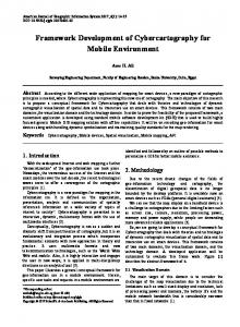
Figure 1: Overview of the selected publications with 2D InfoVis and empirical evaluation per year.
Every selected publication was categorized by two coders (co-authors of this paper). After the coding of five papers, we discussed the coding criteria and matched our coding strategy. When there were conflicted codes, coders discussed the reasons for decisions and resolved the inconsistencies. A second coding round for the rest of the papers (16 papers) was performed, followed by an additional discussion of the coding and eliminating the ambiguities.
4. seven conferences over 13 years and ended up with 59 publications (0.45%) which deal with visualization on mobile devices. Due to our focus on 2D InfoVis, we excluded 34 publications without such a contribution. As we were concentrating on empirical evaluation aspects, we left out all literature without covering this aspect concerning encoding/ interaction technique design [35]. Finally, we had 21 publications which documented an empirical evaluation. Figure 1 gives an overview of the publications per year and venue. The total number of papers and extended abstracts (EA) is shown in Figure 2. In general, publications concerning 2D InfoVis with empirical evaluation are currently more likely published in the HCI venues ACM CHI and MobileHCI (14 papers) rather than in the InfoVis venues (seven papers). For SciVis, we collected two publications with visualization on mobile devices but none of them focus on 2D InfoVis. For VAST, we documented three publications with focus on 2D InfoVis but no empirical evaluation was described.
Figure 2: Total number of papers and extended abstracts (EA) with 2D InfoVis and empirical evaluation per venue. EA are shown hatched. In a next step, all 21 papers were further investigated and systematically characterized along the following main categories:2 2
The raw data of the paper selection process and the coding overview is available at https://github.com/fhstp/ mobile-infovis-paper-selection.
Device type Type of visualization by Harris [20] Context of usage Evaluation scenarios by Isenberg et al. [25] Participants Evaluation devices
VISUALIZATION SPACE
For a better understanding of the performed evaluations, it is necessary to understand the design space of the described visualization techniques. Therefore, we categorized the systems by the used device, the visualization techniques and the context of usage.
4.1
Device Type
For a better overview of the physical display properties we decided to categorize our literature as follows: • PDA: devices with single touch display and a low resolution • Smartphone: devices with multi touch display, a high resolution and a display size up to 6 inches • Tablet: devices with multi touch display, a high resolution and a display size above 6 inches Results: Table 1 shows that ten out of 21 papers are targeted for PDAs and eight papers for tablets. Only three out of 21 papers focus on smartphones although smartphones are disseminated widely since 2010 [17]. Papers, first dealing with InfoVis on smartphones and tablets were published in 2010 [41] and 2011 [47]. An outlier concerning publication year with an outdated device is the 2012 study by Hossain et al. [21] using a PDA, even though sales of PDAs were rapidly decreasing since 2006 [53]. However, the type of research carried out by Hossain [21] (evaluating techniques for showing off-screen objects) is not connected to a specific target device. The physical size of the displays ranges from 2.8 inches to 12.1 inches with a resolution from 210 × 175 pixel up to 1280 × 800 pixel. The complete information on the target display size and resolution of the devices could not be extracted from eight papers [1, 8, 19, 27, 32, 41, 43, 51]. In these cases, the category assignment was only possible due to the included figures. One reason may be that some papers generally address PDAs [8, 19], mobile phones [41], tablets [51] or mobile applications [27] instead of a specific device.
4.2
Types of Visualization
To classify the different presented visualization techniques, we used the categorization by Harris [20] which divides techniques into five groups:
B¨ uring & Reiterer [9]
Engdahl et al. [14]
Burigat et al. [5]
B¨ uring et al. [8]
Dunlop et al. [13]
Burigat et al. [6]
Gustafson [19]
Pinheiro et al. [38]
Pombinho et al. [39]
Reddy et al. [41]
Shin et al. [47]
Burigat et al. [7]
Da Silva Junior et al. [11]
Hossain et al. [21]
Legg et al. [32]
Drucker et al. [12]
Rzeszotarski & Kittur [42]
Rzeszotarski & Kittur [43]
Apperley & Kalyan [1]
Sydow [51]
Kay et al. [27]
SUM (21)
Visualization Device
PDA Smartphone Tablet
3 -
3 -
3 -
3 -
3 -
3 -
3 -
3 -
3 -
3 -
3
3 -
3
3 -
3
3
3
3
3
3
3 -
10 3 8
Graph (plot) Map Diagram Table Chart
3 -
3
3 -
3 -
3 -
3 3 3
3 -
3 3 3
3 -
3 3 -
3 -
3 -
3
3 3 -
3
3 -
3 -
3 3
3 3
3 -
3 -
9 9 2 2 7
Context of usage
-
-
3
3
3
-
-
3
-
3
-
3
-
-
3
-
-
-
3
3
3
10
Table 1: Visualization Space – Categorization overview of the literature found in relation to the used device, the visualization techniques and the context of usage. The literature is sorted by year and first author.
• Graph (plot): visualizing “quantitative information using position and magnitude of geometric objects” [33] • Map: visualizing information related to its spatial location • Diagram: visualizing information mainly by geometric shapes (circles, rectangles or triangles) which are connected by lines or arrows • Table: visualizing information in a tabular form • Chart: InfoVis which does not fit in one of the other categories Results: An overview of our findings regarding the type of visualization is shown in Table 1. Comparing the found visualization techniques, it is apparent that maps and graphs are the most often used type of visualization (each used nine times). Maps seem to be obvious to use for visualizations on mobile devices, especially smartphones, as you can easily integrate the current location of users based on GPS coordinates as a visualization context. Five out of nine map visualizations [5, 6, 7, 19, 21] focus on off-screen visualization techniques (techniques focusing on data points which are positioned off the view port). Graph visualizations (nine times) are mainly scatterplots [8, 9, 42, 43], bar graphs [1, 12], line graphs [1, 41] and histograms [42, 43]. Seven out of 21 tools use chart visualization techniques. A detailed analysis on charts revealed three different techniques: treemaps [11, 14, 38], pie charts [1, 43] as well as a glyph based technique [32]. Diagrams [6, 51] and Tables [38, 47] were used two times each. Most of the found papers used only one particular visualization technique. Only six tools [1, 6, 21, 38, 41, 43] combined two or more techniques.
4.3
Context of Usage
For a better understanding of the chosen evaluation scenario, we tried to code the context of usage in combination with the target group if it was defined.
Results: Table 1 shows the found usage contexts and target groups in ten out of 21 papers. Target groups range from specialized fields like analysts of real-time sports performances [32], logistics experts in automotive industry [51], field sales staff [8] to casual users like skiers [13], bikers [41], tourists [5, 38], people using public transport [27], residential consumers [1] and users on the go [7]. The contexts of usage can be summarized as: during a match [32], on the go [5, 7, 8, 27, 38], at home [1], at work [51] and combinations of planning maybe at home and on the go [13, 41].
5.
EVALUATION SPACE
For comparison of evaluation aspects, we categorize the literature by evaluation scenario used, details on the evaluation device and the study participants.
5.1
Evaluation Scenario
To categories the evaluation scenario, we used the eight scenarios by Isenberg et al. [25] which are an extension to the well-known seven scenarios by Lam et al. [31]. The provided scenarios are divided into two groups. • Scenarios for understanding data analysis: – UWP: understanding environments and work practices – VDAR: visual data analysis and reasoning – CTV: evaluating communication through visualization – CDA: evaluating collaborative data analysis • Scenarios for understanding visualizations: – UP: user performance – UE: user experience – VA: visualization algorithms – QRI: qualitative result inspection The VDAR and the VA scenarios (shown in gray for completeness) have been excluded due to our focus on publications of visual forms rather than algorithms. The QRI
B¨ uring & Reiterer [9]
Engdahl et al. [14]
Burigat et al. [5]
B¨ uring et al. [8]
Dunlop et al. [13]
Burigat et al. [6]
Gustafson [19]
Pinheiro et al. [38]
Pombinho et al. [39]
Reddy et al. [41]
Shin et al. [47]
Burigat et al. [7]
Da Silva Junior et al. [11]
Hossain et al. [21]
Legg et al. [32]
Drucker et al. [12]
Rzeszotarski & Kittur [42]
Rzeszotarski & Kittur [43]
Apperley & Kalyan [1]
Sydow [51]
Kay et al. [27]
SUM (21)
Eight Scenarios
3 -
3 -
3 3 -
3 3 -
3 3 -
3 -
3 3 -
3 -
3 3 -
3 3 -
3 3 -
3 3 -
3 3 -
3 3 -
3 3 -
3 -
3 -
3 3 -
3 -
3 3 -
3 3 3 -
4 0 0 0 13 19 0 0
Device
Simulated device Target device n/a for evaluation n/a
3 -
3 -
3 -
3 -
3 -
3 -
3 -
3 -
3 -
3
3 -
3 -
3 -
3 -
3 -
3 -
3 -
3 -
3 -
3
3
2 13 3 3
Experienced Novices n/a
3 -
3 -
3 3 -
3
3 -
3 3 -
3 -
3 -
3 3 -
3
3
3 -
3
3
3 -
3
11 8 7
6
17
24
10
24
16
8
15
40
16
5
12
17
5
32
5
3 n/a 6
3 3
6
3 3 n/a 8
3 -
Number of participants
3 n/a 12
737
-
Participants
UWP VDAR CTV CDA UP UE VA QRI
Table 2: Evaluation Space – Categorization overview of the literature found in relation to the eight scenarios, evaluation devices and participants. The literature is sorted by year and first author.
scenario has been eliminated as we were focused on user based evaluation in our literature research. Results: As we can see in Table 2, most common evaluation methods are UE (19 times) and UP (13 times). Only four papers conducted research through UWP [27, 32, 41, 51]. UP is conducted in combination with UE eleven times. Often, the combination of evaluating the performance and the satisfaction of users is used in form of controlled experiments followed by an interview or questionnaire (e.g., [8, 47]). More than half of the selected papers (eleven out of 21) performed comparative evaluations. For instance, comparing a mobile map visualization and a paper map [13] or comparing different visualization or interaction techniques. For example, all off-screen map visualizations were evaluated through comparative studies (see Section 4.2). In UE scenarios, the most used methods are usability tests (e.g., [1, 38]) and laboratory questionnaires (e.g., [7, 42]). Concerning the UP scenario, controlled experiments are the most used method (e.g., [6, 12]). Interviews (e.g., [27, 41]) and one field observation [32] were conducted to understand environment and work practices (UWP). Traditionally, the testing is done in a laboratory setting. Real world testing is described in two papers. Reddy et al. [41] conducted a two-week pilot. A case study over one year was performed by Legg et al. [32]. Burigat et al. [7] defined a dynamic usage scenario and tested their visualization within a mobile computer game. Participants navigated a map with two different types of objects: objects which should be found and objects which should be avoided. Thus, the authors simulated a cognitive workload. However, the tests were carried out in a seated position, the context of usage could be defined as on the go. No other publication with an on the go scenario (see Section 4.3) was tested in the field. Most research is done to evaluate visualization techniques
on mobile devices. Research concerning understanding the mobile environment and requirements of the end users especially for information visualization are very rare. In addition, there is also a lack of research in the field of evaluating InfoVis in mobile related situations.
5.2
Evaluation Devices
The used mobile devices in the evaluation setting are categorized as simulator, target device and not mentioned. In addition, we decided to differentiate between defining a target device in the implementation section and documenting the device for the evaluation. It is, after all, possible to develop, for example, for an iPhone 6 and use for evaluation purposes the simulator on Mac OS provided by Apple. • Simulated device: use simulation environment, e.g., mobile device emulator • Target device: the mobile device is used for the target usage of the prototype/application • n/a for evaluation: no explicit information about the device used for evaluation is given • n/a: no explicit information about the device is given in general Results: Most of the conducted evaluation settings (see Table 2) included the target device (13 times). Two evaluation settings included a simulation environment for testing the developed tool [8, 19]. We found three papers [12, 14, 38] which defined a target device for the implementation but not clearly stated which device was used for evaluation. Additionally, we found three papers which did not mention the type of device used for the evaluation [27, 41, 51]. The categorization shows that the majority of the surveyed papers evaluate applications on the target device. Con-
cerning the variety of mobile devices regarding screen resolutions and display sizes, it is interesting to know that all papers only address one specific target device within their evaluation. It is probable that different devices were used during the field evaluation in [41], but it is not mentioned.
5.3
Participants
Most of the papers do not describe the participants of the performed evaluation(s) in detail. To provide a general overview, we decided to split the subjects into two different groups: experienced and novice subjects. Additionally, we collected the number of participants involved during the performed evaluations. • Experienced: participants who have experience in visualization and/or detailed domain knowledge. • Novices: participants with limited or without visualization experiences or domain knowledge. • Number of participants: sum of participants included in all performed studies.
Figure 3: Distribution of evaluation participants in the analyzed papers (histogram, 1D scatterplot with jittering and boxplot on a log-scale) combining with the venue. Results: Most of the performed evaluations (see Table 2) involved experienced users (eleven out of 21) or combinations of experienced and novice users (four out of eleven experienced user evaluations). Four evaluations [9, 14, 19, 43] recruited only novice users. Additionally, for seven evaluations, we could not find information about the knowledge level of the study participants. Regarding included participants, we found out a median of 12, (Q0.25 = 6, Q0.75 = 17) across the investigated papers (see Figure 3) with one outlier [27] (737 subjects participating in the performed evaluations). Obviously, we found lower participant counts in extended abstract papers (up to 12 participants) as well as IV papers (up to 15 participants). The papers published at CHI documented a higher count of subjects (above 16 participants). Three papers provided the number of participants only for parts of their evaluation [32, 41, 51].
6.
GAPS AND CHALLENGES
In our literature analysis, we were focusing on visualization and evaluation on mobile devices. Based on the gathered results we have identified three major gaps: 1. reporting for reproducibility, 2. device variety, and 3. knowledge about the usage environment.
6.1
Reporting for Reproducibility
Coding the categories was not always straight-forward. On the one hand, details on the evaluation setting were missing from some papers, for example, on the background and knowledge of study participants. While this echoes concerns on evaluation reporting rigor [25] and reproducibility [49], evaluation for mobile devices must also document whether evaluation was conducted on the target device or in a simulator (evaluation device). On the other hand, some papers did not even clearly describe their visual encoding techniques and one would have to interpret the figures for full understanding. We argue for reporting the design and evaluation methods as well as visualization techniques in a way that it is transparent and reproducible for the reader. For example, Forsell and Cooper [15] provide a guideline for reporting evaluations in InfoVis.
6.2
Device Variety
When developing for mobile devices, one has to consider the variety of mobile devices in terms of display resolution and size as well as the operating system. Analyzing the evaluation devices (see Section 5.2), we have seen that generally only one specific target device was used by researchers. However, current display resolutions for mobile devices range from 180 × 180 pixel on 0.94 inches (smart watches) over 480×800 pixel on 4.3 inches (smartphones) up to 2048×2732 pixel on 12.9 inches (tablets) [18, 46]. In addition, there is a large range of operating systems. According to Statcounter [50] Android OS (65%) and iOS (25%) are the most important operating systems in June 2016. Other systems on the market are, for example, Windows Mobile, Blackberry OS as well as special operating systems by Nokia and Samsung. Therefore, there is a need for cross device evaluation, in particular, if one is designing Casual InfoVis [40], which was explicitly claimed by [1, 5, 7, 27, 38].
6.3
Knowledge about the Usage Environment
Inspecting the evaluation scenarios more closely, one can see that researchers mostly conducted UP and UE evaluation methods (see Section 5.1). This reconfirms that UP and UE are most commonly used for evaluation of encoding/interaction technique design [35]. As described in Section 5.1, only four publications [27, 32, 41, 51] described UWP methods to more precisely understand the environment in which visualization may be used. So, there is a lack in analyzing and understanding the usage scenarios of InfoVis on mobile devices in the literature. In general, it is necessary to define the domain the research is focusing on and to analyze the users’ needs. For example, Sedlmair et al. [45] described this process as problem characterization & abstraction. Additionally, the Data– Users–Tasks Design Triangle by Miksch and Aigner [34] concentrates on knowing the users, understanding the data and defining the tasks for the visual data exploration. To build a bridge between the research in InfoVis on mobile devices and the knowledge in mobile application testing we propose to focus more on context of usage and technology. • Context of usage: Knowledge about the context in which the users utilize the InfoVis solution is important to design InfoVis. In contrast to traditional desktop scenarios, mobile solutions are often used on the go or in disturbed surroundings. The users’ attention
span in such scenarios differs significantly from sitting at a working place without any distraction [37]. In addition, there is the opportunity to integrate device sensors and the input capabilities of the mobile device. On the one hand, they could produce data inputs. On the other hand, such information about the context of usage could be used for filtering data. • Technology: The context of usage affects the used technology. The diversity of devices and screen sizes has to be taken into account for development and evaluation. Further, technical limitations like low bandwidth which is related when the users deal with the visualization on the go have to be considered. Both aspects were considered as parts of users in the original Data–Users–Tasks Design Triangle but need to get more attention when developing InfoVis targeting mobile devices. More precisely, knowledge about the usage scenario of InfoVis on mobile devices combined with knowledge about mobile application testing especially simulator based laboratory tests will result in better suited InfoVis for mobile devices.
7.
CONCLUSIONS
This survey presented an overview of research literature in the area of visualization on mobile devices concerning evaluation. We conducted a systematic literature research and categorized the found scientific papers and articles to provide a structured overview of the most common used evaluation scenarios. During the analysis of the literature, we identified three main focus areas: reproducibility, device variety and usage environment. Concerning reproducibility, we argue for describing the process of evaluation clearly. In addition, researchers should keep in mind the diversity of mobile devices when evaluating their InfoVis for mobile devices. Related to the knowledge about the usage environment, evaluation of InfoVis on mobile devices is still in its infancy. To overcome this issue, we propose to focus more on context of usage and technology to design and evaluate well-suited InfoVis for mobile devices. For future work, research should more focus on usage scenarios of InfoVis on mobile devices. Interesting scenarios might be the usage of contextual information for situated visualizations [54] or the usage of the mobile device as a secondary device [4]. Furthermore, heuristics for InfoVis on mobile devices could be helpful for extending the evaluation process on mobile devices.
8.
ACKNOWLEDGMENTS
This work was supported by the project seekoi (no. 1154) funded by the Internet Foundation Austria (IPA), the Austrian Science Fund (FWF) via the KAVA-Time and VisOnFire projects (no. P25489 and P27975), the Austrian Ministry for Transport, Innovation and Technology (BMVIT) under the ICT of the future program via the VALiD project (no. 845598) as well as under the Austrian Security Research Programme KIRAS via the project Courageous Community (no. 850196). Many thanks to Magdalena Boucher and Stefanie Gr¨ oßbacher for their support and feedback to our manuscript.
9.
REFERENCES
[1] M. Apperley and J. Kalyan. A mobile personal residential electricity dashboard. In Proc. IV, pages 195–199. IEEE, 2015. [2] T. Ballendat. Beyond-the-Desktop Interactive Visualizations. Media Informatics Advanced Sem. on Information Visualization, University of Munich, 2009. [3] L. Barnard, J. S. Yi, J. A. Jacko, and A. Sears. Capturing the effects of context on human performance in mobile computing systems. Personal and Ubiquitous Computing, 11(2):81–96, 2006. [4] K. Blumenstein, M. Wagner, W. Aigner, R. von Suess, H. Prochaska, J. P¨ uringer, M. Zeppelzauer, and M. Sedlmair. Interactive data visualization for second screen applications: State of the art and technical challenges. In Proc. Int. Summer School on Visual Computing, pages 35–48. Frauenhoferverlag, 2015. [5] S. Burigat, L. Chittaro, and S. Gabrielli. Visualizing locations of off-screen objects on mobile devices. In Proc. MobileHCI, pages 239–246. ACM, 2006. [6] S. Burigat, L. Chittaro, and E. Parlato. Map, diagram, and web page navigation on mobile devices. In Proc. MobileHCI, pages 147–156. ACM, 2008. [7] S. Burigat, L. Chittaro, and A. Vianello. Dynamic visualization of large numbers of off-screen objects on mobile devices. In Proc. MobileHCI, pages 93–102. ACM, 2012. [8] T. B¨ uring, J. Gerken, and H. Reiterer. User interaction with scatterplots on small screens. TVCG, 12(5):829–836, 2006. [9] T. B¨ uring and H. Reiterer. ZuiScat: querying and visualizing information spaces on personal digital assistants. In Proc. MobileHCI, pages 129–136. ACM, 2005. [10] L. Chittaro. Visualizing information on mobile devices. Computer, 39(3):40–45, 2006. [11] J. d. J. N. da Silva Junior, B. Meiguins, N. Carneiro, A. Meiguins, R. da Silva Franco, and A. Soares. PRISMA Mobile: An information visualization tool for tablets. In Proc. IV, pages 182–187, 2012. [12] S. M. Drucker, D. Fisher, R. Sadana, J. Herron, and m. schraefel. TouchViz: A case study comparing two interfaces for data analytics on tablets. In Proc. SIGCHI, pages 2301–2310. ACM, 2013. [13] M. D. Dunlop, B. Elsey, and M. M. Masters. Dynamic visualisation of ski data. In Proc. MobileHCI, pages 375–378. ACM, 2007. [14] B. Engdahl, M. K¨ oksal, and G. Marsden. Using treemaps to visualize threaded discussion forums on PDAs. In Proc. SIGCHI EA, pages 1355–1358. ACM, 2005. [15] C. Forsell and M. Cooper. An introduction and guide to evaluation of visualization techniques through user studies. In W. Huang, editor, Handbook of Human Centric Visualization, pages 285–313. Springer, 2014. [16] C. Forsell and J. Johansson. An heuristic set for evaluation in information visualization. In Proc. AVI, pages 199–206. ACM, 2010. [17] Gartner. Endkundenabsatz von Smartphones weltweit von 2007 bis 2014. In Statista. 2015. Retrieved 2015-05-18, from http://de.statista.com/statistik/daten/studie/12856/
umfrage/absatz-von-smartphones-weltweit-seit-2007/. [18] R. Goetter and P. Cauh´ep´e. Common smartphones and tablets devices values. Retrieved 2016-06-15, from http://www.mydevice.io/devices/#sortOthers. [19] S. Gustafson, P. Baudisch, C. Gutwin, and P. Irani. Wedge: clutter-free visualization of off-screen locations. In Proc. SIGCHI, pages 787–796. ACM, 2008. [20] R. L. Harris. Information graphics. Oxford University Press, 1999. [21] Z. Hossain, K. Hasan, H.-N. Liang, and P. Irani. EdgeSplit: facilitating the selection of off-screen objects. In Proc. MobileHCI, pages 79–82. ACM, 2012. [22] K. A. Hummel, A. Hess, and T. Grill. Environmental context sensing for usability evaluation in mobile HCI by means of small wireless sensor networks. In Proc. MoMM, pages 302–306. ACM, 2008. ¨ [23] Ipsos MediaCT. Unser mobiler Planet: Osterreich, 2013. Retrieved 2016-06-12, from https://services. google.com/fh/files/misc/omp-2013-at-local.pdf. [24] P. Isenberg and T. Isenberg. Visualization on interactive surfaces. I-COM, 12(3):10–17, 2013. [25] T. Isenberg, P. Isenberg, J. Chen, M. Sedlmair, and T. M¨ oller. A systematic review on the practice of evaluating visualization. TVCG, 19(12):2818–2827, 2013. [26] P. Johnson. Usability and Mobility; Interactions on the move. In Proc. 1st Workshop on HCI with Mobile Devices, 1998. [27] M. Kay, T. Kola, J. R. Hullman, and S. A. Munson. When (ish) is my bus?: User-centered visualizations of uncertainty in everyday, mobile predictive systems. In Proc. SIGCHI, pages 5092–5103. ACM, 2016. [28] J. Kjeldskov and J. Stage. Exploring ‘Canned Communication’ for coordinating distributed mobile work activities. Interacting with Computers, 18(6):1310–1335, 2006. [29] I. Kondratova, J. Lumsden, and N. Langton. Multimodal field data entry. In Proc. Joint Int. Conf. on ICCCBE. NRC, 2006. [30] C. Kray, P. Olivier, A. W. Guo, P. Singh, H. N. Ha, and P. Blythe. Taming context: A key challenge in evaluating the usability of ubiquitous systems. In Proc. USE-Workshop at Ubicomp, pages 13–18, 2007. [31] H. Lam, E. Bertini, P. Isenberg, C. Plaisant, and S. Carpendale. Empirical studies in information visualization. TVCG, 18(9):1520–1536, 2012. [32] P. A. Legg, D. H. Chung, M. L. Parry, M. W. Jones, R. Long, I. W. Griffiths, and M. Chen. MatchPad: Interactive glyph-based visualization for real-time sports performance analysis. CGF, 31:1255–1264, 2012. [33] G. L. Lohse, K. Biolsi, N. Walker, and H. H. Rueter. A classification of visual representations. Comm. of the ACM, 37(12):36–49, 1994. [34] S. Miksch and W. Aigner. A matter of time: Applying a data-users-tasks design triangle to visual analytics of time-oriented data. C&G, 38:286–290, 2014. [35] T. Munzner. A nested model for visualization design and validation. TVCG, 15(6):921–928, 2009. [36] J. Nielsen. 10 Heuristics for User Interface Design:
[37]
[38]
[39]
[40]
[41]
[42]
[43]
[44]
[45] [46]
[47]
[48]
[49]
[50]
[51]
[52] [53]
[54]
Article by Jakob Nielsen, 1995. Retrieved 2016-06-10, from http://www.nngroup.com/articles/ ten-usability-heuristics/. A. Oulasvirta, S. Tamminen, V. Roto, and J. Kuorelahti. Interaction in 4-second bursts. In Proc. SIGCHI, pages 919–928. ACM, 2005. S. Pinheiro, B. Meiguins, A. Meiguins, and L. Almeida. A tourism information analysis tool for mobile devices. In Proc. IV, pages 264–269. IEEE, 2008. P. M. Pombinho, M. B. Carmo, and A. P. Afonso. Evaluation of overcluttering prevention techniques for mobile devices. In Proc. IV, pages 127–134. IEEE, 2009. Z. Pousman, J. T. Stasko, and M. Mateas. Casual Information Visualization: Depictions of data in everyday life. TVCG, 13(6):1145–1152, 2007. S. Reddy, K. Shilton, G. Denisov, C. Cenizal, D. Estrin, and M. Srivastava. Biketastic: sensing and mapping for better biking. In Proc. SIGCHI, pages 1817–1820. ACM, 2010. J. M. Rzeszotarski and A. Kittur. TouchViz: (multi)touching multivariate data. In Proc. SIGCHI EA, pages 1779–1784. ACM, 2013. J. M. Rzeszotarski and A. Kittur. Kinetica: naturalistic multi-touch data visualization. In Proc. SIGCHI, pages 897–906. ACM, 2014. G. Schmiedl, K. Blumenstein, and M. Seidl. Usability testing for mobile scenarios of fragmented attention. In Proc. CHI Sparks, pages 1–8, 2011. M. Sedlmair, M. Meyer, and T. Munzner. Design study methodology. TVCG, 18(12):2431–2440, 2012. W. Shanklin. 2015 Smartwatch Comparison Guide, 2015. Retrieved 2016-06-15, from http://www.gizmag. com/best-smartwatch-comparison-2015/40432/. H. Shin, G. Park, and J. Han. Tablorer – an interactive tree visualization system for tablet PCs. In Proc. EuroVis, pages 1131–1140. EG, 2011. B. Shneiderman. Designing the User Interface. Strategies for Effective HCI. Addison-Wesley Longman, 3rd edition, 1997. M. Smuc, G. Schreder, E. Mayr, and F. Windhager. Should we dream the impossible dream of reproducibility in Visual Analytics evaluation? In Proc. EuroRV3, pages 31–33. EG, 2015. StatCounter Global Stats. Top 8 Mobile & Tablet Operating Systems on June 2016, 2016. Retrieved 2016-06-15, from http://gs.statcounter.com/#mobile+ tablet-os-ww-monthly-201606-201606-bar. A. Sydow, J.-F. Kassel, and M. Rohs. Visualizing scheduling. In Proc. MobileHCI, pages 728–734. ACM, 2015. J. Thomas and J. Kielman. Challenges for visual analytics. IVS, 8(4):309–314, 2009. US Census Bureau. PDA: CE-Sales in the U.S. 2005-2010. In Statista. 2009. Retrieved 2016-07-19, from http://www.statista.com/statistics/191981/ sales-of-pdas-in-the-us-since-2005/. S. White. Interaction and presentation techniques for situated visualization. PhD Diss., Columbia University, 2009.