Abstract. We present NetGrok, a tool for visualizing computer network usage ..... to it, while color denotes the host's bandwidth usage, relative to the other hosts.
Visualizing Real-Time Network Resource Usage Ryan Blue, Cody Dunne, Adam Fuchs, Kyle King, and Aaron Schulman? Department of Computer Science University of Maryland, College Park {blue, cdunne, afuchs, kking, schulman}@cs.umd.edu
Abstract. We present NetGrok, a tool for visualizing computer network usage in real-time. NetGrok combines well-known information visualization techniques—overview, zoom & filter, details on demand—with network graph and treemap visualizations. NetGrok integrates these tools with a shared data store that can read PCAP-formatted network traces, capture traces from a live interface, and filter the data set dynamically by bandwidth, number of connections, and time. We performed an expert user case study that demonstrates the benefits of applying these techniques to static and real-time streaming packet data. Our user study shows NetGrok serves as an “excellent real-time diagnostic,” enabling fast understanding of network resource usage and rapid anomaly detection. Key words: Real-Time, Network Administration, Force-Directed, Treemap
1
Introduction
Network administrators typically look for patterns in textual router logs in realtime. Such patterns include: spotting attackers, validating routing configuration, and monitoring for unfair resource usage. Often, these can be difficult to catch by scanning logs or scripting, and it seems natural that visualization methods could apply. Unfortunately, the task of finding network traffic patterns has long been unable to benefit from information visualization; networks are difficult to visually represent, and few visualization methods have been developed to handle the real-time nature and sheer scale of network data. While forensics applications can benefit from static, historical pictures of the network, network monitoring functions require a view of the network that is always up-to-date. In this paper, we present NetGrok, a tool that studies the application of powerful visualizations—force directed network graphs [7] and treemaps [13]— to problems faced by many network administrators. NetGrok allows network administrators to view network traffic at a glance, and to interact with the visualizations in novel ways that allow them to discover phenomena such as network host scanning. NetGrok’s primary goal and fundamental technical challenge is to bring network visualization techniques into the realm of real-time, streaming data. To this end, we extend both the network graph and treemap to handle ?
Aaron Schulman was supported by NSF-0643443 (CAREER).
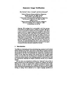
Fig. 1. NetGrok’s visual elements include a main visualization (upper left), a time-line histogram (lower left), a filter and search panel (upper right), and a details on demand window (lower right).
real-time as well as static data. We also present an extension to treemaps, which allows the user to see “edges”—network connections, in our setting—without obscuring the treemap. We describe the relevant work done in network visualization in section 2, our visualization approach in section 3, NetGrok’s user interface in section 4, the back-end infrastructure in section 5, a short case study in section 6, future work in section 7, and our conclusions in section 8. The NetGrok source code and a demonstration video can be found at http://www.cs.umd.edu/projects/netgrok.
2
Related Work
In developing a network traffic visualization tool, a fundamental design question is the following: At what network layer should the traffic be shown? Teoh et al. introduced novel ways of representing network routing data [15] for analyzing faults and anomalies, mainly in physical topologies. NetGrok focuses instead on visualizing and interacting with the logical structure of networks at the IP layer: what IP addresses are interacting, ignoring pass-throughs and infrastructure carrying the IP packets. Cheswick et al. presented one of the first large scale, static network visualizations: the first force-directed map of the Internet [4]. This map shows all connections between Internet routers, which unfortunately obscures the topology of the network. Cheswick et al. also color coded the map by IP address; the
first three octets of the IP are red, green, and blue color values. Although this visualization is useful for understanding a network’s structure as a snapshot, it is not interactive. For larger networks, where many hosts may look visually similar, analyzing such network graphs yields little discovery, unless, of course, the user has an intimate understanding of the underlying data set. Girardin proposed visualizing static network data through the use of selforganizing maps for attack detection [8]. Girardin’s work mapped multi-dimensional data onto a 2D map using an artificial neural network. Unfortunately, the layout of the hosts varies with each run, forcing users to re-acquaint themselves spatially with the network. Moreover, the algorithm is computationally intensive and designed for static data, making it challenging to use in real-time. Herman and Melan presented a survey of the known techniques for visualizing networks [11]. Their work thoroughly characterizes the state of network visualization at the end of the twentieth century. We adapted two of the techniques mentioned in this paper to be used by NetGrok: the popular force directed network graph [7], and treemaps [13]. Like the work of Ball et al., NetGrok focuses on viewing the network from a home-centric perspective by segregating local and external hosts [1]. Ball et al. provide stable internal and external host layouts through the use of grid patterns derived from the hosts’ IP addresses. This has the drawback of sacrificing significant screen space to show hosts that do not exist. NetGrok achieves efficient space usage by using a force directed approach for the internal hosts, with a hashed layout for external hosts. Host clustering reduces visual instability for internal nodes, and increases the information content embedded in the external node layout. The host anchoring feature also supports visual consistency. There are a handful of free and commercially available network administrationfocused visualization tools. These include: The Multi Router Traffic Grapher (MRTG) by Tobi Oetiker (available as a free download), QRadar from Q1 Labs (commercially available), and several others. These tools provide traditional statistics visualizations, including: pie charts, line graphs and histograms.
3
Visualizations
NetGrok’s main features are two visualizations: a network graph and a treemap. Both of these visualizations capture: 1. IP hosts, 2. the hosts’ bandwidth usage, and 3. links between hosts. We implemented both visualizations using the Prefuse visualization library [10]. These visualizations are found in the upper left portion of the overall interface that can be seen in Figure 1. 3.1
Network Graph
We now discuss the features of NetGrok’s network graph and how they aid in finding patterns in network traffic, and developing familiarity with a particular network.
Fig. 2. NetGrok’s Network Graph Visualization
Grouping Hosts As shown in Figure 2, NetGrok’s network graph groups nodes in two ways: through their placement in or out of a large dashed ring, and through convex hulls. Traffic collected on a typical Internet-connected network will likely have far more foreign hosts represented than local hosts. To prevent local network hosts from becoming lost among an overwhelming number of foreign hosts, the network graph contains a dashed ring. This ring serves as a boundary with local hosts contained within the ring and foreign hosts outside, providing a home-centric view of the network [1]. All hosts belonging to user-defined groups are encompassed by a uniquely colored, semi-transparent convex hull. This technique allows users to visually identify the logical groupings of hosts in the network and manipulate entire groupings of hosts simultaneously. The google.com group can be seen on the right side of Figure 2.
Navigation An important feature of NetGrok is its ability to allow users to navigate the vast amount of real-time network traffic in the visualizations. In the network graph, this is done mainly through zooming and panning; both of which are useful for exploring groups of hosts. A user can, for example, zoom in on a group to see all members of the group simultaneously. A user may zoom in on an item by double-clicking on it, or by scrolling with the scroll wheel. Double-clicking the item a second time resets the zoom to encompass the entire graph. The zoom can also be reset by right-clicking anywhere on the graph and selecting the ”Reset Zoom” option.
As internal hosts are laid out using the force directed algorithm, the hosts will move when new hosts are added. To overcome this problem, users arrange the internal hosts as they wish by fixing hosts or groups to their desired location on the graph. This also allows the user to arrange the internal hosts to their pleasure.
Fig. 3. This graph shows group, host, and edge characteristics. The large node in the center is a local host in the Wireless group. A download between the two dark nodes is evident in the image. The group on the right contains hosts in the google.com domain.
Host and Connection Characteristics Every IP host on the network is represented in the graph as a colored node labeled with the host’s IP address. The label’s size is proportional to the size of the host, so that it does not occupy more space on the graph than the host itself. A host’s size is proportional to the number of unique hosts it communicates with. For example, in Figure 2, the large node within the dashed ring has by far the most number of connections. Hosts are colored by their bandwidth usage. Colors range from green to red, with green hosts utilizing the least bandwidth and red hosts utilizing the most. NetGrok uses binned host colors. Host colors are assigned relative to the most bandwidth consuming host in the network. Similarly, there are binned sizes for hosts, assigned relative to a host’s degree. Figure 3 shows host and edge characteristics. We define zero-byte hosts, shown in Figure 4, as the hosts that have received IP traffic, but have not sent any IP traffic. Although these hosts might not have
Fig. 4. An example of what a ping sweep looks like in the network graph. The large, dark circle in the center is performing a scan and the smaller white circles are zero byte hosts.
sent any data, it is possible that they do not exist at all. For example, a ping sweep is a scanning technique for finding active IP addresses by sending out ping packets to a range of IP addresses, and waiting for a response from active hosts. Since many of these addresses are not active, a ping sweep of a local subnet might yield far more zero-byte hosts than responses. Figure 4 shows how a ping sweep of a local network might look in NetGrok. Since there is no visual way to distinguish between low-degree hosts and zero-byte hosts, the visualization treats them as a special case, coloring them white and giving them a dashed border. Every connection between unique hosts is represented as an edge in the network graph. Because the sheer number of edges in the graph can obscure the visualization, only the edges to or from the host under the mouse are shown. There are options to always show edges to or from certain nodes, and to show all edges on the entire graph. Edges thickness depends on the number of bytes transferred between two hosts. To aid in differentiation of edge thickness only three values were chosen. Discovering Abnormalities Developing a familiarity with the graph of a network helps to reduce the work required to discover network abnormalities. A user that has become familiar with a network graph in which, for example, a large red backup server appears every night, is likely to notice when the server fails to appear. The ability to easily recognize network hosts is an important factor in the developing of graph familiarity. Host recognizability is based on a host’s
Fig. 5. A treemap visualization generated from the OSDI dataset. The dataset was anonymized so groupings are not possible.
size, color, and, most importantly, position on the graph. The more consistent these characteristics are, the more recognizable the host will be to users. Since local network hosts have well-defined grouping, established network roles, and a dedicated area at the center of the graph, they are far more recognizable than foreign hosts for which users have far less information. To increase the recognizability of foreign hosts and the spatial stability of the graph, foreign hosts are always placed in the same location on every graph. The foreign host layout algorithm hashes the host’s IP, creates rectangular coordinates from the halves of the hash, and then converts them into polar coordinates. The resulting coordinate is plotted in an exponential polar plot, (eρ−1 , θ) as the new coordinates where ρ and θ are set from parts of the hashed IP [6]. This layout pushes the points away from the center while keeping them from being bunched up at any particular radius. This algorithm guarantees that the same foreign host will always occupy the same position on any network graph. Users can override this position by fixing hosts to a desired position on the graph. 3.2
Treemap
To augment the network graph NetGrok also offers a treemap visualization [13]. Just like the network graph, the treemap shows: IP hosts, their bandwidth usage and connections, as well as groups and links between nodes. Treemaps complement network graphs as they can handle considerably more nodes, without occlusion, than the network graph, and they layout nodes using all of the available
space. However, unlike the network graph the layout algorithm does not consistently place a host in the same location. Figure 5 shows a treemap with many hosts, generated from the OSDI 2006 dataset [3]. Host Characteristics The treemap is structured using the squarified treemap algorithm [2]. The tree is organized with hosts as leaf nodes and groups as internal nodes. The size of a host in the treemap indicates the number of connections to it, while color denotes the host’s bandwidth usage, relative to the other hosts. To allow for display of large networks, hosts do not contain any labels. Instead, mousing over a host reveals this information in the details on demand window.
Fig. 6. Showing links in a treemap
Showing links in a treemap A treemap can coherently show more hosts than the network graph, but a basic treemap does not show links between nodes. Fekete et al. showed that links between nodes in a treemap can be overlaid on top of the treemap [5]. Unfortunately, placing links on top of nodes can occlude the nodes underlying the links. When there is high link density, even the links themselves can be occluded. We take advantage NetGrok’s interactive nature to show links in the treemap. Figure 6 shows how we take advantage of mouse roll-over and color to quickly view a host’s connections. Hovering over a host activates the link browsing view of the treemap. The hosts that are not connected to the selected host will change from color to black and white. Only the hosts that are connected to the hovered over host will be in color. This technique allows the users to distinguish
between connected and unconnected hosts, while still being able to see the network structure. When using a treemap, users first look for nodes that are larger and a darker color. We expect users will want to inspect the connections for these hosts.
4
Interface
In this section, we present the other elements of NetGrok’s user interface that assist network administrators in exploring their real-time or static network data. NetGrok provides a Swing-based GUI written in Java using the prefuse visualization toolkit[10]. The NetGrok user interface (Figure 1) provides a consistent set of controls to manipulate the data model. In the current implementation, these controls provide three methods to filter the hosts that are displayed in the visualizations. IP prefix filtering and bandwidth and degree sliders only filter on hosts, while the time-line tool filters both hosts and links. There are many additional ways to filter links and host, and the NetGrok framework is easily extensible for adding such filters in the future. 4.1
IP Prefix Filtering
IP filtering is based on classless inter-domain routing (CIDR) prefixes1 . The user is presented with a text box in the filter pane, shown in Figure 7, that they can use to input a CIDR prefix to filter by. IP filtering is helpful for focusing on resource usage in contiguous IP blocks. 1
For example, 172.26.0.0/16 represents IP addresses between 172.26.0.0 and 172.26.255.255.
Fig. 7. NetGrok’s filter panel
Fig. 8. NetGrok’s time-line histogram. This histogram shows a history of hundreds of packets collected between 12:51:53 and 12:57:26 on April 30, 2008. The highlighted region indicates a zoomed-in region of time that is used as a filter for the other NetGrok visualizations. This region can be moved, broadened, or narrowed by using the doubleblock slider shown.
4.2
Bandwidth and Degree Filtering
Bandwidth and degree filtering are simple and effective methods for tailoring the data displayed in the visualizations to answer particular questions. In network traces, host behavior can be very different at opposite ends of the bandwidth and degree spectra. Large classes of hosts can be quickly eliminated from the view by using NetGrok’s bandwidth and degree filtering. Hosts are filtered by specifying bandwidth and degree ranges using sliders in the filter pane. The sliders allow users to interactively filter the hosts that are displayed by selecting a range or eliminating extremes in host bandwidth and degree. These controls can be seen in Figure 7. Filters affect only the visualization of the data. Their effects are seen immediately and are completely reversible. 4.3
Time-Line Histogram Filtering
NetGrok provides a time-line histogram and time-range slider filtering option, as well. This filter can be seen in Figure 8. The time-line histogram filter has two functions: it displays an overview of the collected packets over time, and it allows users to zoom in to a particular time frame of interest. This histogram automatically updates as data flows into the program, displaying the entire time range of known packets. Like all of the visualization aspects of NetGrok, the time-line histogram required significant design effort to deal with displaying real-time streaming data. Histogram Update Algorithm Constructing an efficient algorithm to update the histogram online is technically challenging. We require the histogram to cover a time range that includes all of the packets in the visualization. However, covering too much time diminishes the efficiency and accuracy of the histogram. We also want the histogram to maintain a roughly constant number of buckets in which to aggregate packet counts. When NetGrok starts, the time range that will need to eventually be covered is unknown. As new packets arrive, that time range grows into the future to include the new packet. For accuracy throughout
the execution of NetGrok, the range of the histogram must dynamically match the range of packet times seen. Balancing efficiency and accuracy required the creation of a histogram updating algorithm. NetGrok never removes packets from its data set, hence one can assume that the histogram only needs to grow, and never to shrink. The histogram can therefore effectively adapt to a growing time range by using a pair of grow operations: one to grow back in time, and one to grow forwards in time. The forward growth algorithm is as follows: When a packet is received that has a time greater than the histogram covers, NetGrok finds an integral factor by which to grow the width of the histogram so that it will cover the new point. For example, if we have a histogram that covers 10:00 to 11:00, and we see a new packet from 11:30, we will grow the histogram forwards in time by a factor of 2, and the new histogram will cover the time 10:00 to 12:00. The new histogram has the same number of buckets as the old histogram. During the growth, all of the buckets of the previous histogram are dumped into the appropriate buckets of the new histogram. With an expansion factor of n, we will see n buckets from the previous histogram combined to form a single bucket in the first portion of the new histogram. In this translation, we see no loss of accuracy on the bucket boundaries. NetGrok uses a similar algorithm to grow the histogram backwards in time, as it may need to do when loading historical data from a file. Because of the dynamic updating algorithm, the histogram may cover a time period wider than the time range of collected packets. This can be up to a factor of 4 in the worst case, but generally is no more than a factor of 2. NetGrok does not display this entire range, but instead only the range of the packets seen. Only the part of the histogram from the first seen packet to the last seen packet is drawn. The number of buckets in the histogram must be sized accordingly, so enough precision is given at a zoom factor of four, and the curve is still relatively smooth when showing every bucket. When the grow operations are called, users see the view zoom out slightly to include the new range, and the histogram smoothes slightly because the bucket width increases. Filtering With the Timeline Histogram The time-line includes a doubleblock range slider that allows users to select a temporal region of interest, and only see traffic from that time period. This resembles the technique used by Girardin et al. [9], as well as many other projects since then. When users move the range slider, the highlighted period of the histogram updates to reflect the selected time period, and the other visualizations filter out data that is not relevant to that time period. The time range slider has two modes: forensic mode and real-time mode. If a time period that does not include the latest packets is selected, the time slider will be in forensic mode. In forensic mode, NetGrok does not change the selected period when new packets arrive. When observing a historical time period for forensic reasons, users most likely do not want that time period changing. This can lead to the highlighted time period walking away from the position of the double-block slider. When users move the slider again, the highlighted time
period will again line up with the slider. If the selected range includes the latest packets, the time slider will be in real-time mode. In real-time mode, the selected time window is updated when new packets arrive to include new packets that are further in the future.
5 5.1
Infrastructure Back-end Data Model
NetGrok uses the prefuse.data.Graph object as its primary data store [10], and this is augmented by several auxiliary data sets. The program stores simplified versions of collected packets, and a prefuse.data.Tree structure holds the hierarchical set of groups. The data store also keeps a collection of basic statistics for normalizing visualizations. Lastly, the NetGrok data store has basic support for brushing and linking with shared filter and selection resources. These data structures take advantage of prefuse data models, where possible, for performance. The data store manages the data and exposes the containing structures to the visualization components. For dynamic updates, NetGrok components can register to be notified when new packets arrive and when graph attributes are modified. This is particularly important for atomic real-time updating of data with multiple visualization threads. This also allows NetGrok’s back-end data model to support batch updating, where newly added data may not be accurate until the entire batch is loaded. Large data sets and high bandwidth flows rely on batch updating for efficiency. 5.2
Network Packet Collection
NetGrok provides a variety of options for importing data. First, a user can directly connect to a local network interface and stream packets from that interface. For a network administrator, local interfaces may not have access to wide enough coverage of the network traffic. Thus, NetGrok also supports a remote sensor system, where a set of remote network sniffers forward batches of simplified packets to NetGrok, in real-time. In addition to live capture options, NetGrok supports reading the standard PCAP packet capture file format. It also has support for reading and saving data to a more compact format that disregards packet data not used in the visualization. 5.3
Group Configuration
The groups.ini file defines the hierarchical groups used in NetGrok’s visualizations. This file allows the user to specify which IP addresses and ranges are associated with each group (see Figure 9). The file is divided into two main groups: local and foreign. Each line contains the group name followed by any number of CIDR prefixes to represent networks. Initial group location can be
specified by two additional x and y parameters, as shown for the Slashdot foreign group with location (100,200). If the location isn’t specified, it is automatically set to the default root polar projection location for the first CIDR prefix as described in Section 3.1. [local] UMD CP=128.8.0.0/16 local 0=192.168.0.0/24 local 1=192.168.1.0/24 [foreign] Slashdot=66.35.250.55/24=100=200 Google=216.239.0.0/16,64.233.0.0/16,64.68.0.0/16
Fig. 9. Sample groups.ini file
6
Evaluation
To evaluate NetGrok, we performed a single subject case study. Our subject, Brad Plecs, is the network administrator for the University of Maryland Computer Science Department. Mr. Plecs’s network monitoring is “usually in response to a right-now network-is-broken situation,” but he is interested in network visualization tools to aid with attack detection. His normal usage of network monitoring tools is to find “interesting” hosts, meaning IP addresses that are using a “disproportionate” share of bandwidth or number of connections. Mr. Plecs’s current tools are a combination of grep, tcpdump, and “occasionally,” Ethereal/Wireshark. 6.1
Hands-on sessions
The study consisted of a short demonstration of NetGrok and two hands-on sessions in which the subject used NetGrok to analyze PCAP packet traces, and a live network. In the first session the subject used NetGrok to analyze PCAP traces of the wireless network at the 2006 OSDI Conference (available from CRAWDAD [3]). The purpose of this session was to familiarize the subject with NetGrok by finding interesting features in the data. This session went quickly because the interesting features—disproportionate bandwidth and connections— were easy to locate with both visualizations’ use of color gradients and node size. “Zero-byte” hosts also received a positive response. Mr. Plecs gave two criticisms after the first session. First, that NetGrok needs to incorporate transport layer information, specifically, TCP and UDP port numbers: “[NetGrok] lets you find IP addresses easily, but next you want
to see what they’re doing.”2 His second criticism was that there should be a division between incoming and outgoing bandwidth, to make investigating zerobytes hosts easier, and for more fine-tuned filtering. For the second session, Mr. Plecs gathered live traffic from a segment of the UMD Computer Science network which hosts the department’s PlanetLab [12] nodes. As soon as NetGrok started showing traffic in the network view, the subject said the external host placement animation caused confusion. The hosts appear in the center of the display then they slingshot to their final positions in the external network area. When large internal hosts are near the start location, it visually implies communication between the new external host and the existing internal host. Mr. Plecs quickly found the time slider useful to restrict what was displayed. Initially, he used it to remove the distraction of hundreds of hosts entering the display every second. He responded that—along with the histogram—the feature was useful, allowing users to identify and investigate events that “could easily be missed.” However, because the time slider is so closely tied with the histogram display, Mr. Plecs initially attempted to use the edges of the histogram’s highlighted time section to modify the filter. He also liked the filter sliders because he could remove the vast number of uninteresting hosts on the live network. The subject appreciated NetGrok’s representation of the internal network (see Figure 2). Within seconds, he understood the network segment and went on to investigate the external hosts. We think that this is a successful demonstration of applying semantic substrates—in this case, groups—to visualizing computer networks. The subject responded positively to the groups and requested a dynamic grouping ability, so that users can maintain a watch-list or hide hosts on demand and keep the display visually organized without restarting the application and editing the groups configuration. He also noted that having the ability to fix a node’s position helps, but is tedious for tasks like ignoring a large group. 6.2
Suggestions for Improvement
Investigating the network through the treemap view was difficult because the treemap does not currently respond to the filtering or time overview and selection. Further, Mr. Plecs indicated that the treemap was unintuitive—obvious patterns in the treemap were difficult to understand, and once understood, indicated uninteresting features. After the live session, Mr. Plecs said that the “biggest thing” is incorporating transport layer data to give users more information. At the IP layer, NetGrok helps users to discover interesting hosts, but cannot help users investigate exactly why those hosts are interesting. Mr. Plecs had two other criticisms about the network graph. First, that the animation used to place hosts in the external network is distracting. Initially hosts have a set position in the display, but then they are force-directed to avoid 2
TCP and UDP information greatly increases the complexity of network tools. This data, while extremely useful, was simply beyond the scope of the initial project.
overlapping; this works well with a moderate number of hosts, but when too many hosts are on the graph, it causes constant shaking or jiggling. Mr. Plecs commented that it’s fine for initial placement, but hosts should not continue moving, especially when the traffic displayed is a static time-slice of live capture or packet trace. Second, Mr. Plecs wanted a more structured layout for the network graph. Hosts are placed via hashing outside the internal network circle so that all of the space on the screen is used. This, however, discards the structure of IP space and isolates hosts that are potentially associated. Consequently, if a certain IP subnet is sending malicious traffic (and it is not specifically grouped), the traffic will visually appear to come from random places in the external network. 6.3
Questionnaire
In addition to working with Mr. Plecs’s during the sessions, we provided him with a short questionnaire about NetGrok. For each task discussed in our initial interview, Mr. Plecs was asked to gauge the speed and accuracy of NetGrok when compared to his standard tools. The questionnaire presented a five-option Likert scale ranging from “much worse” to “much better” to record responses3 . Mr. Plecs rated NetGrok “much better” for all of the tasks using both PCAP and live data sources. The questionnaire also included Likert-scaled questions regarding the usability of both the visualizations and user interface components. The scale for these questions ranged from “bad” to “acceptable” to “good.”4 Mr. Plecs rated the graph visualization and user controls (filtering) “good” in all areas, including organization, the ability to identify features or details, and filtering. Mr. Plecs rated the treemap visualization mostly “acceptable.” The last part of the questionnaire asked Mr. Plecs to rate NetGrok’s ability to aid in detecting problems and monitoring networks. Mr. Plecs rated NetGrok “fair” on monitoring because “[monitoring tools] should be able to run automatically and notify you when [they] detect something,” but rated NetGrok “good” in the areas of problem detection. He noted: “NetGrok is excellent as a real-time diagnostic.”
7
Future Work
One future direction for NetGrok is to rapidly prototype additional real-time network visualizations. NetGrok has a modular construction, so new visualizations can be added without repeating the back-end development effort. The current version displays two primary visualizations, but there are countless others we can potentially implement. 3
4
The actual choices for the first section of the questionnaire were: “much worse,” “worse,” “equivalent,” “better,” and “much better.” The actual choices for the second section of the questionnaire were: “bad,” “poor,” “acceptable,” “fair,” and “good.”
NetGrok’s filtering capabilities offer a good first solution to displaying large datasets, but these capabilities need additional work. For NetGrok to truly support large scale data sets, it needs to contain an abstract overview capability that displays the gist of the data set without showing every node. Many network visualization tools support graph clustering algorithms and cluster-based views of the network. However, extending these clustering and visualization techniques to real-time data flows is not trivial. NetGrok has the foundations for a real-time clustered visualization, which can be seen in the group visualization. However, more effort is needed to develop this into a complete, large scale overview capability. The network graph was created under the assumption that there would be a manageable number of hosts in the local network and a force-directed algorithm would convey more information about the relationships between local hosts. However, the force direction destroys the spatial stability, which disorients users. In the future a hashed layout algorithm, like the foreign host layout, should be applied to local hosts. The current network view visualization consistently lays out non-local hosts in the same location. However, that location is essentially randomly generated. We think that there is room for improvement by using semantic substrates[14] to meaningfully arrange hosts. The challenge of using a semantic substrate for IP address layouts lies in grouping addresses from the same domain, while illustrating one or two attributes of those addresses. Although we expect this is possible, we did not find an appropriate set of attributes to generate a useful semantic substrate to integrate into our visualization, and we must leave this as future work.
8
Conclusion
The visualizations, filtering, and details on demand, provide network administrators with the capability to identify network scans, and hosts using a disproportionate amount of network resources. The case study with our expert subject shows that NetGrok’s approach holds promise. The study also confirms that NetGrok’s network graph and treemap assist in rapid identification of high bandwidth and degree hosts, as well as ping sweeps. The study gave us significant insight into which features need to be enhanced to create a production quality tool for network administration visualization.
9
Acknowledgments
We thank Brad Plecs, our case study subject, for lending his time and expertise to help evaluate NetGrok. We also thank the reviewers and Dave Levin for their thoughtful comments.
References 1. R. Ball, G. A. Fink, and C. North. Home-centric visualization of network traffic for security administration. In VizSEC/DMSEC ’04: Proceedings of the 2004 ACM workshop on Visualization and data mining for computer security, pages 55–64, New York, NY, USA, 2004. ACM. 2. M. Bruls, K. Huizing, and J. van Wijk. Squarified treemaps. In In Proc. of Joint Eurographics and IEEE TCVG Symp. on Visualization (TCVG 2000), pages 33– 42. IEEE Press, 2000. 3. R. Chandra, R. Mahajan, V. Padmanabhan, and M. Zhang. CRAWDAD data set microsoft/osdi2006 (v. 2007-05-23). Downloaded from http://crawdad.cs.dartmouth.edu/microsoft/osdi2006, May 2007. 4. B. Cheswick, H. Burch, and S. Branigan. Mapping and visualizing the internet. In ATEC ’00: Proceedings of the annual conference on USENIX Annual Technical Conference, pages 1–1, Berkeley, CA, USA, 2000. USENIX Association. 5. J.-D. Fekete, D. Wang, N. Dang, A. Aris, and C. Plaisant. Overlaying graph links on treemaps. In Information Visualization Symposium Poster Compendium, pages 82–83. IEEE, 2003. 6. G. Fink and C. North. Root polar layout of internet address data for security administration. Visualization for Computer Security, 2005. (VizSEC 05). IEEE Workshop on, pages 55–64, 26 Oct. 2005. 7. T. M. J. Fruchterman and E. M. Reingold. Graph drawing by force-directed placement. Software - Practice and Experience, 21(11):1129–1164, 1991. 8. L. Girardin. An eye on network intruder-administrator shootouts. In Proceedings of the Workshop on Intrusion Detection and Network Monitoring (ID’99), pages 19–28, Berkeley, CA, USA, 1999. USENIX Association. 9. L. Girardin and D. Brodbeck. A visual approach for monitoring logs. In LISA ’98: Proceedings of the 12th USENIX conference on System administration, pages 299–308, Berkeley, CA, USA, 1998. USENIX Association. 10. J. Heer, S. K. Card, and J. A. Landay. prefuse: a toolkit for interactive information visualization. In CHI ’05: Proceedings of the SIGCHI conference on Human factors in computing systems, pages 421–430, New York, NY, USA, 2005. ACM. 11. I. Herman, G. Melancon, and M. S. Marshall. Graph visualization and navigation in information visualization: A survey. IEEE Transactions on Visualization and Computer Graphics, 06(1):24–43, 2000. 12. L. Peterson, T. Anderson, D. Culler, and T. Roscoe. A blueprint for introducing disruptive technology into the internet. SIGCOMM Comput. Commun. Rev., 33(1):59–64, 2003. 13. B. Shneiderman. Tree visualization with tree-maps: 2-d space-filling approach. ACM Trans. Graph., 11(1):92–99, 1992. 14. B. Shneiderman and A. Aris. Network visualization by semantic substrates. IEEE Transactions on Visualization and Computer Graphics, 12(5):733–740, 2006. 15. S. T. Teoh, K.-L. Ma, and S. Wu. A visual exploration process for the analysis of internet routing data. Visualization, 2003. VIS 2003. IEEE, pages 523–530, 24-24 Oct. 2003.