VII Congresso Brasileiro de Informática na Educação (CBIE 2018) Anais do XXIX Simpósio Brasileiro de Informática na Educação (SBIE 2018)
On the Usability of Parallel Coordinates Plots for Representing Behavioral Attributes in LMS Platforms Nathan Alves de L. Silva¹, Raphael A. Dourado2, Rodrigo L. Rodrigues3, Aldo A. Cavalcanti1 1
Computer Department – Federal Rural University of Pernambuco - Brazil 2 Computer Center – Federal University of Pernambuco - Brazil 3 Department of Education – Federal Rural University of Pernambuco - Brazil
[email protected],
[email protected],
[email protected],
[email protected]
Abstract. This paper investigates the suitability of using Data Visualization, specifically Parallel Coordinates Plots (PCP), as an instrument for helping distance learning instructors identify students with poor performance. To answer this question, we developed a web application that lets users generate and interact with PCPs and evaluated it with usability tests inspired by the NOVIS framework — a usability framework specifically designed for evaluating data visualizations. The results show that PCPs and Data Visualization are perceived, by distance learning instructors, as an invaluable tool for following student progress on Virtual Learning Environments.
1. Introduction With the advancement of technology, sharing and searching information became faster and simpler, thus favoring the growth of Distance Education. However, with the growth and adoption of Distance Education by the many educational institutions, instructors are now facing the challenge of following the learning progress of a high number of students in a single class. As a response to this challenge, an emerging field of research known as Learning Analytics is providing new techniques to collect and analyze data stored by VLEs in order to help instructors to identify behavioral patterns in the learning process. Among the many techniques proposed by Learning Analytics researchers, Data Visualization offers the possibility to present data in such a way that a user can quickly find patterns and better inform their decisions — which can be useful for instructors as a way to identify students that are in a risky situation and then make pedagogical interventions [Vieira et al, 2018; Emmons et al, 2017]. Therefore, the relevance of this work lies in the development of a prototype to analyze the adoption impact of Learning Analytics and Data Visualization, more precisely, in the use of the Parallel Coordinates Plot (PCP) by teachers as an instrument to analyze their students’ online activity. Among the many different types of charts available for data visualization, we decided to investigate if the PCP it’s a good alternative for distance learning instructors to follow their students’ activities and gauge their performance. The remainder of this paper is organized as follows: Section 2 presents the background regarding Learning Analytics, Data Visualization, and the Parallel Coordinates Plot; Section 3 presents the related work; Section 4 presents the
DOI: 10.5753/cbie.sbie.2018.1946
1946
VII Congresso Brasileiro de Informática na Educação (CBIE 2018) Anais do XXIX Simpósio Brasileiro de Informática na Educação (SBIE 2018)
methodology adopted in this study; Section 5 presents the conducted experiment results and discussion; finally, Section 6 draws some conclusions about the study.
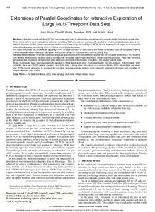
2. Background 2.1 Learning Analytics and Data Visualization Learning Analytics is a multidisciplinary area that uses several methods such as: data visualization, social network analysis and semantic and predictive models to extract knowledge from educational datasets. These techniques can aid to identify students’ behavioral patterns, to improve their performance and to reduce retention. [Nunn et al. 2016]. One of the most effective ways of delivering educational data to students and instructors so they can inform their practice is through interactive data visualization interfaces [Vieira et al, 2018]. In the context of distance learning, Data Visualization can provide instruments to effectively analyze data such as forum participation, completion of required activities, and the number of times a student accesses the platform. Thus, with visualization interfaces the instructor can make by himself discovers about the behavior, engagement, motivation, and performance of the students, which can be used as feedback for adjusting the course instructional design [Silva et al. 2016]. Among the wide array of visualization techniques available in the literature, a particular interesting category is multidimensional data visualization [Gintautas et al. 2013]. These visualizations aim to map multi-dimensional data into a bi-dimensional plane, making it easier visualize patterns in the data. The next subsection describes one approach to visualize multidimensional data: The Parallel Coordinates Plot. 2.2 Parallel Coordinates Plot Heinrich e Weiskopf (2013) state that the Parallel Coordinates Plot (PCP) is a visualization technique commonly used to represent multidimensional data. The PCP is built by the composition of three domains: the spatio-temporal domain, which is responsible for the events projection inside of the chart; the data domain, which is responsible for the arrangement of the data on the chart; and the parallel-coordinate domain, which is responsible for the construction of the chart on cartesian coordinates, using the x and y axes of the spatio-temporal domain. According to Martins (2012), the construction of the PCP is achieved by the mapping of the n-dimensional space to a two-dimensional structure, which uses parallel axes that are vertically equidistant, as shown the Figure 1. The axes represent the data dimensions and the sharp lines represents the connection between data and the other dimensions. A user can interact with the PCP by: inclusion and removal of axes (coordinates), selection of an interval on one of the axes to highlight part of the data (also known as brushing), and multiple brushing — the selection of intervals in two or more axes simultaneously. In the next section, we discuss related works where the authors used Learning Analytics, Data Visualization, and the Parallel Coordinates Plot to represent multidimensional data about students’ academic activities on VLEs.
1947
VII Congresso Brasileiro de Informática na Educação (CBIE 2018) Anais do XXIX Simpósio Brasileiro de Informática na Educação (SBIE 2018)
Figure 1. Representation of the Parallel Coordinates Plot on the high fidelity prototype
3. Related Work In the work of [Siirtola et al. 2009], the authors conducted a study to verify the visual perception of the PCP with users that never used this kind of visualization. To collect the experimental data, the authors used visual tracking, observing the areas in which the users most looked during the task execution and if this pattern was correlated with the task’s expected results. After analyzed the data, the authors concluded that the middle part of the PCP, where the interaction (brushing) happens, requires more attention from the user than the top and bottom areas. The data related with fixation time and time spent on areas of interest of each task showed that the PCP has a quick learning curve and that is possible to make simple searches right after the first interaction with the plot. In the work of [Lee et al. 2016] the authors performed an investigative study trying to understand people’s reaction and interaction with certain types of data visualizations for the first time. The authors investigated the following characteristics about visualizations: chart format, visual characteristics, knowledge about graphs, and knowledge about the context of the data represented on the chart. In this study, the participants were submitted to an experimental session where they interacted with three types of charts: PCP, Chord Diagram and Treemap. At the end of the interview, they also participated in a semi-structured interview. The results showed that: i) giving extra information about the chart before the user interacts with it affects the way he/she builds their mental model; ii) the participants had issues to continue the task when the mental model was incorrectly built; and iii) the data context directly affects the interest of the participants in exploring the chart. Different from the works discussed in this section, this work focuses on analyzing distance learning instructor’s visual perception of PCPs, and to which extent a Visual Analytics tool based on PCPs can help them improve their practice.
1948
VII Congresso Brasileiro de Informática na Educação (CBIE 2018) Anais do XXIX Simpósio Brasileiro de Informática na Educação (SBIE 2018)
4. Methodology In this study, we used the NOVIS evaluation method, proposed by [Lee et al. 2016] as a starting point. This model focus on evaluating how the user interacts with textual objects (alphanumeric format), non-textual objects (the axes of a PCP), and how they build a mental model to interpret the data represented on the plot. To perform the proposed experiment, we developed a prototype using HTML5, CSS3, JavaScript, and the D3.js library to provide a full interactive PCP. The dataset available on the prototype for plotting PCPs corresponds to data from distance learning undergraduate students’ interactions with a VLE, comprising a period of 7 years, provided by the NEAD/UPE from University of Pernambuco (UPE). For this experiment we used five distance learning instructors that are currently working on Distance Education or had earlier experience with it. Through the method Think-aloud described by [Preece et al. 2005], we could collect information about the interaction of the users with four tasks that explore the features of the PCP and in a semi-structured interview opinions about the frequency to give feedback to the students, the importance of use the data extracted from the VLEs to improve not only the class but also the students experience, what method they preferred to analyze the information between the traditional and using PCP, and the perceived need to receive training to use this type of visualization. Before the experiment, each participant received a briefing about Learning Analytics, what is a PCP and how to interact with it, and the variables presented in the graph. The next section discusses the results obtained from the analysis of the experiment data.
5. Results and Discussion To analyze the experiment results, we collected the following metrics: number of clicks (NC), number of times that the participant needed help (NH), time spent to complete each task (T1-T4), number of times that the participant reformulated the mental model (RMM), and the number of times that the participant reported difficulty with the PCP (RDC). Table 1. Scores of each participant in the experiment. Participant P1 P2 P3 P4 P5
NC 80 62 50 86 80
NH 7 8 3 10 16
T1 07.37 06.36 04.59 08.24 15.43
T2 02.94 06.34 05.26 11.59 12.42
T3 05.81 02.37 03.13 04.07 12.34
T4 04.20 02.51 01.30 04.09 11.56
RMM 6 5 3 5 11
RDC 6 6 1 1 2
Based on the metrics presented in Table 1 and the semi-structured interviews, we concluded that even with a few numbers of participants, the data showed the PCP could be a valuable tool to help teachers to identify behavioral patterns and use it to help students in their learning process. In general, the participants did not need much help to understand the tasks, interact with the PCP, and discover the patterns on the chart.
6. Conclusion The use of Learning Analytics and Data Visualization empowers distance learning instructors by giving them the ability to understand VLEs interaction data, gauge
1949
VII Congresso Brasileiro de Informática na Educação (CBIE 2018) Anais do XXIX Simpósio Brasileiro de Informática na Educação (SBIE 2018)
students’ performance, give informed feedback, and take action on time, before the student fails. Although the number of participants in this study was small, we could conclude that the use of PCP can help instructors to identify behavioral patterns quicker than with traditional methods. As future work, we plan to rerun this experiment with more participants, comparing the efficiency of the PCP with other multidimensional visualizations and with the traditional methods currently used by the teachers.
Acknowledgements The authors thank PRPPG/UFRPE and CNPq for the financial support through the Scientific Initiation grants. They also thank NEAD/UPE for the datasets used in this study. Raphael Dourado receives a doctoral scholarship from CNPq (grant #140973/2017-6).
References Conde, M. Á. and Hernández-García, Á. (2015). Learning analytics for educational decision making. Computers in Human Behavior, v. 47, p. 1–3. Gintautas, D., Olga, K. and Žilinskas, J. (2013). Multidimensional Data Visualization. Methods and Applications. Heinrich, J. and Weiskopf, D. (2013). State of the Art of Parallel Coordinates. Eurochart Conference on Visualization (EuroVis), p. 95–116. Jivet, I., Scheffel, M., Specht, M. and Drachsler, H. (2018). License to evaluate: Preparing learning analytics dashboards for educational practice. v. 18, n. 10. Lee, S., Kim, S. H., Hung, Y. H., et al. (2016). How do People Make Sense of Unfamiliar Visualizations?: A Grounded Model of Novice’s Information Visualization Sensemaking. IEEE Transactions on Visualization and Computer Chart, v. 22, n. 1, p. 499–508. Martins, R. (2012). Revista do programa de mestrado em cultura visual. Nunn, S., Avella, J. T., Kanai, T. and Kebritchi, M. (2016). Learning Analytics Methods, Benefits, and Challenges in Higher Education: A Systematic Literature Review. Online Learning, v. 20, n. 2. Siirtola, H., Laivo, T., Heimonen, T. and Räihä, K. J. (2009). Visual perception of parallel coordinate visualizations. Proceedings of the International Conference on Information Visualisation, n. 978, p. 3–9. Silva, J., Ramos, J. L. C., Rodrigues, R., et al. (2016). Uma abordagem para integração do Moodle com o framework Shiny para Learning Analytics. p. 930. Preece, J., Rogers, Y. and Sharp, H. (2005). Interaction Design: Beyond Human Computer Interaction. Leonardo, v. 38, n. 5, p. 404. Vieira, C., Parsons, P., & Byrd, V. (2018). Visual learning analytics of educational data: A systematic literature review and research agenda. Computers & Education. Emmons, S. R., Light, R. P., & Börner, K. (2017). MOOC visual analytics: Empowering students, teachers, researchers, and platform developers of massively open online courses. Journal of the Association for Information Science and Technology, 68(10), 2350-2363.
1950