USABILITY EVALUATION OF TOPOGRAPHIC MAPS IN MOBILE DEVICES Nivala, A.1, Sarjakoski, L.T.1, Jakobsson, A.2 and Kaasinen, E.3 1
Department of Geoinformatics and Cartography, Finnish Geodetic Institute, P.O. Box 15, 02431 Masala, Finland. E-mail:
[email protected] and
[email protected] 2 Development Centre, National Land Survey of Finland, P.O. Box 84, 00521 Helsinki, Finland. E-mail:
[email protected] 3 VTT Information Technology, P.O. Box 1206, 33101 Tampere, Finland. E-mail:
[email protected]
ABSTRACT The following paper studies the usability of topographic maps in mobile devices. In order to evaluate the usability, field tests in a national park were arranged with a group of test users. The purpose of the evaluation was to identify, at an early stage of the project, preliminary design principles for maps in small displays, as well as main benefits and obstacles for using topographic maps in mobile devices. The evaluation was part of the GiMoDig project (Geospatial Info-mobility Service by Real-time Data-integration and generalisation), funded by the EU. The paper presents in detail the design of the user evaluation and discusses its results. One of the central findings was that the main benefit of the mobile map services (besides the location information provided by the GPS module) was regarded to be the combining of additional information from various databases and its presentation over the topographic map data. In future mobile map services, the symbology, placement of symbols and other visualization will have to be adapted to small displays. Finally, we conclude that the scenario-based design and early user evaluation in the field are methods well-suited for developing mobile applications utilizing topographic maps. 1.
INTRODUCTION
Commercial services delivering various geographical information to mobile devices are approaching the markets of everyday business. Mobile map services are also on the way to reaching fieldworkers or people spending leisure time. Topographic maps have already been utilized in mobile devices, too. Having maps in mobile devices may cause usability problems due to the size and quality of the screen as well as the input techniques for moving and zooming on the map. On the other hand, electronic maps may offer advantages to the user by providing access to different maps, supporting a search of the user's location on the map, zooming as well as linking maps with location-based services, according to Kaasinen [1]. Mobile electronic maps thus far have mainly been traditional paper maps converted to rasterized electronic form. Information technology, however, will greatly expand the potential of mobile maps. Only a small amount of research has been published in this area; the existing studies are mainly focussed on tourist and route maps, and no studies on mobile topographic maps and their usability are known to the authors. Cheverst et al. [2] have studied how context awareness can be utilized in a tourist information system, although maps play a minor role in their study. Baus et al. [3] describe a system that determines the location of the user and adapts the presentation of route directions according to the characteristics of the user’s mobile device as well as according to the expected cognitive resources of the user. For instance, in their study the graphical presentation could be adapted according to the user's moving speed and the precision of the location information. Geldof and Dale [4] have examined how route directions could be improved in mobile devices. According to them, key elements for effective navigation support emphasize salient properties of the routes and segment the routes optimally, e.g., according to the screen size. Reichenbacher [5] has studied the process of adaptive and dynamic generation of map visualizations for mobile users. He stresses the importance of encoding geoinformation for mobile devices with GML (Geographic Markup Language) and the presentation of the map as vector data. These technologies form a good basis for context integration, adaptability, personalisation, true dynamism, and flexibility. However, we haven’t found any research on usability evaluations of mobile maps. In our study, we examine the usability issues concerning topographic maps in mobile devices. The paper presents results of user evaluations carried out in Nuuksio National Park in Finland. The evaluation was conducted as a part of the GiMoDig project (Geospatial Info-mobility Service by Real-time Data-integration and Generalisation), funded by the European Union from the Information Society Technologies (IST) programme [6], [7]. According to the aims of the project we have also tried to identify issues that should be taken into account to facilitate the use and utility of mobile topographic maps, emphasizing real-time data integration and generalisation. The evaluation was conducted during Proceedings of the 21st International Cartographic Conference (ICC) ‘Cartographic Renaissance’ ISBN: 0-958-46093-0
Durban, South Africa, 10 – 16 August 2003 Hosted by The International Cartographic Association (ICA) Produced by: Document Transformation Technologies
1903
2000-2002 in cooperation with the KEN project (Key Usability and Ethical Issues), one of the horizontal support projects in the Finnish Personal Navigation (NAVI) research and development programme. The evaluation results will be used to develop design principles for adaptive maps and a suitable user interface for the GiMoDig service. This paper presents in detail the compilation and the results of the user evaluation. The usability evaluation in general is studied as a background in Section 2. Section 3 presents the methods, materials and equipment employed in the Nuuksio tests. The evaluation results are reported and analysed in Section 4, and the proposed methods for scenariobased design and the field tests evaluating map-based mobile services are discussed and concluded in Section 5. 2.
EVALUATING AND TESTING USABILITY
Human-centred design can be seen as an iterative process, which starts by recognizing the potential users, their contexts of use and the tasks. The design then continues by using this information to set the requirement specifications and usability goals for the product. The next step is to illustrate the design to the users, and based on the user feedback, to evaluate the design against the goals that were set earlier. By doing this, the user requirements may be refined or new requirements may be identified. The feedback may also lead to changes in implementation. The iterative process continues until the usability goals are achieved. The need to consider usability issues during product design and development is nowadays widely accepted, and a human-centred design approach has been defined in an ISO standard [8]. Usability studies should start early in the design process, even without actual devices and programs, and the studies should continue until the end of product development. In this chapter we briefly describe the usability testing in general, to provide a background for our user tests in mobile maps. 2.1 Definition of usability According to Shackel [9], the usability of a system is “the capability in human functional terms to be used easily and effectively by the specified range of users, given specified training and user support, to fulfil the specified range of tasks, within the specified range of environmental scenarios.” The ISO 9241 standard for ergonomic requirements for office work with visual display terminals [10] defines usability as “the effectiveness, efficiency, and satisfaction with which specified users achieve specified goals in particular environments”. Nielsen [11] in turn, lists the following attributes of usability: learnability, efficiency, memorability, minimal errors and satisfaction. All the usability attributes were taken into account in this study. 2.2 Evaluating usability According to Nielsen [11], one should not start implementations with the early-stage user interface designs, but instead start the usability evaluation based on prototypes of the final systems. These can be changed many times during the development process faster and more cheaply than the actual interfaces. Nielsen also summarizes the usability methods. These include heuristic evaluation, performance measures, thinking aloud, observation, questionnaires, interviews, focus groups, logging actual user, and user feedback. He states that there are many possible ways of combining the methods listed above, of which one of the most useful is the combination of heuristic evaluation and thinking aloud. Rosenbaum [12] stated that today most of the iterative usability processes follow two models: 1) Exploratory usability testing with two to four participants after each of several iterative development cycles and 2) Heuristic evaluation followed by design revisions, followed by usability testing. 2.3 Background for our usability testing in the field Faulkner [13] states that one part of the usability orientated design process is to make requirement specifications for the product. This can be done in several ways, one of which is to actually meet the users, and observe their behaviour in real-life situations in the field or in the laboratory. Usability testing is one of the methods that also serve as a basis for getting user feedback into the human-centred design process. It measures the actual performance by actual users and usually encompasses a range of methods for identifying how users actually interact with a prototype. Usability testing usually involves building prototypes of the system or of the user interface (often called mock-ups) and testing these early versions with representative users, performing representative tasks. The tests are observed in order to identify the usability problems that users may face with the system. Usability testing can be done either in a laboratory environment or in an authentic environment. In our research, the usability of maps was studied by ‘field testing’, i.e. usability testing in real environments. Our evaluation also utilized other usability methods such as thinking aloud, observations, interviews and user feedback. Field evaluations are not normally used at the early stages of product development, mainly due to technical and practical problems in organising the evaluation. However, when the usage environment is essential in performing typical tasks with the system, field evaluations should be organised as early as possible in the design process. This was the case in our study, because the actual environment fundamentally affects the use of maps. The map is strongly related to usage situations in which the user tries to find his/her way in an unfamiliar environment. This is why we presumed
1904
that field evaluation would give us much richer feedback from the users than traditional laboratory evaluation. In addition, mobile usage – using while moving – could be studied more naturally in a real environment. Nivala and Sarjakoski have listed the relevant contexts for the use of mobile maps [14], [15]. All contexts relevant to the map usage situation can be determined only by testing the service in a real environment. In this way the system can be designed to meet the actual needs of the users and of the different context requirements. 3.
THE NUUKSIO FIELD TESTS - METHODS, MATERIAL, EQUIPMENT
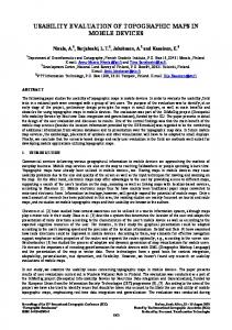
As discussed above, few studies exist on the usability of maps presented on the small displays of PDAs. Because direct user feedback is widely recognized as a necessary element in a human-centred design process, we decided to bring the users into the project development at a very early stage. The test is described in detail in the following paragraphs. 3.1 Goal and hypotheses The goal of the study was to examine the usability of present topographic maps in mobile devices, to derive user requirements for the GiMoDig prototype [16], and to identify design principles for adaptive maps to be shown by the GiMoDig interface. We also wanted to gain experience in arranging field tests and see if such tests were adequate with respect to maps developed for mobile devices. The hypotheses we wanted to study in the field test were: What topographic datasets do users use to resolve predefined tasks, and under what conditions? ! ! Is the user able to resolve the tasks using the given material? What are the deficiencies of the maps? ! ! Are the symbology and feature types easily understood? Can the user recognize the map symbols? ! ! What are the features needed to resolve the tasks? The predefined tasks that the users were asked to perform were based on the “Hiker in Nuuksio National Park” scenario. In this phase we did not want to evaluate the usage scenario itself, but we utilized this as a background for the test. 3.2 The user scenario: Hiker in Nuuksio National Park Typical scenarios in which users could benefit from topographic maps were compiled for different user groups. The “Hiker in Nuuksio National Park” scenario was selected and field tests were set up according to the following storyline: A hiker goes on a camping trip in Nuuksio National Park. She uses topographic maps on a mobile device (PDA) that are provided by a map service. Specific maps having different scales allow her to find the nearest campsites, determine her position, navigate to other locations and obtain information on restricted areas etc. See Figure 1.
Figure 1. In the Nuuksio scenario a hiker uses topographic maps, provided by a GiMoDig service, on her PDA. Nuuksio National Park in Espoo, southern Finland, is an area noted for its hiking and camping possibilities. Thousands of people visit Nuuksio throughout the year. Visitors are requested to adhere to the park’s specified routes, in order to safeguard the area’s flora and fauna. For the same purpose, there are strictly limited areas for camping and making campfires.
1905
3.3 Test method The aim of the evaluation was to identify main usability problems, to better guide future design. A controlled, experimental field-testing method was chosen, one that would allow for the same conditions and same tasks for each user. The field test was devised from three usability methods: thinking aloud, observation and interviews. Field tests provide a good deal of varying information about how a product is likely to operate in the real world. For this reason the data can be difficult to interpret, especially because the results will be more qualitative than quantitative. But as we mentioned earlier, our primary interest was in determining the main benefits and obstacles and finding design principles, which are well suited to the qualitative results idea. At Nuuksio National Park, the users were first told the purpose of the test, and it was made clear that the purpose was not to test them, but the product, and that the more questions and mistakes they make during the test, the more this would help our study. They were informed of the Nuuksio scenario and were asked to complete predefined test tasks using topographic maps on a PDA. Two observers monitored the users during the test and interviewed them in the usage situations. The users were asked to think aloud, especially in situations where they thought they were having problems. The tests were recorded on minidisk and videotape. One pilot test was conducted to rehearse, identify any problems that might arise in the field situations and determine test duration. 3.4 Test users The test was only a preliminary one and concerned with deriving qualitative data and eliciting the thoughts of the users. The study’s user group was somewhat small. We had one pilot test-user, to make sure that the test set-up was working as planned, and six actual test persons. The ideal situation would be to test the product with individuals who would be the most representative users of the product, but we thought that at this point it would be more interesting to have as wide a group of people as possible – this could reveal new aspects concerning maps and related devices. The test users were selected to represent the average users of map services. They included both genders and were from 24 to 60 years of age. Among them were some novice, and also expert, map users. Users in Nuuksio tests are presented in Table 1. Table 1. Summary of background information on users, gathered by a questionnaire. User
Sex
Age
Profession
Hobbies
Use of the different maps
1
M
26
Artist
-
Weekly: city
Estimation of own map-use skills [1-7]
Familia r with use of PDA
Familiar with use of GPS
Familiar with test area [1-7]
6
No
No
4
Seldom: topographic, road, maps in www 2
F
50
Accountant
Sports
Seldom: topographic
2
No
No
2
3
F
24
Machine operator
Floor ball, savate
Monthly: maps in www
4
No
No
1
4
M
60
Consultant
Sports, literature
Monthly: road, city
3
No
Slightly
3
-
Monthly: road, city
2
No
No
1
6
Yes
Slightly
4
Seldom: paper maps
5
F
60
Informatician
Seldom: topographic, CD-ROM Seldom: topographic, maps in www
6
M
35
Sales manager
Sailing, hiking, cycling
Daily: road, city Monthly: topographic, maps in www, CD-ROM
3.5 Test material and equipment The mobile maps used for the test were derived from the Topographic Database (TDB) of the National Land Survey of Finland (at a scale of 1:10 000). Raster maps in four different scales with four different sets of features were derived from the TDB, to be utilized in the PDA, see Table 2. These were compiled to simulate a “zooming function” on the screen. The cartographic presentation of the maps used in test was partly the same as in the present topographic map (1:20 000), and partly altered (e.g. colour of the paths). Some improvements were made on the information content, e.g. symbols of campsites and routes were added manually to the maps in the Adobe Illustrator program.
1906
Table 2. Description of the maps used in the Nuuksio field tests. Map
Basic area of interest when providing this map to the users
Scale
Topographic features presented
1:35 000
The Nuuksio National Park area, hiking trails and their lengths, main roads, larger ponds and their names, parking area and information cottage symbols
1:14 000
Features in map 1 plus regular contour lines (5m intervals), ditches, precipices, tracking routes, houses, depths of the ponds, camping and campfire sites, small paths
3
1:7 000
Features in previous maps and auxiliary contour lines (2.5 m intervals), elevation values of regular contour lines, trees, outcrops, boulders, description of park service areas, swamps, names and heights of hills, names of places, power lines, weirs
4
1:3 500
Features in previous maps and cultivated areas
1
2
! !
An overview map Generalised topographic map
!
Testing different sets of features from topographic database
!
Zoom + more information
!
Zoom + more information Topographic database and all other information
!
At the time of field testing the GiMoDig project did not yet have any real prototypes to test. We decided to test the existing available maps with existing hardware and software (see Figure 2), to identify the most problematic issues concerning maps in mobile devices. The mobile device used in the field evaluation was a PDA (Compaq’s Pocket PC), with 57.6 mm wide and 76.8 mm tall display, 64-colours’ image, 240 x 320 resolution and 0.24 mm dot pitch, and keyboard, stylus and touch screen input methods. The navigation software used for showing the test maps was Genimap® Navigator LT, which supports raster maps and GPS receivers, and enables map-handling operations such as zooming and measuring distances. Our aim was not to test the software or the hardware, but use them only as a means to utilize the mobile maps instead of the GiMoDig service. 3.6 Predefined test tasks The users were brought to the park and after being told the scenario were asked to complete the following predefined test tasks using topographic maps on a PDA. Users were given two “orienteering” tasks, of which the first was to find a suitable campsite for a tent in the nearby area. While planning their route to the site, the users were asked to give reasons for choosing a specific campsite and to name the topographic elements they thought were relevant to the planning of the route. They were also asked to describe, on the basis of information from the map, their impression of the campsite they planned to visit. After planning the route they were asked to estimate the distance to the chosen campsite and then calculate it with a measuring tool. Other questions related to the information content of the map and its cartographic design were also asked during the route planning. Finally, the users were asked to navigate to the chosen place. During this task the GPS was not connected to the PDA. While hiking, the users were asked several times to establish their location and show it on the map. They were asked about the landmarks they used for locating themselves and about other information they might possibly need. The use of different scales was also observed during the test. The users were asked which of the map scales were the most suitable for their purpose. After arriving at the campsite, they were asked how well their earlier impression from the map corresponded to the real situation. If the site looked different from what they had thought, they were asked to describe what was wrong, and what information they would have needed, and how the information could have been displayed on the map in order to present a more realistic impression of the area. The second “orienteering” task was performed using the location information delivered to the screen of the PDA by the GPS module. The GPS was turned on and the users were asked to return to the parking area where the test began, using a route different from the outward route. Planning the route’s course and the factors that affected the decisions, were discussed with the users. Users were asked to evaluate the topography of the area. During the return and at the parking area the users were asked several questions about the maps and the navigation.
1907
At the end of the field test the users were asked several predefined questions, including the following: ! What did you think about the GPS? Did you find it useful? Did you trust it? Would you have liked to have a route suggested to you? ! ! What landscape information should the route suggestion service take into account? ! Was the topography what you thought it would be? ! Would you use a service like this, or stay with paper maps? Why? ! Was there enough/too many targets shown on different-scale maps? What could have been added and what reduced? ! What topographic information do you think is relevant for navigation? ! What else would you like to see in maps provided on a PDA? How should the visualization be? What about the colours of the maps? ! What other improvements to the device and its functionality could be made? !
Figure 2. PDA with navigation software and examples of maps used in the Nuuksio field tests. In the following section the main results of the field tests are described in detail. 4. RESULTS The results of the field tests are divided into three parts. The first deals with map-related results and the second, the technical issues regarding the software and equipment. The third part describes our experience testing the usability of mobile maps in a field test. In the following section we discuss some general aspects and the reliability of the results. 4.1 Maps The maps used in the tests were derived from the existing topographic database, not originally intended for small display maps of mobile devices. In the following subsection we list issues that our tests identified regarding map symbology and the cartographic presentation. These results are summarized in Table 3. 4.1.1 Map symbols and cartographic presentation The users found it difficult to understand some of the map symbols, most of which were either unfamiliar or not clearly and distinctively different from the other symbols. One such symbol was the symbol for outcrop, which has earlier been different. It was now displayed with a light grey colour, which was not very distinctive or easily recognized on a PDA screen. Also the symbols of the contour lines ran together with the small path markings, and symbols for hiking trails were mixed with main road symbols. What seems to connect these misunderstandings is the colour of the symbols, since the contour lines and path markings were both brown and the hiking trails and roads were both presented with in red. When using the same colours as paper maps, the symbology might become unclear in the small display. The fact that mobile map services are used outdoors, and in our case in bright sunlight, can make it more difficult for the users to recognize the different colours. Light colours were also difficult to recognize, e.g. yellow and light grey. This means that the symbols’ colours should be even more distinct from each other compared to paper maps. The maps should be tested in as many light and weather conditions as possible before making final decisions on the colours and symbols used in the displays.
1908
Table 3. Map symbols that the users commented on or had problems with during the Nuuksio tests. Symbol
Meaning of the symbol
Displayed on maps
Feature type
Colour
Main road
1-4
Line
Reddish brown
Hiking trail
2-4
Line
Red
Road
1-4
Line
Black
Users’ comments
The colour and thickness were too similar.
Mixed with contour lines. Path
2-4
Deciduous tree
3, 4
Coniferous tree
3, 4
Ditch
2-4
Line
Black Was thought to be a small contour line.
Point symbol
Black
Line
Blue
Users didn’t understand the size and the differences; both were thought to be river symbols.
Tree symbols should be more illustrative or they should be displayed as a coloured area.
Small stream
2-4
Boulder
3, 4
Point symbol
Black
Symbol unknown to all the users, not descriptive enough.
Precipice
2-4
Line
Black
Symbol unknown to some users.
Outcrop
3, 4
Area
Light grey
Symbol unknown, not seen very well in bright sunlight.
Contour lines
2-4
Line
Brown
Mixed with the path symbols. Should be more descriptive: several users suggested shadowing of the slopes.
Weir
3, 4
Residential building
2-4
Black
Outbuilding
2-4
The symbol for the weir was unknown to all of the users. Suggestions about more picturesque symbols for the human-made structures (e.g. houses, bridges) were made.
Campsite
2-4
Information
1-4
Red
Campfire
2-4
The placement of commercial service symbols should be better; they must not hide anything relevant, but still be accurate. Maybe the actual situation could be illustrated with a connective line. The actual shapes of the areas should also be shown, not only symbols for camping areas and parking places.
Point symbol
Point symbol
The legend is an important issue when studying maps in small displays. The users felt that a legend is necessary, but that maybe there should be an optional choice whether or not to show it. Some of the users commented that the information about map symbols and their meaning could be displayed in the same way as Internet links; i.e. when you select a symbol by pointing to it, you would get an explanation on the display. This might be possible in the future in vector graphics, but on the raster maps, such as the ones we used, it was not. A function giving an active explanation could be provided by a tip tool, for example, in which the explanation appears when the user holds the pointer on the symbol.
1909
Some users thought that more descriptive symbols would make maps more comprehensible and the question of the legend could be avoided. One suggested the idea that maps could be like drawings in fairytale books, where visualization would describe the surrounding environment to make them look like 3-D maps. The other main complaint mentioned by the users was the inaccurate positioning of certain symbols, such as those for campsites or information kiosks. The users thought that these symbols could more accurately show the locations. Inaccuracies were seen to result from some symbols being placed in the approximate location instead of the actual location, in order to make a place name readable. One solution could be a thin line connecting the symbol to the true location. 4.1.2 Integrating information The users thought that the greatest advantage of the mobile map services (besides the GPS) would be the possibility of combining information from different databases and presenting it over the topographic map data. The users were asked to describe what kind of information they would like shown in topographic maps of this kind of area. According to our tests, the additional information needs could be as listed as shown in the following table. Table 4. Additional information needs described by users during the tests. Type of the information
Examples of the information content
! Datasets of Park and Forrest Service
Datasets of meteorological information Datasets of environmental information Datasets of geological formations Datasets of commercial services in the area
! ! ! ! ! ! !
Location of camping and campfire sites, toilets, firewood, information points Limits of fishing licenses, availability of drinking water, swimming spots, places “with a view” Detailed information about hiking trails (how long and how demanding, suitability for cyclists or families with the small children, topographic differences etc.) Weather forecasts, warning about potential forest fire hazard in the area Information about the terrain and the vegetation Areas containing endangered species, wildlife conservation areas (e.g. birds nesting places) Information about the soil (where to camp) and the bedrock (special bedrock formations e.g. the ‘Giant’s Kettle’) Rentable cabins, cafes, places to rent sports equipment (kayaks, tents etc.)
This demand for additional information shows that there is a clear need for data integration. From the users’ point of view, separate datasets (in this case topographic data) are not enough. Users thought that in some cases they would be interested in deciding for themselves what information should be shown on the display, depending on their task. 4.1.3 Maps with different information and scale The users thought that one of the main advantages of the mobile maps was the possibility of zooming between different map scales. We had four maps in our test, each in a different scale and with different information levels. The users wanted the step between the layers to be smooth enough that one would not lose the sense of the area. This means that the step between the layers should not show the user a totally different-looking view. The visual representation should be equal and correspond well to the other scales. But the users also thought that the step between different layers was not needed unless the information level changed, and that as the scale increases the amount of information should also increase. It was also noticed, quite naturally, that the small-scale map was used for planning a route and the larger scales when walking along the route. The overview map should contain general information about the terrain, the routes and the services in the area. With larger-scale maps people were interested in seeing more specific information on near-by areas and also on the available services. The larger-scale maps were also expected to provide detailed information on several landmarks in the area. The scale should be indicated in a way that would make it immediately usable to everyone. The users could not easily interpret the traditional number scale (e.g. 1:20 000) on the maps. A more suitable way would be some kind of segment (attached to its length). A light grey grid was also thought to be a possible way of helping the user to understand the scale and the distances on the map.
1910
5.
TECHNICAL ASPECTS
During this test, we intended not to focus on the hardware or the software, because the main interest was in the mobile maps and the usability testing itself. However, during the test, the users raised several problems and usability issues concerning the technical aspects. We decided to document the most severe, to show that these are aspects that should also be considered when actually developing the mobile map service and making it user-friendly. 5.1 Software Many problems arose when using the software for showing map data in the PDA display. One of the most severe was its slowness in some situations, especially when the GPS module was attached to the device. In such situations no indication was given of how long the processes would take. Sometimes it was difficult to know whether the program was working or if it had crashed down. The user was also unable to see which tool was active while using the map service. Many mistakes occurred; for example when the users thought the scrolling tool was active, they actually had the zooming tool on instead. There were also several problems using the measurement tool: afterwards the map was not centred and if the next point was outside the map view, the users had to choose the scrolling tool, move the map, and then choose the measurement tool and add the next point. Another problem from the user’s point of view was that when the GPS was connected, the user could not scroll up or down the map, since the map was always presented in a way that the user’s location was in the centre of the display. The measuring tool and the GPS information were also shown on top of each other, so they could not be used at the same time. 5.2 PDA and GPS module GPS positioning worked much better than the users had thought at the beginning of the test, and they started to trust it more and more as the test proceeded. The users even considered it to be the main advantage when comparing mobile map services to traditional paper maps. If they had to choose between a map in a mobile device or on paper, without GPS positioning they would choose the paper maps. The PDA that was used also had some problems; for example, the users noted that in some cases the most important functions (like scrolling and zooming) could not be executed with one hand. The users were also very sceptical about how long the batteries would last, especially during winter. This was not a problem in our case, since the PDA was only used for three hours during each test, of which only one hour was spent using the GPS module. They also thought that the PDA might not be the best technical equipment for field usage, since it was sensitive to dirt, not waterproof and not designed for a heavy handling (dropping etc.). The screen also reflected the light, which made it difficult for the users to see the map in bright sunlight. The users thought it might be useful to have a wrist strap on the device, to prevent it from being dropped. Also a possibility to deactivate the screen in some situations, when the touch screen is not being used, was suggested. 5.3 Experience gained from the test set-up One of the things noticed during the tests was the fragility of each testing situation. The individuals involved were very easily influenced; for example, if the test supervisor asked why a person chose a specific option, the user started to doubt the decision and cancelled it. The identifiability of topographic and other features is partly dependent on familiarity with the cartographic presentation. As noted in the results, people had difficulty recognizing boulders, outcrops and precipices, for example, and a reason for this might be that traditional symbols had been changed. It is important to take this into account in the design process, which will probably mean different cartographic presentations for different countries and for different user groups. One could assume that the user requirements for maps are different when having the GPS. One interesting aspect that we noticed in the test was that people relied more on the position indicated by the GPS than their own interpretation of the position using the maps. Also when the GPS signal was on, the role of the map appeared to change. As noticed in the test, people would prefer paper maps if the GPS was unavailable in mobile map service. One of the reasons for this might be that you cannot plan a route as well with a small display as you can with a paper map. But when the GPS is available you can be sure of finding your way, so having a large overview map is not so important. One indication of this was that when a GPS signal was turned on, people tended to change from the overview map to the most accurate (largest scale) map available.
1911
6.
SUMMARY AND CONCLUSIONS
This paper presented the compilation and results of a preliminary usability evaluation of topographic maps in mobile devices for the GiMoDig project. The evaluation was carried out as a field test, which is considered to be a controlled experimental method allowing for the same conditions and same tasks for each user. Usability studies should start early in the design process, even without actual devices and programs, and the studies should continue until the product development is complete. We presented the design and results of the user evaluation in detail. We also briefly described the usability evaluation in general, to give a background for our user tests on mobile maps. A group of appropriate test users was selected, including both genders, ranging in age from 24 to 60. In the Nuuksio National Park, users were asked to complete predefined test tasks using topographic maps shown on a Personal Digital Assistant (PDA) (Compaq’s Pocket PC) with Genimap’s Navigator LT software. The mobile maps used in the evaluation were derived from the Topographic Database of the National Land Survey of Finland. Two observers monitored the users during the evaluation, and interviewed them when the users were performing predefined tasks with the aid of mobile maps. The goal of the field test was to identify the main benefits and obstacles evident when using topographic maps in mobile devices. The purpose was also to find design and development ideas for maps suitable for mobile devices. We also wanted to gain more experience in how to arrange the field testing, and to see if the tests were adequate for evaluating the usability of maps developed for mobile devices. According to our experience, we recommend that field testing with users is a suitable method when evaluating the usability of mobile maps. This method is more applicable when evaluating mobile maps as opposed to paper maps, because more things can affect the use of mobile maps, features that are sometimes difficult to determine out in a laboratory environment. Arranging field evaluations might take time and effort, but we believe it is the only way to truly evaluate the usability of maps that are going to be used in mobile outdoor situations and in varying contexts. We therefore suggest that scenario-based design and early user evaluation in the field are very suitable methods for developing mobile applications that utilize topographic maps. The evaluation results point out that the cartographic presentation and symbology of the present topographic maps are not well suited to mobile small-display devices. The field evaluation identified several problems related to the usability of maps in mobile devices. These included problems with technical equipment, functionality of the software, cartographic presentation, colours of map symbols, and the symbols’ general effectiveness. Clearly, map symbology, the placement of the symbols, and other cartographic presentation will have to be redesigned for the small displays. Our evaluation included four maps, each in a different scale and having different levels of information. The users wanted the step between layers to be smooth enough so that one would not lose the overall idea of the area. The users also thought, that the step between different layers was not needed, unless the information level changed, and that as the scale increases, the amount of information should increase as well. One of the central outcomes of the results was that the main benefit of the mobile map services (besides the GPS) was seen to be the combined additional information from different databases, presented over the topographic map data. The users’ obvious need for more information showed that there is a clear need for data integration. Separate topographic datasets are not enough from the users’ point of view: users will need meaningful map entities that are adapted according to their context of use. Adaptation of map presentation and content according to the usage context will greatly improve the usability of mobile topographic maps. Current mobile maps, essentially paper maps converted to electronic format, do not provide the users with these possibilities. When location becomes an integral part of mobile devices, new kinds of map services will be needed. Users will require different maps for different purposes. The maps will need to be available in different scales, and will have to provide comprehensive information in various formats to various types of devices. All this will create several challenges for map service providers, in generating and maintaining mobile map services. 7.
ACKNOWLEDGEMENTS
This research is part of the Geospatial Info-mobility Service by Real-time Data-integration and Generalisation (GiMoDig) project, IST-2000-30090, funded by the European Union through the Information Society Technologies (IST) programme. Special thanks go to Mr. Ari Ahonen and Mr. Rolf Södergård from the KEN project, who participated in designing and carrying out the field trial, as well as in analysing the results. We also thank the following persons for their contribution to the compilation of the user evaluation: Mr. Lassi Lehto, Mr. Reino Ruotsalainen, Mr. Ismo Kemppainen, Mr. Jaakko Kähkönen and Prof. Tapani Sarjakoski.
1912
8. [1] [2] [3] [4] [5] [6] [7]
[8] [9] [10] [11] [12] [13] [14] [15] [16]
REFERENCES E. Kaasinen, User Needs for Location-Based Services. Accepted to be published in Personal and Ubiquitous Computing (2003). K. Cheverst, N. Davies, K. Mitchell, A. Friday and C. Efstratiou, Developing a context-aware electronic tourist guide: some issues and experiences. Proc. of the SIGCHI conference on Human factors in computing systems, The Hague, The Netherlands, pp. 17-24 (2000). J. Baus, A. Krüger and Wolfgang Wahlster, Resource-adaptive mobile navigation system. Proc. of the 7th International Conference on Intelligent User Interfaces, San Francisco, California, USA, pp. 15-22 (2002). S. Geldof and R. Dale, Improving route directions on mobile devices. Proc. of the ISCA workshop on MultiModal Dialogue in Mobile Environments, Kloster Irsee, Germany, 15 p. (2002). T. Reichenbacher, The World in Your Pocket – Towards a Mobile Cartography. Proc. of the 20th International Cartographic Conference, Beijing, China, 4, pp. 2514-2521 (2001). GiMoDig, Geospatial Info-Mobility Service by Real-Time Data-Integration and Generalisation. At http://gimodig.fgi.fi/ (accessed April 9, 2003). T. Sarjakoski, L.T. Sarjakoski, L. Lehto, M. Sester, A. Illert, F. Nissen, R. Rystedt and R. Ruotsalainen, Geospatial Info-mobility Services - A Challenge for National Mapping Agencies. Proc. of the Joint International Symposium on "GeoSpatial Theory, Processing and Applications" (ISPRS/Commission IV, SDH2002), Ottawa, Canada, 5 p., CD-ROM (2002). ISO13407, International Standard ISO 13407:1999. Human-centred design processes for interactive systems. International Organization for Standardization (1999). B. Shackel, Usability - context, framework, definition, design & evaluation. In Human Factors for Informatics Usability, (Shackel B. and Richardson S. J., eds.), pp. 21-37, Cambridge University Press (1991). ISO 9241-11, International Standard ISO 9241-11:1998. Ergonomic requirements for office work with visual display terminals (VDTs) – Part 11: Guidance on usability. International Organization for Standardization, (1998). J. Nielsen, Usability Engineering. Morgan Kaufmann, London, 362 p. (1993). S. Rosenbaum, Not Just a Hammer: When and How to Employ Multiple Methods in Usability Programs. Usability Professionals Association Conference Proceedings, 6 p. (2000). X. Faulkner, Usability Engineering. Pallgrave, New York, 244 p. (2000). A.-M. Nivala and L.T. Sarjakoski, Need for Context-Aware Topographic Maps in Mobile Devices. To be published in the Proceedings of the 9th Scandinavian Research Conference on Geographic Information Science ScanGIS’2003, Espoo, Finland, 12 p. (2003). L.T. Sarjakoski and A.-M. Nivala, Context-aware maps in mobile devices. In: Salovaara, A., Kuoppala, H. and M. Nieminen, (eds.), Perspectives on intelligent user interfaces, Helsinki University of Technology Software Business and Engineering Institute, Technical Reports 1, HUT-SoberIT-C1, Espoo, pp. 112-133 (2003). A. Jakobsson, User requirements for mobile topographic maps. GiMoDig-project, IST-2000-30090, Deliverable D2.1.1, Public EC report, 93 p, at http://gimodig.fgi.fi/deliverables (2002).
1913
USABILITY EVALUATION OF TOPOGRAPHIC MAPS IN MOBILE DEVICES Nivala, A.1, Sarjakoski, L.T.1, Jakobsson, A.2 and Kaasinen, E.3 1
Department of Geoinformatics and Cartography, Finnish Geodetic Institute, P.O. Box 15, 02431 Masala, Finland. E-mail:
[email protected] and
[email protected] 2 Development Centre, National Land Survey of Finland, P.O. Box 84, 00521 Helsinki, Finland. E-mail:
[email protected] 3 VTT Information Technology, P.O. Box 1206, 33101 Tampere, Finland. E-mail:
[email protected]
Biography Annu-Maaria Nivala (M.Sc.) graduated from the University of Oulu in 2002. She joined the Department of Geoinformatics and Cartography at the Finnish Geodetic Institute as a research scientist and is also currently a Ph.D student in the Computer Science Department of the Helsinki University of Technology. She is working on the GiMoDig (Geospatial info-mobility service by real-time data-integration and generalisation) project where her research interests include usability issues related to maps on mobile devices.
1914