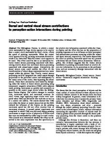
whole window list from the beginning, until we meet two contiguous windows, say ... is scanned again to find window pairs that need to merge, until all changes.
Visual Exploration of Stream Pattern Changes Using a Data-driven Framework Zaixian Xie, Matthew O. Ward, and Elke A. Rundensteiner Computer Science Department Worcester Polytechnic Institute {xiezx,matt,rundenst}@cs.wpi.edu
Abstract. When using visualization techniques to explore data streams, an important task is to convey pattern changes. Challenges include: (1) Most data analysis tasks require users to observe the pattern change over a long time range; (2) The change rate of patterns is not a constant, and most users are normally more interested in bigger changes than smaller ones. Although distorting the time axis as proposed in the literature can partially solve this problem, most of these are driven by the user. This is however not applicable to streaming data exploration tasks that normally require near real-time responsiveness. In this paper, we propose a data-driven framework to merge and thus condense time windows having small or no changes. Only significant changes are shown to users. Juxtaposed views are discussed for conveying data pattern changes. Our experiments show that our merge algorithm preserves more change information than uniform sampling. We also conducted a user study to confirm that our proposed techniques can help users find pattern changes more quickly than via a non-distorted time axis.
1 Introduction The term data streams, or streaming data, refers to data arriving at end-users in a continuous, unbounded, and normally very rapid way [1]. Many real-world examples exist, such as traffic monitoring, intensive care units in hospitals, and the stock market. Storing data, performing queries, and mining patterns are common tasks on data streams in order to retrieve useful information, understand associated phenomena, and provide support for decision-makers. Because of this wide usage, data stream analysis has attracted much attention in multiple areas of computer science, including database management and data mining [1]. As an efficient technique to help data analysis, visualization is also increasingly being employed to help users investigate data streams. This has resulted in some frameworks, algorithms, and techniques for preprocessing and visualizing streaming data, along with interaction techniques to explore it [2–5]. Although some of this work only focuses on time-series data, their techniques can often be applied to data streams. We can divide the tasks solved by these efforts into two categories: (1) maintaining and conveying data patterns of the current window; and (2) detecting and representing the pattern change over time. Not many researchers have focused on the second category,
2
Zaixian Xie, Matthew O. Ward, and Elke A. Rundensteiner
although this is an important part of stream analysis. Figure 1 shows one intuitive approach to visualizing pattern change in the traffic data. In this figure, each time window corresponds to 30 minutes; every subfigure shows two contiguous windows to convey the pattern change. This can help users detect changes of the fit line slope for the linear trend between Occupancy and Speed. However, because significant pattern change only happens when entering rush hours (see the subfigure with the label “big change”), such useful information is buried by other subfigures. This might result in a slow response rate, which is not acceptable for some applications. Moreover, the display canvas is wasted by a lot of subfigures with small or no changes.
Fig. 1. A juxtaposed output using the traffic data of 5 hours from a specific sensor. 10 windows are shown in this figure. Each subfigure shows two contiguous windows. Newer data is in dark color, while the older data is light. Significant changes are buried in a lot of subfigures with few or no changes.
In order to overcome the above shortcoming, our basic idea is to design algorithms to automatically merge windows with small or no changes and assign more screen space to periods having large pattern changes. Figure 2 shows a motivating example, where 48 original windows (24 hours) are merged to 3 windows and then visualized by 2 subfigures. Note that each subfigure contains the data in two windows, and is linked to the time axis via three lines ( two thick and one narrow ) to delimit the time ranges for these two windows. Obviously, Figure 2 reduces users’ response time significantly, and merging maintains most of the information about recognizable changes of the fit line slope, the increasing at 6AM, and the decreasing at 8PM.
Lecture Notes in Computer Science
3
Fig. 2. 48 windows, containing the data in Figure 1, are merged to 3 windows and then shown with 2 scatterplots. Each scatterplot contains two windows, and is linked to the time axis via three lines to delimit the time range for these two windows. Newer data is in dark color, while the older data is light.
The main contributions of this paper include: – We propose a framework to visualize data streams with the goal to show significant pattern changes to users. The main approach is to merge those windows with few or no changes when visualizing and storing recent as well as old data. – The above framework is materialized using two important data patterns: linear trends and data range. – We performed experiments to show that our merge algorithm can preserve more change information than uniform sampling. User studies were conducted to demonstrate that our techniques can significantly reduce users’ response time when looking for significant pattern change in a data stream.
2 The Data-driven Framework Before describing the framework and algorithms, we give some terms. Terms: If we merge windows W1 , W2 , ..., and Wk to a window W ′ , we call W ′ the parent window or parent of W1 , W2 , ..., and Wk , and W1 , W2 , ..., and Wk the child windows or children of W ′ . We also call W1 , W2 , ..., and Wk original windows and W ′ the merged window. Current view means the most recent n0 windows over which users want to observe data pattern changes. Many multivariate data patterns can be described using a vector (v1 , v2 , . . . , vr ), which we call a pattern vector. An example is the vector (−2, 5) that describes a linear trend y = −2x + 5. Merge Algorithm: We first explain how to merge n0 windows to nm (≤ Nm ) windows, where Nm is the maximal number of windows that the canvas can hold, and then some special requirements for handling streams will be discussed. Data patterns in real applications normally need some complex presentations, such as the linear trend. However, in most cases, it is enough to represent the pattern change as a real number. For example, if we want to investigate how the slopes of fit lines change in the linear trend, we can define the pattern change as the slope difference between two contiguous windows. Based on this reasonable assumptions, we use an
4
Zaixian Xie, Matthew O. Ward, and Elke A. Rundensteiner
example shown in Figure 3 to describe our merge algorithm. In this example, the pattern is described by a real number and the change is defined by the difference between two numbers. Actually we only consider the change instead of the patterns themselves, this simplified example can show our idea very well. In Figure 3, the first row shows all 9 original windows with their pattern description. Recall that our approach is to merge contiguous windows if the change between them is small. Thus, the intuitive idea is to calculate all changes between contiguous windows and merge those with small changes. In the first row (original windows) of Figure 3, we can find the following facts: (1) the change between neighbor windows is 0.1 or 0.2; (2) the pattern differences between W1 and W2 , W2 and W3 , W3 and W4 , all are 0.1, which is a small change compared to other changes. Can we merge W1 , W2 , W3 and W4 to one window? Absolutely no. The reason is that the data pattern is increasing steadily from W1 to W4 . The aggregate change is 0.3, which is not small. If we merge these four windows to one window, we will lose this important change. Therefore, in our merge algorithm, we only merge two windows at once. To explain this idea, assume that we are merging the window list { Wn0 −1 , Wn0 −2 , . . . , W0 }, where W0 is the current window, and the change threshold is δ . We search the whole window list from the beginning, until we meet two contiguous windows, say W j and W j−1 having a change less than or equal to δ , and then merge them. After that, we do the same searching and merging from W j−2 until W0 . For example, in Figure 3 in the first pass of searching and merging, we get four merged windows: W1′ , W2′ , W3′ and W4′ , given δ =0.1. Note that a single pass scan is not enough because the change between a merged window and an original window, or two merged windows can be less than δ , e.g., W3′ and W4′ . Thus we need to do multiple pass searching and merging from the beginning of the window list for a given δ , until we cannot find a change less than δ in a complete pass. In Figure 3, we finally get a new window list {W1′ ,W2′ ,W5 ,W3′′ }. After multiple pass searching and merging given a threshold δ , the number of windows in the new window list is probably still bigger than Nm . Under this situation, we can increase δ and do searching and merging again. For flexibility, we allow users to p (δi < δi+1 ). The searching and merging will be run on these provide a sequence, {δi }i=0 δ values one by one until nm < Nm . δ p should be the maximal possible change to make this algorithm applicable to any input.
W1
0.1
W2
0.2
0.15 W 1'
W3
0.3
W4
0.4
0.35 W 2 '
W5
0.6
W6
0.8
W7
W8
0.9
0.7
0.85 W 3' 0.8
T
W9
0.8
0.75
Original Windows
W4'
W3 ''
Fig. 3. An example to show how we do a one pass merge given a change magnitude δ = 0.1. First, all pairs of windows are merged if their change magnitude is smaller than or equal to 0.1, and then the window list is scanned again to find window pairs that need to merge, until all changes between contiguous windows are bigger than 0.1.
Lecture Notes in Computer Science
5
When we discuss the merge algorithm, we fix the number of original windows to n0 . For data streams, if one new window arrives, the oldest window, namely the expired window, has to be removed from the current view before we add the new window to the visualization. For example, in Figure 3, if we have a new window W10 , then W1 must be removed from the view. The easiest approach is to run the the merge algorithm again on this new window list {W2 ,W3 , . . . ,W9 ,W10 }. Obviously this is not efficient because the merge result of the last time period is not reused. Thus we handle the new arrival window via the following steps: (1) If the oldest window in the current view has been merged into other windows, decompose the oldest merged window and put all its child windows back to the window list. (2) Remove the oldest window from the window list. (3) Add the new window to the window list. (4) Run the merge algorithm on the new window list. Therefore, for the new window W10 , we run merge algorithm on {W2 ,W2′ ,W5 ,W3′′ ,W10 } instead of {W2 ,W3 , . . . ,W9 ,W10 }. How to Merge Windows: We have two options to merge two windows: (1) We first do a union set operation on two windows and get a merged window. And then we apply uniform sampling to this merged window to reduce the number of datapoints to the size of one window. For example, if each window has 100 datapoints, we can get a window having 200 datapoints after union set operation. And then, we apply uniform sampling to this merged window with 50% as the sampling ratio. (2) Once when we get a complete time window in the data stream, we calculate and store its pattern in the memory. Assume the patterns of two time windows W1 and W2 are denoted by Vp1 and Vp2 respectively. When we merge W1 and W2 to W ′ , we calculate the pattern of W ′ directly from Vp1 and Vp2 . This way saves the time to calculate the pattern for merged window but can only be applied to some specified data patterns [6]. The two streaming datasets used in this paper are the following. Traffic Data Stream: In Section 1, We showed a slice of this data stream, which is provided by Mn/DOT (the Minnesota Department of Transportation) [7]. There are more than one thousand sensors on highway entrance/exit ramps and main lanes throughout the Twin Cities metro area. Each detector can collect the following values every 30 seconds: (1) Volume: the number of vehicles passing the detector. (2) Occupancy: the percentage of time that the detector sensed a vehicle. (3) Speed: the average speed of vehicles passing the detector. We normally select one detector and retrieved its three measures during a specific time period, e.g., one day or onw week, on the Mn/DOT website. Sleep Data Stream: This data stream is a physiological dataset (Santa Fe time series competition data set B) selected from the PhysioBank archive [8]. It is recorded from a patient suffering from sleep apnea in a sleep laboratory. Since it is relatively long (about 4 hours at a frequency of 2Hz), we use it to simulate a data stream. This dataset has three measures: heart rate, chest volume (respiration force), and blood oxygen concentration.
3 Visualization of Patterns and Their Changes In this section, we discuss the juxtaposed view to convey pattern changes over merged windows.
6
Zaixian Xie, Matthew O. Ward, and Elke A. Rundensteiner
Assume that we have n windows, W1 , W2 , . . ., and Wn , we need to visualize. We generate n − 1 subfigures using standard multivariate visualization techniques, e.g., scatterplots or parallel coordinates. The first contains W1 and W2 ; the second shows W2 and W3 , and so on. This design is from our prior work [9] and enables users to quickly detect pattern changes in the visualizations. In juxtaposed views, we develop two types of visualization techniques: (1) juxtaposed full view that uses traditional visualization techniques to show all datapoints in the windows (Figure 2); and (2) juxtaposed pattern outline view that shows only the outline of the discovered pattern for each window. Pattern outline view is specific to each pattern. For example, it can be a line for linear trends. Figure 4 shows a pattern outline view for the same data as Figure 2.
Fig. 4. A pattern outline view to visualize the pattern change in traffic data slice used in Figure 2. Each line represents a linear model for a merged window.
In Figures 2 and 4, all subfigures are placed on the canvas horizontally in the order of the timestamp. Because the time axis is evenly spaced and subfigures have different lengths of time range, we use lines to connect subfigures to the time axis. This can help users understand where the change is fast and where the change is slow. We call this a 1D even layout. The 1D even layout is intuitive to interpret, but it does not make full use of the canvas when the number of merged windows is large, especially for those visualization techniques that generate output in a shape close to square, such as scatterplots or parallel coordinates. In order to avoid this drawback, we propose a grid layout, in which we lay out all√subfigures in a grid having n rows and n columns. If there are m subfigures, n = ⌊ m − 1⌋ + 1. In grid views, the representation of the time axis is problematic. If we use the same method as the 1D even layout to connect the subfigures to the time axis via lines, we will encounter a lot of overlapping. We solve this problem using an interaction techniques : when the mouse hovers over a subfigure, the corresponding time range will be highlighted on the time axis (Figure 5). Figure 5 shows an example using the pattern outline view and grid layout. Each subfigure is a two-dimensional parallel coordinates. There are two bands in each subfigure. One band represents the data range in a time window. On dimension X, two corners of the rectangles correspond to (X + s) and (X − s) respectively. Note that X is the mean value, and s is the standard deviation for dimension X in an arbitrary time window. In
Lecture Notes in Computer Science
7
this figure, we can find two types of range: Type 1 (low heart rate and high blood oxygen concentration, e.g., the yellow band in the highlighted subfigure) and Type 2 (high heart rate and low blood oxygen concentration, e.g., the dark band in the highlighted subfigure). Our merge algorithm can automatically detect the shift between two types, as shown in Figure 5. From the time axis, we can find that Type 2 normally only exists in a short time range, so it can be treated as an outlier. This might be associated with sleep apnea (periods during which a patient takes a few quick breaths and then stops breathing for up to 45 seconds) [8].
Fig. 5. A pattern outline view in grid layout to visualize the changes in data range for sleep data. A subfigure is highlighted with a purple border when the mouse hovers over it. The corresponding part of the time axis is highlighted as well.
4 Evaluation In this section, we evaluate two important issues: (1) how well does the merge algorithm preserve the change information for data patterns? and (2) how much can the proposed techniques reduce users’ response time? 4.1 Measuring Result Quality of The Merge Algorithm To the best of our knowledge, there are no existing algorithms designed and optimized for achieving the same goal as our proposed merge algorithm. Therefore, we chose uniform sampling as our competitor in this algorithm to evaluate the output quality.
8
Zaixian Xie, Matthew O. Ward, and Elke A. Rundensteiner
We first defined a measure for merging quality, and then ran our merge algorithm and uniform sampling on the traffic data stream to compute quality measures in different configurations. In order to explain the quality measure, we show an example in Figure 6. The numbers in this figure have the same definition as Figure 3. In each subfigure, the first row represents the original windows; the merged windows are shown in the second row that will be visualized. Thus the actual change information perceived by users shown in the third row may be different from that in the original windows. For example, the original change between W4 and W5 is 0.4. In Figure 6(a) (our proposed merge algorithm), the perceived change by users is 0.35. This value becomes 0.55 in Figure 6(b) (uniform sampling). Obviously, regarding this change, our proposed merge algorithm has a better result than uniform sampling because |0.35 − 0.4| < |0.55 − 0.4|. Based on the above discussion, the formula to measure the result quality is given below: � � |δi − δi′ | 1 n−1 Q= ∑ 1 − δmax n − 1 i=1 Note that n is the number of original windows; δi denotes the actual change between Wi and Wi+1 ; δi′ represents the perceived change; and δmax means the maximal change. If δmax = 1.0, the quality measures for Figures 6(a) and 6(b) are 0.95 and 0.85, respectively. In addition, normally we are more interested in bigger changes than small ones, so we count only those changes bigger than a threshold δT when using the above equation. If we set δT = 0.2, the quality measures for Figures 6(a) and 6(b) become 0.975 and 0.725, respectively . In this experiment, we chose δT = π /6 and calculated quality measures in two cases: In this set of experiments, we aim to test merge algorithm by treating a slice of traffic data within one day as the current view. Hence the number of original windows is 48. Figure 7 shows the quality measures for seven different values as the number of merged windows. W1
Original Windows
0.1
0.1
W2
0
0.2
Merged Windows
W3
0.1
0.2
0.15 0
W5
0.4
0.5
W 2' 0.5
0.15 0
0.4
0.1
0.15 W1'
Information perceived 0.15 by users
W4
0.15 0
0.35
W6
W1
0.9
0.1
0.9 W3'
0.5
0.9 0.4
(a) The proposed merge algorithm
0.1
W2
0
0.2
W4
0.4
0.1
W5
0.15 0
0.15 0
0.4
0.5
0.15 W2'
0.15 0
0.1
0.2
0.15 W1' 0.15
W3
W6
0.9 0.7 W3'
0.7
0.55
0.7 0
(b) Uniform sampling
Fig. 6. This figure shows how to measure result quality of the merge algorithm and uniform sampling regarding the degree to which the change magnitude is preserved.
We can make the following observations based on Figure 7: (1) The merge algorithm performs better than uniform sampling in all configurations of this experiment; (2) When we decreased the number of merged windows in the current view, the merge algorithm shows good stability, but uniform sampling does not.
Lecture Notes in Computer Science
9
Quality Measure � � �
� � � �
� �
Merge
� �
Sampling
� �
�
�
��
��
��
The number of merged windows
Fig. 7. The quality measures for merge algorithm and uniform sampling when merging a slice of traffic data in the current view with differentnumber of merged windows.
4.2 Comparing Proposed Techniques with Uniform Time Axis Our initial goal is to reduce users’ response time for detecting pattern changes. To verify whether we have achieved this, we conducted a user study to compare users’ response accuracy (RA) and response time (RT) on different visualization techniques. The techniques we tested included: (1) Juxtaposed views with the original windows; (2) Juxtaposed full views; (3) Juxtaposed pattern outline views. The first one is the competitor, and the techniques 2 and 3 use the merged windows. In this experiment, we chose the traffic data and set the length of the current view to one day. The target data pattern was linear trends. The length of one time window was 30 minutes. The number of merged windows is set to 6. We picked 2 sensors and generated 2 figures for each technique, resulting in 10 figures. Every participant was asked to observe each figure on a laptop monitor and answer: “When did the biggest change of the fit line slope happen?” Note that one figure using technique 1 contains 47 scatterplots, so we allowed users to apply zooming on figures when explore them. 8 graduate students in computer science participated in this user study. Since there was no significant difference for the RA using the five techniques, we only calculated the average RT shown in Figure 8 with 95% confidence interval, and compared the RT of different techniques using a paired samples t-test. The statistical result revealed that our proposed techniques (Techniques 2 and 3) have significantly shorter response time than the visualizations of the original windows (p < 0.01). Based on the experiment results, we conclude that our proposed visualization techniques combined with the merge algorithm can significantly reduce users’ response time when exploring the linear trend changes on streaming data. In the future, we plan to introduce other data patterns, such as data range, into this experiment. More participants will also be invited.
5 Related Work In order to deal with large time-series datasets, some abstraction algorithms have been introduced into time-series visualization. These can be categorized into two approaches: user-driven [10, 5] and data-driven [11, 3]. Hao et al. [10] introduced DOI (degree of interest) functions to determine the sampling rate. The DOI function is used to represent
10
Zaixian Xie, Matthew O. Ward, and Elke A. Rundensteiner
Fig. 8. The response time for five techniques with 95% confidence interval. Tech 1: juxtaposed views with the original windows; Tech 2: juxtaposed views (full view); Tech 3: juxtaposed views (pattern outline).
how users are interested in different portions of a time-series dataset. The subset with a higher DOI value is visualized using a higher sampling rate. In another paper by Hao et al. [5], they used variable resolution density displays to visualize univariate data. These user-driven approaches can show more details for important data, but are not applicable to data streams whose requirements normally are close to real-time. Miksch et al. [11] developed an abstraction algorithm for temporal univariate data that aims to transform numerical values to qualitative descriptions. It can smooth data oscillation near thresholds. BinX [3] is a real-time system to visualize time-series data on the fly. It uses an aggregation algorithm to adapt large datasets to a limited canvas and supports online adjustment for the levels of aggregation. Both of these techniques, only handle univariate data trends, but our framework can be applicable to more complex data patterns. If using an abstraction algorithm, a distorted timeline might be necessary to give important data more space. This technique is used in many research efforts. For example, Bade et al. designed an intensive care unit monitoring system in which multiple timelines are displayed. Users can select a subrange at the bottom timeline, then rescale the time range and show it in the middle and top timelines [12]. We borrowed the ideas from the above literature to represent the unevenly spaced timeline in this paper.
6 Conclusions This paper addresses the problem of how to efficiently visualize pattern changes on a data stream given the fact that the pattern change rate is not constant. Distorting the time axis can partially solve this problem, but most existing techniques are user-driven. This is not applicable to data streams that normally need quick responses. We proposed a data-driven approach to automatically merge adjacent time windows with few or no changes in the current view. Our experiments show that our proposed merge algorithm can preserve more change information than uniform sampling. We proposed two types of visualization techniques: juxtaposed full views and outline views. The former keeps
Lecture Notes in Computer Science
11
the data details while the latter aims to convey only the data pattern users want to observe. We conducted a user study to confirm that our visualization techniques together with the merge algorithms can significant reduce the time cost to detect pattern changes over data stream.
References ¨ 1. Lukasz, G., Ozsu M. Tamer: Issues in data stream management. SIGMOD Rec. 32 (2003) 5–14 2. Wong, P., Foote, H., Adams, D., Cowley, W., Thomas, J.: Dynamic visualization of transient data streams. Proc. IEEE Symposium on Information Visualization (2003) 97–104 3. Berry, L., Munzner, T.: Binx: Dynamic exploration of time series datasets across aggregation levels. IEEE Symp. Information Visualization Poster (2004) 215.2 4. Albrecht-Buehler, C., Watson, B., Shamma, D.A.: Visualizing live text streams using motion and temporal pooling. IEEE Computer Graphics and Applications 25 (2005) 52–59 5. Hao, M.C., Keim, D.A., Dayal, U., Oelke, D., Tremblay, C.: Density displays for data stream monitoring. Comput. Graph. Forum 27 (2008) 895–902 6. Chen, Y., Dong, G., Han, J., Wah, B.W., Wang, J.: Multi-dimensional regression analysis of time-series data streams. In: VLDB. (2002) 323–334 7. Minnesota Department of Transportation: Mn/DOT traveler information. http://www.dot.state.mn.us/tmc/trafficinfo/, accessed on Feb. 25, 2009 (2009) 8. Goldberger, A.L., Amaral, L.A.N., Glass, L., Hausdorff, J.M., Ivanov, P.C., Mark, R.G., Mietus, J.E., Moody, G.B., Peng, C.K., Stanley, H.E.: PhysioBank, PhysioToolkit, and PhysioNet: Components of a new research resource for complex physiologic signals. Circulation 101 (2000 (June 13)) e215–e220 9. Xie, Z., Ward, M.O., Rundensteiner, E.A.: Visual analysis of multivariate data streams based on doi functions. Technical Report TR-10-06, Worcester Polytechnic Institute, Computer Science Department (2010) 10. Hao, M.C., Dayal, U., Keim, D.A., Schreck, T.: Multi-resolution techniques for visual exploration of large time-series data. EuroVis07: Joint Eurographics - IEEE VGTC Symp. on Visualization (2007) 27–34 11. Miksch, S., Horn, W., Popow, C., Paky, F.: Utilizing temporal data abstraction for data validation and therapy planning for artificially ventilated newborn infants. Artificial Intelligence in Medicine 8 (1996) 543–576 12. Bade, R., Schlechtweg, S., Miksch, S.: Connecting time-oriented data and information to a coherent interactive visualization. CHI (2004) 105–112