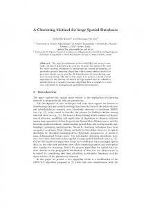
Proceedings XVIII GEOINFO, December 04th to 06nd , 2017, Salvador, BA, Brazil. p 140-151.
Learning spatial inequalities: a clustering approach Juliana Siqueira-Gay1, Mariana Abrantes Giannotti1, Monika Sester2 1
LabGEO – Dept. of Transportation Eng. – Polytechnic school at University of São Paulo 2
Institute of Cartography and Geoinformatics – Leibniz Universität Hannover
[email protected],
[email protected],
[email protected]
Abstract. The rationality of transport as a distributive instrument of people and opportunities is recently discussed in transportation planning field. The measures of spatial inequalities could inform about transport provision and land use, featuring the opportunities to be accessed by specific groups. To meet the challenge of applying complementary methodological approaches to integrate information, this work aims at analysing spatial inequalities by using clustering analysis. Using such approach, it was possible to identify patterns of accessibility and income in São Paulo municipality through the years of 2000 and 2010. In 2010, a new group is formed in the inner-city border. In both years, there are distinguished conditions of accessibility on the city outskirts.
1. Introduction The role played by transportation planning in reinforcing poverty and social disadvantages evidence the need to incorporate analysis of social exclusion, equity and inequalities into the policymakers practice (Lucas, 2012). Recent research point out the importance of specifying objectives and measures regarding multiple dimensions of social equity and the different effects on distinguished individuals, groups, communities and regions (Manaugh et al., 2015). To point out some techniques to assess inequalities, current studies refer to, for instance, the Gini Index to evaluate the cumulative percentage of access of a specific group (Delbosc & Currie, 2011). In addition to this, new developments in the computational literature field present data mining techniques, which focus on knowledge extraction from large and complex datasets. This field encompasses a specific class of techniques, which deal with ideas of knowledge acquisition, namely Machine Learning (ML) techniques. They are useful to explore high dimensional data in order to: (i) identify and describe hidden patterns in the dataset with unsupervised learning and (ii) predict values of continuous and categorical variables with supervised learning. In the transportation area, ML techniques are applied mainly to: (i) explore big data on traffic and transit (Fusco et al., 2016; Mahrsi et al., 2017); (ii) make prediction of travel model choice (Hagenauer & Helbich, 2017; Zhu et al., 2017) and travel time (Gal et al., 2014); (iii) quantify interdependence between land use and transport delivery (Hu et al., 2016). Therefore, most applications deal with high complexity data in order to better understand the object of study and extract knowledge from it. Especially, unsupervised learning aims at identifying and describing groups, given the instances proximity in their features’ space. Dimensionality reduction techniques are useful to identify relevant features before the application of ML algorithms. This 140
Proceedings XVIII GEOINFO, December 04th to 06nd , 2017, Salvador, BA, Brazil. p 140-151.
procedure can reduce computational costs, remove noise and make the dataset easier to use (Harrington, 2016). For clustering techniques, no class should be predicted and the instances should be divided into groups similar features (Joseph et al., 2016). For some algorithms, the desired number of groups should be informed in advance. Regarding the measures and indicators, some concepts are already used in the transportation literature. An important measure is accessibility to opportunities and infrastructure elements. They are developed to inform, above all, the decision makers, about the number and availability of spatially distributed potential opportunities to be reached, given a cost of travel. Also, in the transportation literature, the monthly income of the householders is used to feature deprived groups in order to describe the socioeconomic level of the residents and transportation users (Delbosc & Currie, 2011; Pereira et al., 2017). Based on the motivation of proposing innovative approaches to inform the decision making (Lucas, 2012), this study aims at identifying income and opportunity inequalities through the years 2000 and 2010 in the Sao Paulo municipality, and their change due to enhancing and improving the traffic infrastructure. In this time, new metro lines were built. Dimensionality reduction and clustering techniques were applied to analyze groups in two frames: The entire São Paulo municipality and the surroundings of two new metro lines, which started to operate after 2000. These two analyses allow us to understand the city as a whole and especially regions with transportation improvements. The goal of this work is not to explain the consequences of the new metro structure, but to identify differences before and after the line operation. Thus, the analysis is to infer changes in the socio-economic situation and accessibility at the census tract level. The next section describes the data and techniques applied, as well as the preprocessing steps in order to determine relevant features. Section 3 shows the results and further discussions. Finally, the conclusion is stated.
2. Materials and Methods This investigation, first, built a representative dataset to characterize inequalities of transportation and a deprived group. A two-step approach with dimensionality reduction and clustering analysis, already presented in literature (Ibes, 2015), was applied. Then, the spatial pattern of the entire city and the neighborhood of two new metro lines was analyzed for the two years investigated in this study (Figure 1).
141
Proceedings XVIII GEOINFO, December 04th to 06nd , 2017, Salvador, BA, Brazil. p 140-151.
Methods and procedures
Objective
Research question
How inequalities of opportunities and income could be explored by using unsupervised techniques ? How to represent geographically opportunities and income?
Which are the relevant data?
Determine feature of the database
Remove noise
Indicators calculation
Dimensionality reduction
Accessibility Income
Which algorithm should be used to describe the spatial patterns?
Identify and describe clusters of income and accessibility
Groups composition
Database 2000
Database 2010
Database 2010
How is the spatial pattern of the identified clusters?
Map the groups
2000
2010
Clustering analysis Database 2000
Database 2000
How is the groups composition in 2000 and 2010?
Database 2010
Groups 2000
Database 2010
Groups 2010
K-Means Database 2000
2000
Expectation Maximization
2010
Figure 1 – Main research question, steps and methodology
2.1. Database Accessibility measures Based on configuration of the São Paulo municipality metro network (Logiodice, 2016; Tomasiello, 2016), in the two-time periods, 2000 and 2010, the inference of transit travel time was used to estimate the travel cost for the accessibility indicators. The network was built firstly for 2010 and regressed to 2000 with the increased impedance of the travel time in the new parts of metro lines. The network changes, depicted in Figure 2, comprise the new metro and train stations constructed after 2000, mainly yellow and lilac lines as well as stations of green line. For the accessibility indicators, the same urban equipment (e.g. hospitals and others) was used, therefore, the changes in accessibility levels reflect the changes in the transportation network.
Figure 2 - - Transit lines of metro and train in São Paulo municipality: yellow and lilac lines were built after 2000
142
Proceedings XVIII GEOINFO, December 04th to 06nd , 2017, Salvador, BA, Brazil. p 140-151.
The accessibility metric used was the cumulative opportunities to evaluate the potential number of urban equipment to be reached, given a travel time (Neutens, Schwanen, Witlox, & de Maeyer, 2010; Páez, Scott, & Morency, 2012; Siqueira-Gay, Giannotti, & Tomasiello, 2016). The travel time threshold was calculated based on Department for Transport Business Plan (2012) from UK and represents the median of the all travel with public transportation with specific purpose. The accessibility indicators used are shown in Table 1 and the main steps for calculation are shown in Figure 3. This leads to six accessibility features for each census tract. Table 1 – Accessibility measures Type of accessibility measure
Urban facilities Hospitals Health centers Public schools
Cumulative opportunities
Private schools Sports centers Museums and public libraries
Indicator Number of hospitals to be reached within 60 minutes of travel time by transit Number of health centers to be reached within 60 minutes of travel time by transit Number of public schools to be reached within 45 minutes of travel time by transit Number of private schools to be reached within 45 minutes of travel time by transit Number of sports centers to be reached within 50 minutes of travel time by transit Number of museums and libraries to be reached within 50 minutes of travel time by transit Centroids of the census tracts
Census tracts Service areas generation
Public Transportation Network
Metro Origin Destination Survey 2007
Service areas
Threshold values for 2010: - Leisure = 50 minutes - Education = 45 minutes - Health = 60 minutes
Spatial Join + Dissolve
Urban facilities
Acessibility indicator: Number of potential facilities to be reached within a certain range of time
Threshold values for 2000: - Leisure = 45 minutes - Education = 40 minutes - Health = 60 minutes
Metro Origin Destination Survey 1997
Calculation of the thresholds values for each travel purpose (education, health and leisure)
Figure 3 – Main steps of accessibility measures calculation
Census The census variable selected was the average monthly income of the householder (Figure 4. In order to exclude economic inflation from the analysis, the value was divided by the minimum salaries (in 2000 it was R$ 151,00 and in 2010, R$510,00). Then, categorical values were set to help to better identify the groups of interest (low, intermediate and high income) in the clusters composition. Table 2 show the income indicators used in the dataset. Even after normalizing the income by minimum salaries, the purchasing power of the minimum wage may have changed along years. In this context, we decided to keep 143
Proceedings XVIII GEOINFO, December 04th to 06nd , 2017, Salvador, BA, Brazil. p 140-151.
this approach, rather simplistic, and leave for future works the adoption of a more enhanced normalization for income, which may achieve a complex discussion.
Figure 4 – Spatial patterns and values of income in 2000 and 2010 Table 2 – Variable of 2000 and 2010 Census used in the analysis Census Variables Average monthly Income income of householder
Indicators Families that earn up to 3 minimum salaries Families that earn from 3 to 10 minimum salaries Families that earn more than 10 minimum salaries
1 (Low) 2 (Medium) 3 (High)
The income adds one additional feature to the data instances, leading to a total number of seven features for each data set. In the database of 2000, 13278 instances were analyzed and in 2010, 18953. The difference in the number of census tracts is due to the changes in the urban area and population growth during the years. The missing values of census data were removed from the database - they represent less than 1% of all data in 2000 and 3% in 2010. The software for Machine Learning used was Weka (Witten et al., 2011); ArcMap 10.5 was used for spatial analysis and visualization.
2.2 Analysis The Principal Component Analysis (PCA) is a well-known technique for dimensionality reduction (Joseph et al., 2016). After this, for the clusters composition, two algorithms were tested: K-Means and Expectation Maximization (EM). The objective was to test the response of spatial pattern of each algorithm. K-Means is a popular algorithm due to its intuitive character and low computational cost (Joseph et al., 2016; Zaki & Meira, 2013). It involves two main steps: the cluster assignment and the centroid update. Firstly, the number of clusters “k” are set and each point of the sample is assigned according to its proximity of the mean. The group of points closes to the mean value constitute one cluster. In the next step, the centroids of each cluster are updated. The convergence occurs if the cluster centroid does not change between the iterations. The EM algorithm assumes that each cluster is featured by a multivariate normal distribution. In the first step, the parameters of the probability distribution, median and covariance matrix are estimated. In the sequence, the log likelihood expected value, i.e. the conditional probability, is maximized. The algorithm is also simplified to analyze spatial data (Griffith, 2012). In this study, the classical approach implemented in Weka was used and no information about the spatial relation of the instances was considered. 144
Proceedings XVIII GEOINFO, December 04th to 06nd , 2017, Salvador, BA, Brazil. p 140-151.
3. Results and discussion 3.1 Accessibility indicators The accessibility indicators are visualized and analyzed. The main changes between 2000 and 2010 occur close to metro station areas, especially in the lilac line. As this region has fewer transit alternatives, the travel time changed considerably with the construction of the fast transit system. In the central area, however, this effect is not visible, as it disposes of a greater supply of bus lines. A similar effect refers to the accessibility to some culture facilities the city center, where there is no relevant difference between the years, as there the main part of the facilities is concentrated. Figure 5 depicts the number of respective urban facilities to be reached given a travel time. The dots are the new metro and train stations implemented between 2000 and 2010. The division scale was natural breaks. The quality of the service is not assessed in this analysis, only the existence of facility. The travel time inference changed but the offer of urban facilities is the same on both years of analysis.
Number of public schools Number of public schools to Number of private schools toNumber of private schools to to be reached in 45 minutes be reached in 45 minutes be reached in 45 minutesbe reached in 45 minutes (2000) (2010) (2000) (2010)
Number of health centers to Number of health centers be reached in 60 minutes to be reached in 60 (2000) minutes (2010)
Number of hospitals to be reached in 60 minutes (2000)
145
Number of hospitals to be reached in 60 minutes (2010)
Proceedings XVIII GEOINFO, December 04th to 06nd , 2017, Salvador, BA, Brazil. p 140-151.
Number of sports facilities to be reached in 50 minutes (2000)
Number of sports facilities to be reached in 50 minutes (2010)
Number of culture facilities to be reached in 50 minutes (2000)
Number of culture facilities to be reached in 50 minutes (2010)
Figure 5 – Accessibility measures of 2000 and 2010
3.2 Clustering The PCA transformation was applied to generate a new dataset that represents about 95% of the original variance. The results show four components in 2000 and 2010 instead of seven variables of accessibility and income, as the original dimension. In 2000, the first two main components explain about 87% of the sample variance and are related to income and public schools, respectively (See in Table 3, line “cumulative variance”). In 2010, the first two also explain about 86% but both are mainly related to income1 (Table 3). Table 3 – Results of PCA analysis in the 2000 (left) and 2010 (right) Eigenvectors Cumulative variance Loads of each variable in eigenvector composition
Variables
V1
V2
V3
V4
0.62
0.87
0.94
0.97
-0.40
-0.36
-0.28
-0.09
-0.46
-0.07
-0.18
0.34
PrivSchools
Eigenvectors
Hospitals
Cumulative variance Loads of each variable in eigenvector composition
Variables
V1
V2
V3
V4
0.62
0.86
0.93
0.96
-0.38
-0.38
0.22
0.06
-0.40
0.33
-0.35
-0.23
PrivSchools
-0.38
0.41
-0.34
0.11
SportCenters HealthCenters
Hospitals
-0.38
0.39
0.14
-0.72
SportCenters
-0.41
0.33
0.06
-0.07
HealthCenters
-0.46
0.04
-0.18
0.39
Culture
-0.40
-0.31
0.05
-0.77
Culture
PublicSchools
-0.36 -0.24
-0.45 0.52
0.14 0.82
0.44 -0.01
PublicSchools
-0.36
-0.43
-0.35
-0.09
-0.36 -0.23
0.45 -0.48
0.15 0.85
0.59 0.02
Income
Income
For the clustering analysis using K-Means, the first step is to determine the number of clusters k. For that, the elbow curve (Figure 6) displays the sum of squared error, that represent the distance between the clusters and the “best” number of clusters is the inflexion of the curve. The figure depicts the number of three clusters in 2000 and four in 2010.
1
Table 3 depicts the values of each variable load in the eigen vector composition. The higher the value of variable load, more correlated that indicator is with the respective component.
146
Proceedings XVIII GEOINFO, December 04th to 06nd , 2017, Salvador, BA, Brazil. p 140-151.
Sum of squared error
2500 2000 1500 1000 500 0 2
3
4
5
6
7
8
9
10
11
12
13
14
15
Number of clusters 2000
2010
Figure 6 – Elbow curve to determine the best number of clusters
Based on the number of clusters, both algorithms were tested in Weka. The EM algorithm estimates the parameters to maximize the log probability of the observed data. On the other hand, K-Means calculates the distances between the instances and assigns the observed data into similar groups. The model’s parameters exported from Weka are depict in Table 4. Table 4 – Model’s parameters K-Means Distance Function Number of seeds Initialization method Number of clusters Number of iterations
2000
2010
Eucledian
Eucledian
10
10
Random
Random
3
4
16
11
Within cluster sum of squared errors
604.15
428.95
EM
2000
2010
3
4
Number of clusters Number of iterations Log likehood
55
100
-4.73
-4.48
The maps show (Figure 7) that the K-Means algorithms performs better considering the spatial pattern of income (Figure 4) and general tendency of the accessibility levels (Figure 5). As shown by other related works, it also provide similar patterns to other exploratory analysis of accessibility in São Paulo (Arbex et al., 2016). In Table 5 the percentage of assignments and percentage of population show on both years, differences between the population in each cluster.
147
Proceedings XVIII GEOINFO, December 04th to 06nd , 2017, Salvador, BA, Brazil. p 140-151.
Figure 7 – Spatial patterns of the 2000 and 2010 groups formed by using EM and K-Means algorithms Table 5 – The percentage of instances and population assigned in each cluster 2000 EM
K-Means
Cluster Percentage of instances Percentage of population Percentage of instances Percentage of population 1
52%
46%
23%
22%
2
30%
35%
22%
17%
3
18%
19%
55%
61%
2010 EM
K-Means
Cluster Percentage of instances Percentage of population Percentage of instances Percentage of population 1
16%
18%
19%
17%
2
50%
47%
45%
48%
3
25%
27%
18%
15%
4
9%
8%
18%
20%
148
Proceedings XVIII GEOINFO, December 04th to 06nd , 2017, Salvador, BA, Brazil. p 140-151.
The groups composition generated by K-Means can be seen in Figure 8. Clustering only determines groups, but it does not provide a classification. Therefore, the clusters have to be interpreted. In 2000, the group with high income (2) (See Figure 4) is in the inner city and present high level of all types of accessibility. In 2010, the group with high income (3) located in the city center present high accessibility level to all facilities but not to sport centers. It is important to highlight the good offer of hospitals to this group face the others, especially those with low income in both years. Also, the heterogeneity in the peripherical region of the city is stressed. In both years, the east zone present distinguished group from the south and north of the city. In 2000, the cluster in this region (1) presents the lowest income level but good offer of public schools, sports facilities and health centers. In 2010, this pattern remains in the group 4. In 2000, the group that encompasses the urban fringe of the city (3) presents the lowest level of accessibility to all facilities. Since the spatial extension of this group is big, it aggregates distinct income groups as in the deep south are the extremely poor and in the city center border, there are some residents with intermediate income. Therefore, the average value of income in this group is not the lowest one. in 2010, there is a new group in the border of the inner city (1). It represents an intermediate income cluster with good level of accessibility to all facilities.
K-Means 2000
K- Means 2010
0.8 0.80 0.6 0.60 0.4 0.40 0.2
0.20
0 1 SportCenters Culture HealthCenters
2
3
0.00 1 2 SportCenters Culture
Hospitals PrivateSchools PublicSchools
3 Hospitals PrivateSchools
4
Figure 8 – The mean value of the indicators in each cluster 2
The new yellow line is located in the city center connecting “Luz” central station to “Butantã” in the west zone of São Paulo municipality (Figure 7). In the surroundings of the stations, there is a cluster with high income and high accessibility in both years. Given that in this central area there is a considerable offer of public transportation, the new measures do not capture the increment of accessibility. Therefore, looking in the surroundings, on both years, the group is the same: high income and high accessibility. On the other hand, the lilac line, in the south, connects “Capão Redondo” to “Largo Treze” stations. In 2000, the region is marked by the low-income group, however, in 2010, the region presents three distinguished groups (1, 2, 4). The metro stations in this region represents a relevant transportation improvement since there is no other fast transit alternative in this area. 2
The income is the average of minimum salaries normalized and accessibility is the average of the value assigned for each group
149
Proceedings XVIII GEOINFO, December 04th to 06nd , 2017, Salvador, BA, Brazil. p 140-151.
The methodological steps and analysis could be adapted to other cities and context, for instance, in the case of new transportation infrastructure built for World Cup and Olympic games as in the study of Pereira et al. (2017). For this, the requirement is the availability of transportation data with travel times and opportunities, which could be acquired with the government survey as Origin-Destination, GTFS and GPS-based big data. The socioeconomic data is easier to get in the Brazilian context due to the existence of Census in every 10 years.
4. Conclusion and future work The clustering analysis showed interesting results in learning about inequalities of opportunities and income in São Paulo municipality. The proximity of instances reveals relevant groups in 2000 and 2010, mainly: (i) new group in the inner-city border in 2010; (ii) heterogeneous conditions in the city outskirts in both years and; (iii) the surroundings of the new metro line located in the south region has more heterogeneous groups than the central one. Further developments could be made exploring other features of deprived groups, improving the accessibility measures with competition and quality of services and exploring other techniques to analyze the impact of transportation infrastructure on the citizens’ life.
5. Acknowledgements The first author acknowledges the Coordination for the Improvement of Higher Education Personnel (CAPES) for graduate scholarships financial support and the second author acknowledge to São Paulo Research Foundation FAPESP (Process 15/50127-2).
6. References Arbex, R., Pacifi, M., Rios, L., Carneiro, C., Giannotti, M. A., Politécnica, E., & Paulo, D. S. (2016). Análise espacial da acessibilidade no município de São Paulo através do Self Organizing Maps. Revista Brasileira de Cartografia, 68(4), 779–795. Delbosc, A., & Currie, G. (2011). Using Lorenz curves to assess public transport equity. Journal of Transport Geography, 19(6), 1252–1259. http://doi.org/10.1016/j.jtrangeo.2011.02.008 Department for Transport Business Plan. (2012). Accessibility Statistics Guidance. London. Fusco, G., Colombaroni, C., & Isaenko, N. (2016). Short-term speed predictions exploiting big data on large urban road networks. Transportation Research Part C: Emerging Technologies, 73, 183–201. Gal, A., Mandelbaum, A., Schnitzler, F., Senderovich, A., & Weidlich, M. (2014). Traveling time prediction in scheduled transportation with journey segments. Information Systems, 64, 266–280. Griffith, D. A. (2012). Some expectation-maximization (EM) algorithm simplifications for spatial data. In Proceedings of the 10th International Symposium on Spatial Accuracy Assessment in Natural Resources and Environmental Sciences. pp. 388– 393. Florianópolis. Hagenauer, J., & Helbich, M. (2017). A comparative study of machine learning classifiers for modeling travel mode choice. Expert Systems with Applications, 78, 273–282. 150
Proceedings XVIII GEOINFO, December 04th to 06nd , 2017, Salvador, BA, Brazil. p 140-151.
Harrington, P. (2016). Machine Learning in Action. Manning: New York. Hu, N., Legara, E. F., Lee, K. K., Hung, G. G., & Monterola, C. (2016). Impacts of land use and amenities on public transport use, urban planning and design. Land Use Policy, 57, 356–367. Ibes, D. C. (2015). A multi-dimensional classification and equity analysis of an urban park system: A novel methodology and case study application. Landscape and Urban Planning, 137, 122–137. Joseph, J., Torney, C., Kings, M., Thornton, A., & Madden, J. (2016). Applications of machine learning in animal behaviour studies. Animal Behaviour, 124(December), 203–220. Logiodice, P. C. R. (2016). Avaliação de impacto do aumento da acessibilidade a partir de simulações da malha metroviária. Trabalho de Formatura. Escola Politécnica da Universidade de São Paulo. Lucas, K. (2012). Transport and social exclusion: Where are we now? Transport Policy, 20, 105–113. Mahrsi, M. K. El, Côme, E., Oukhellou, L., & Verleysen, M. (2017). Clustering Smart Card Data for Urban Mobility Analysis, 18(3), 712–728. Manaugh, K., Badami, M. G., & El-Geneidy, A. M. (2015). Integrating social equity into urban transportation planning: A critical evaluation of equity objectives and measures in transportation plans in north america. Transport Policy, 37, 167–176. http://doi.org/10.1016/j.tranpol.2014.09.013 Neutens, T., Schwanen, T., Witlox, F., & de Maeyer, P. (2010). Equity of urban service delivery: A comparison of different accessibility measures. Environment and Planning A, 42(7), 1613–1635. Pereira, R. H. M., Banister, D., Schwanen, T., & Wessel, N. (2017, September 29). Distributional effects of transport policies on inequalities in access to opportunities in Rio de Janeiro. Retrieved from osf.io/preprints/socarxiv/cghx2 Páez, A., Scott, D. M., & Morency, C. (2012). Measuring accessibility: Positive and normative implementations of various accessibility indicators. Journal of Transport Geography, 25, 141–153. Siqueira-Gay, J., Giannotti, M. A., & Tomasiello, D. B. (2016). Accessibility and flood risk spatial indicators as measures of vulnerability. In Proceedings of the XVII Brazilian Symposium of Geoinformatics. Campos do Jordão. Tomasiello, D. B. (2016). Modelos de rede de transporte público e individual para estudos de acessibilidade em São Paulo. Dissertação de Mestrado. Universidade de São Paulo. Witten, I. H., Frank, E., & Hall, M. a. (2011). Data Mining: practical machine learning tools and techniques Third Edition. Elsevier: Burlington. Zaki, M. J., & Meira, M. J. (2013). Data Mining and Analysis: Fundamental Concepts and Algorithms. Cambridge University Press: New York. Zhu, Z., Chen, X., Xiong, C., & Zhang, L. (2017). A mixed Bayesian network for twodimensional decision modeling of departure time and mode choice. Transportation. 151