In Situ Exploration of Large Dynamic Networks ¨ Schulz, and Heidrun Schumann Steffen Hadlak, Hans-Jorg Abstract—The analysis of large dynamic networks poses a challenge in many fields, ranging from large bot-nets to social networks. As dynamic networks exhibit different characteristics, e.g., being of sparse or dense structure, or having a continuous or discrete time line, a variety of visualization techniques have been specifically designed to handle these different aspects of network structure and time. This wide range of existing techniques is well justified, as rarely a single visualization is suitable to cover the entire visual analysis. Instead, visual representations are often switched in the course of the exploration of dynamic graphs as the focus of analysis shifts between the temporal and the structural aspects of the data. To support such a switching in a seamless and intuitive manner, we introduce the concept of in situ visualization – a novel strategy that tightly integrates existing visualization techniques for dynamic networks. It does so by allowing the user to interactively select in a base visualization a region for which a different visualization technique is then applied and embedded in the selection made. This permits to change the way a locally selected group of data items, such as nodes or time points, are shown – right in the place where they are positioned, thus supporting the user’s overall mental map. Using this approach, a user can switch seamlessly between different visual representations to adapt a region of a base visualization to the specifics of the data within it or to the current analysis focus. This paper presents and discusses the in situ visualization strategy and its implications for dynamic graph visualization. Furthermore, it illustrates its usefulness by employing it for the visual exploration of dynamic networks from two different fields: model versioning and wireless mesh networks. Index Terms—Dynamic graph data, multiform visualization, multi-focus+context.
1
I NTRODUCTION
The need to explore large dynamic networks arises in many fields from traffic analysis in computer networking to studies of changing interpersonal ties in social networks. As dynamic networks, we consider networks in the graph-theoretical sense with a node set V and an edge set E, as well as sets of node attributes VA and edge weights EW being subject to change over time. Until today, a whole range of visualization techniques for dynamic networks has been developed, each of them suited for a certain set of analysis tasks (e.g., overview vs. detail) and data with certain characteristics (e.g., trees vs. networks, or linear time vs. branching time). As a visual analysis session is a sequence of different tasks, a user usually cannot decide for a single visualization once and for all, but has to switch between different visualizations to be able to always use the one that is best suited at a given stage of analysis. The same holds true if the user selects different subsets of the data for further analysis, as these may have different characteristics demanding for a dedicated visualization. For example, when concentrating at one point during the analysis on a spanning tree of a given network, this calls for a switch to a tree visualization to exhibit the tree characteristics of that subgraph. Furthermore, we consider dynamic networks to be large, if their number of data items is in the order of magnitude of 100,000’s or more, where #items = (|V | ∗ |VA | + |E| ∗ |EW |) ∗ #time steps. If the dynamic networks get that large, they can no longer simply be mapped to the representation space, as they would clutter the display. Instead, the number of data items must be reduced in beforehand – either by reducing the size of the network (the first part of the equation above), by reducing the number of time steps (the second part of the equation), or by reducing both aspects of the data. The level of reduction of each aspect can be chosen so as to reflect the focus of the visual analysis: if the focus of analysis lies on the network aspect, one may not want to reduce the network structure, e.g., by clustering, but instead rather cut down on the number of time steps. Likewise, if the analysis is centered
• Steffen Hadlak and Heidrun Schumann are with the University of Rostock, E-mail: {hadlak,schumann}@informatik.uni-rostock.de. • Hans-J¨org Schulz is with the Graz University of Technology, E-mail:
[email protected]. Manuscript received 31 March 2011; accepted 1 August 2011; posted online 23 October 2011; mailed on 14 October 2011. For information on obtaining reprints of this article, please send email to:
[email protected].
around the temporal aspect, this should be left as detailed as possible, while aggregating the network instead. In fact, as shown in Section 2, most visualization techniques for large dynamic graphs realize one of these options or even both to find a balance between them. Yet, this adds another layer of complexity to the issue of selecting a suitable visualization technique, as again the analysis focus may change over the course of the analysis, thus making a switch between different techniques with different foci necessary. Despite the apparent need for it, a method to perform such a switch between different visualizations in a smooth and seamless manner is largely unknown. Most publications focus on individual graph layout and visualization techniques, but very few concern strategies to interactively shift between them and combine them. Hence, we propose a mechanism to solve the integration of various visualization techniques for dynamic graphs, making them available through one common principle, which we term in situ visualization and which is described in Section 3. Our approach draws upon well-established concepts, such as focus+context [23], semantic lenses [6], and portals [37], and thus does not confront the visualization users with an entirely new paradigm. It enables the user to shift the analysis focus for individual regions of a visualization to a different one by switching between visual representations while maintaining the context and thus supporting the user’s mental map. This is an important aspect especially for structured data such as networks, as the continuity of the spatialization used by the underlying base visualization should be preserved – be it either the structural continuity of the network or the temporal continuity of a time axis. Our approach achieves this by linking embedded in situ visualizations and contextual base visualization. Solutions to achieve an embedding even if the selection is small, nonrectangular, or discontinuous are discussed in Section 4 along with methods to support the choice of adequate visualization techniques to embed. The usefulness of the in situ visualization concept for dynamic networks is illustrated by two exemplary use cases in Section 5. Here, we apply our approach to dynamic networks from two different application fields: model versioning and mesh networks. The expert feedback given in both cases confirms that the adaptability of the in situ approach makes it a good fit for these highly interactive analysis scenarios, which require to tailor the view to the given data in a number of subsequent exploration steps. We finally conclude this paper by discussing further implications of the in situ visualization strategy and by pointing out future research directions in Section 6.
Table 1. A categorization of visualization approaches for large dynamic graphs.
time reduced abstraction
selection
unreduced
unreduced
Online Dynamic Graph Drawing [22]
Software Cities [45]
Dynamic Network Visualization in 1.5D [43]
TimeRadarTrees [12]
Spiral Treemap [48]
BiGraphiXplorer [30]
Community Detector [19]
Coarsened Difference Graph [2]
selection abstraction
reduced
structure
only suitable for large displays [17]
2
P ROBLEM D ESCRIPTION
AND
R ELATED W ORK
The problem of visualizing large dynamic networks consists of two major aspects that must be considered: the graph structure describing the relations between the elements of the network and their attributes, as well as the temporal domain describing the dynamics of the network. Each aspect by itself poses a challenge for the visualization, be it a high number of nodes and edges, or a multitude of time steps. Combining both, as it is necessary when visualizing dynamic networks, aggravates the situation even further, because the limited screen space does not permit to show both aspects in their full detail. Current visualization techniques try to find a compromise for what to show at what level of detail between the huge graph structure on the one hand and the large number of time points on the other hand. This problem is captured best by the concept of the visual entity budget as introduced in [18]. It represents an upper limit for the number of visual entities to be displayed, which can result from limited screen space, limited processing capabilities, or the limits of the human understanding. In order to stay below a given visual entity budget, there are two principal ways to handle large data: either reduce the amount of data by selecting a smaller subset which is of interest, or by abstracting the data so that multiple data items get mapped onto a single visual entity [32]. A selection maintains individual details at the cost of losing the overview of the whole, whereas an abstraction
preserves the overall characteristics at the expense of the details. In terms of the compromise between structure and time this means the more detail of one of these aspects is shown the fewer details can be shown for the other aspect. If a visualization focuses rather on the time aspect, more visual entities are allocated for time and less for the structure, and vice versa. In order to achieve this, selection and abstraction can be applied independently for both aspects of the data. As this is such a fundamental property of visualizations for large dynamic networks and an important decision to make when deciding for one of them, we use it as a natural classification system for these techniques, as shown in Table 1. This classification allows us to give a compact overview of the available techniques, as most visualizations for large dynamic graphs fall into one of the table cells. The shown technique in each cell serves as a representative example of a cell’s specific combination of reducing structure and time. The individual rows and columns of the table are shortly described in the following. Unreduced Structure/Unreduced Time: The first row and the first column keep the structure and the time unreduced respectively, so that these visualization techniques contain a lot of details. Especially the combination of both leads to huge layouts for large dynamic graphs. They are thus only suitable for very large displays, such as display walls [17] or poster printouts [28], which have the necessary space and resolution to show them. Otherwise, if only one aspect is left unreduced, visualizations can be made to fit a regular display by using
a drastic reduction of the respective other aspect – e.g., by selecting merely a single time point for which to show the full network or a single node for which to show its complete development over time. Selected Structure: Selecting only a small part of the network structure leaves more space for representing the dynamics of this smaller part. Depending on how small a selection is made, its development can either be shown over the entire time line or only for a reduced set of time steps. The selection can range from just a single node as in [43] which is thus able to display many time steps, to large selections which also require a reduction of the time aspect, for example by abstracting it [24]. Another often encountered variant is the selection of only a certain kind of nodes, i.e., only leaf nodes of a tree for which to show the temporal development [48]. Abstracted Structure: Visualization techniques that abstract the graph structure of the network and use these abstractions for visualization, can likewise abstract away either more or less structural details, thus giving more or less space to the temporal aspect. An approach for a rather heavy abstraction of the graph structure is to capture it with different graph metrics [7, 38], each expressing some structural property of the graph and plotting them over the course of the entire time line, e.g., in graph complexity plots [30]. Techniques that abstract away less of the structure are for example graph clustering techniques [10]. They show only clusters of nodes and their interrelations – either by a layering [19] showing a few time steps at once or by animating its evolution [21] showing only a single time step at a time. Clustering and metrics can also be combined by clustering the graph at first and then computing cluster metrics such as the average number of nodes per cluster, which are then shown in time-value plots [19]. Selected Time: When cutting down on the number of time points, many techniques select only a certain time interval or even just a single time point for which to show the network. Visualizations of single time points usually make use of animation, which is interactively steered by a slider on the time axis, with which a user can pick a time point of interest [20]. Multiple time points from a time intervals can be represented by multiple small drawings [41] or layers in which changes between subsequent time steps are highlighted [9]. A wide range of different layering approaches exist for 2D [46], 3D [8, 26], and even concentric arrangements [12]. Independent of the representation, all techniques try to maintain the user’s mental map of the graph structure as good as possible for which different concepts exist [14, 15, 22, 39]. Abstracted Time: When time gets abstracted, it can be done via temporal clustering to group sequential time steps that are similar with respect to some kind of measure, or simply by generating a single large supergraph over all time steps. Clustering as well as computing the supergraph means to join networks of all time steps to be grouped into a single graph structure which contains all nodes and edges that ever existed in the graph. This reduces the time aspect to an attribute value for each node and edge which can be incorporated into the visualization – e.g., the time point a node was created or last modified. One way to incorporate it is by using the third dimension, e.g., by mapping a node’s creation time onto its height [45]. Combination: As it was already mentioned, reduction of both aspects can be combined to meet the constraints of the visual entity budget. Some techniques actually interweave reduction of both aspects so that one depends on the other – e.g., by first constructing the supergraph over all time steps (abstraction of time) and then clustering connected subgraphs which are simultaneously present (abstraction of structure) as done in [2]. Also, combinations of selection and abstraction of the same aspect can be observed in some cases. For instance, the Gephi graph visualization platform [5] allows the user to first select a time interval (selection of time points) for which then a supergraph is computed (abstraction of time). Another example are focus+context techniques for graphs which combine the selection of a focus region with the abstraction of the context region [32]. The list of given examples is far from exhaustive, but even this selection of visualization techniques gives already a good impression of their diversity. Furthermore, the classification itself can be used for a preliminary decision which visualization techniques to use for a given task. As an abstraction maintains the overview of the data
at the expense of the detail, techniques utilizing it are mostly suitable for overview tasks. Whereas a selection preserves details while trading in the overview, which makes techniques using a selection approach more suitable for detail-on-demand tasks. So, if for example an overview of the structural aspect is needed while details of the temporal development shall be explored, a technique from the category (AS) should be considered. The visualization strategy presented in the following section draws upon this classification and utilizes it as a practical concept to integrate different techniques. 3
I N S ITU WORKS
- A
NEW
A PPROACH
FOR
L ARGE DYNAMIC N ET-
The overview given in Section 2 concerns individual visualization techniques that all have their individual strengths at showing the graph structure, the time aspect or a certain compromise between both. In the light of visual analysis for which not a single best-suited visualization exists, it is only natural to attempt to patch different visualizations together that correspond to the local characteristics of the data. This has already been done for both of the two aspects time and structure independently. For the structural aspect, several visualizations are combining different representational paradigms such as explicit node-link representations, implicit space-filling techniques, and matrix views to better display subgraphs of certain topologies [27, 40]. But also within one representational paradigm, a local adaptation to different subgraph structures is possible, as for example different node-link layout types can be used in concert to better reflect the different topologies of subgraphs [3] or by providing interaction techniques for adjusting the layout [35]. Similar ideas were followed in the visualization of temporal data, where for instance high detailed line plots and bar charts are often used in an enlarged region of interest and less detailed color coding for the context [4, 11, 36]. All these approaches share the same idea, as they adapt the visualization locally, in situ, bringing to bear the different facets of the data. The in situ visualization concept presented here is a generalization of these approaches which is able to locally combine visualizations in the structural and in the temporal domain likewise. The Visual Analytics Mantra proposes a well established guideline for iterative visual analysis of large data sets: “Analyse First, Show the Important, Zoom, Filter and Analyse Further, Details on Demand” [31]. While the mantra describes this iterative analysis as a series of computations (“Analyse First”), visualizations (“Show the Important”), and interactions (“Zoom and Filter”), it does not relieve the user of deciding which concrete technique to use at each step. Nevertheless, this choice of different techniques is not to be understood as a burden, but instead as a powerful opportunity for the user to focus the analysis on specific aspects of the data. Especially when facing an unknown data set for which it is not known in beforehand which aspect may be important and should thus be focused in the visualization, being able to switch and locally adapt different techniques is extremely helpful for a swift analysis. In this case, an in situ adaptation is a powerful tool, as it allows the user to locally reconfigure or switch the representation. In the following, the in situ visualization strategy is presented as a means to pursue the Visual Analytics Mantra by a stepwise local refinement of an initial suitable overview or base visualization. At each refinement step, it allows the user to select different subsets of data, then choose an appropriate and desired visual representation for each selection, and finally to embed these representations right in the place where the selection was performed. The selection as well as the visual representation can be altered at any time allowing the analysis of different subsets by different representations. 3.1
Selection of Data Subsets
In the in situ approach, the selected area within a base visualization serves at the same time as the selection mechanism and as the drawing area in which to embed the visualization later on. Therefore, a detached selection mechanism using sliders or input fields for threshold values would not work in our case and thus an immediate selection mechanism that works within the base visualization should be used.
visualization techniques. For example, for a selection of only a dozen nodes, no aggregation and no further selection would be necessary, as the analysis has apparently already reached a fairly detailed level on the structural aspect, allowing for techniques from classes (UA) or (US) – depending on how the temporal aspect shall be treated. Overall, three phases can be differentiated and each phase corresponds to a specific set of suitable visualizations. Analyse First, Show the Important: In this first phase, there is too much data, which would not fit in the visual entity budget without being abstracted by mapping multiple data items to a single visual entity. This is usually done by running analysis methods to determine sensible abstractions, such as temporal or structural clustering. Hence, appropriate classes of visualizations for this phase are (AU), (UA), or (AA) which reflect the abstraction in their visual encoding. As techniques of these classes provide a first overview of the data, we term them overview techniques.
Fig. 1. Example showing our in situ strategy. 1: base visualization showing a node-link layout of the supergraph and multiple embedded visualizations. 2: in situ visualization showing a complexity plot for the underlying subgraph. 3: in situ visualization showing a 1.5D visualization of the underlying subgraph, connecting links are overlaid in red by the base visualization. 4: recursive use of in situ visualization to show a complexity plot for a subgraph selected in a matrix view.
This is usually a rectangular selection tool that can be applied right on top of the visualization for both aspects – structure and time. Hence, targets of selections can be either nodes, edges, and subgraphs in the structural domain, or time points and intervals in the temporal domain. Since the different visualization techniques all show the data from different perspectives, they allow and forbid different types of selection. For example, aggregated representations do not allow the selection of individual nodes or time steps, or even both as it is the case for class (AA) in Table 1. Yet, they allow the user to select parts of the graph structure and the temporal domain depending on their characteristics such as a peak in the number of nodes or edges for which the corresponding time point(s) shall be selected. More complex selection criteria which are hard to perform interactively via mouse clicks can furthermore be (pre)computed in the “Analyse (first)” step, so that elaborate statistical measures are readily available as node/edge attributes for interactive selection. This rather abstract view on selection for in situ visualization refinement allows us to perceive the visual analysis process as described by the mantra as a sequence of such selections: starting from an overview, subsets of interest are subsequently chosen until a desired piece of information is found. This provides a general interface between the different selection steps, which allows the user to recursively redefine a previous selection and all other selections that have been defined in its context will adapt accordingly. Another interesting observation is that the nestedness of in situ visualizations provides a good sense of their provenance, as the different steps of their creation are clearly visible. One challenge, though, is to select suitable and compatible visualization techniques to be displayed inside the selected area in order to investigate its characteristics and to select further. This issue is discussed next. 3.2 Choice of Visualization Techniques As much power as the free choice of visualization techniques provides to the visual analyst, choosing a suitable one from the many techniques available remains challenging. It must not only suit the data to be shown and the selection to be carried out next, but also the stage the analysis is currently in. For example, an in situ display of an overview-on-demand inside of a detail view, as it is realized in [29], would be somewhat counterintuitive in the context of the Visual Analytics Mantra, which rather proceeds from overview to detail. Hence, it makes sense to use the mantra to cut down on the number of applicable
Zoom, Filter and Analyse Further: After a first abstracted visualization of the data is given, subsets of interest can be selected for a more thorough examination. However, a single selection may not be enough to reduce the data to fit in the visual entity budget, so that additional abstractions may have to be calculated for this subset before visualizing it. Classes that can be used for this phase are (AS) and (SA) from the Table 1. As these visualizations are still abstract but can display more details because of the selection, we call them intermediate techniques. Details on Demand: Through multiple iterations of the previous phase a sufficiently small subset can be selected so that very detailed visualizations can be used. This allows the application of the most detailed visualization techniques contained in the classes (SU) and (US), depending on which aspect has been drilled-down to the detail level. If both aspects have been drilled down, techniques from the class (SS) can be chosen. Accordingly, we name them detail techniques. As there exist a large number of possible visualization techniques, which would be bothersome to pick from a long list, a categorization of these techniques according to their uses is proposed: 1. Exploration Phase: Overview, Intermediate, Detail 2. Focused Aspect: Structure, Time This scheme allows for a very space-efficient display of the visualization techniques that can possibly be applied after an in situ selection was made. After a visualization is chosen, it has to be embedded in the area of the selection, which is detailed next. 3.3 Embedding of the Visualization Placing a visualization inside another visualization is not uncommon, even though a local adaption of a view is often not perceived as an embedding while it could very well be used in such a way. Common approaches are: Multiple Coordinated Views: e.g., by placing different visualizations inside a matrix visualization [34] Focus+Context: e.g., by using semantic lenses [6] or portals [37] Overview+Detail: e.g., via transient overlays, as described in [29] One of the most important requirements for an embedding within a graph visualization is to preserve the context [42]. This cannot be guaranteed by multiple coordinated views, which generally arrange visualizations side by side, or by overview+detail approaches which just superimpose one visualization with another, leaving only the focus+context techniques. A second requirement would be the ability of the approach to cope with the recursive nature of its application, as it is needed for repeated refinements via selection. While lenses can be stacked on top of one another, this is far from trivial, as conflicts between the different lenses may arise [47]. Whereas for portals, multiple levels of nesting have been shown to work without such problems [51]. Hence, we have decided for a portal-based embedding with
some extensions that go beyond the original portal concept, such as the ability to connect nodes inside and outside of the portal to preserve the overall graph structure. Portal-Based Approach: As described in [37], portals are defined as two-dimensional regions of a view showing another view. In our case, the extent of the selection made in a view corresponds directly to the region of the portal. That means that the data shown inside the portal is exactly the data positioned in the region of the base view now being occupied by the portal. Hence the position, size, and shape of the portal define the data inside it. This allows the user to change the data shown inside a portal simply by dragging, resizing, or reshaping the portal to include or exclude certain regions of the base visualization. Additionally, it is also possible to open up multiple portals by making multiple selections allowing the user to analyze different regions simultaneously using different visualization techniques, as it can be seen in Figure 1. Making subsequent and multiple selections, and choosing different views for them provides exactly the needed functionality to carry out the iterative analysis process of going from an overview to the detail on demand, while at the same time maintaining the context of each analysis step. Extending Portals to In Situ Visualizations: Portals have the limitation that they are defined to be completely independent from their base visualization. This may suffice for unrelated data items within a data set, but it does not go far enough for graph visualization, where complex relationships must be maintained even across multiple levels of nesting. Therefore, we have relaxed the strict compartmentalization of the portals in order to allow for a mutual adaptation. These relaxations are portal awareness (the base visualization knowing about the portal and its contents), context awareness (the portal knowing about the base visualization and its contents), and overlays (the base visualization being allowed to draw on top of the portal). Portal Awareness: As portals may interfere with the existing edge routing in the base view, it is of importance for the base view to have information about the portal firstly as a whole to be able to reroute edges around the portal, if they do not lead to nodes within it. Secondly, the base view should also be aware about the layout of the data inside of the portal, as it is certainly different from the original positioning in the base view and thus requires an adaptation of the connections leading to them. Otherwise, after opening up a portal, it would no longer be possible to determine to which nodes inside of a portal the edges lead. This modification is illustrated by red links in Figure 1 connecting the nodes of the base visualization with the relayouted nodes in Selection 3 and the correct row of the matrix. Context Awareness: Similarly, it makes sense for the portal to have knowledge about the surrounding base visualization. This allows the visualization within the portal for instance to take the positions of connected “outside nodes” into account when computing a layout. This makes sense when, for example, nodes that are connected to the base view are automatically laid out at the border of the portal, facing the right direction, so that connecting it to the base view will not require to route edges all the way around the portal or across it. The visualization of Selection 3 of Figure 1 for instance placed all nodes with connections to the base visualization on the right side to minimize their edge lengths. Another example is to align the orientation of a time plot with the orientation of the time axis in the base view, making it easier to follow the time axis.
animated node-link layout which shows changes over time, these elements would always be kept together inside the in situ visualization and be treated as a meta node by the layout of the base visualization. This would allow the user to manually cluster graphs and observe their changes as well as the changes between these clusters over time. 4
P RACTICAL C ONSIDERATIONS
FOR THE I N
S ITU S TRATEGY
The in situ strategy as described in Section 3 is a generic approach to combine different visualization techniques. Yet, to apply this approach in practice, a number of functional issues have to be solved – from the handling of arbitrary selections and the different possibilities to deal with higher space demands for an embedded visualization than is actually available, to the user support for choosing appropriate visualization techniques. 4.1
Selection of Data Subsets
Generally, there are multiple ways of making selections of data. Even as our in situ strategy works best with immediate selection mechanisms which directly draw selections into the visualization there are a multitude of possible realizations. These are ranging from simply defining arbitrary selection regions via drawing with the mouse to the possibility to patch selection regions together by adding and subtracting multiple smaller areas. As a result these selected areas can differ in a number of aspects such as shape and connectivity. Yet, they all visually describe subsets of the data that have to be extracted before a visualization showing this subset can be embedded. For instance, in a node-link layout all nodes and edges that are completely contained in the selected area will be extracted. However, this may lead to ambiguities in some cases: in a treemap which shows the child-parent-relation through nesting the nodes it is not clear if to extract all nodes within the selected area or only the leaves as only these are actually visible and thus explicitly selected. To resolve this problem, approaches for refining the selection are necessary. In Situ Approach: First, this problem can be solved by directly using our in situ strategy. Therefore, this decision is delayed by extracting all items at first, visualizing them, and allow the user to refine the selection within this visualization. For instance a tree visualization mapping the depth of the nodes directly to the layout enables the user to easily select distinct levels of that tree for further, recursive embeddings. Thus our strategy in itself already brings with it the means to hierarchically refine the selection without the need for additional mechanisms. However, this approach increases the nesting depth of embedded visualizations resulting in a faster decrease of the available screen space for these visualizations.
Overlay: To achieve the tight interlinking and connection between parent and portal, it is finally necessary, to extend the portal concept in another aspect: originally, portals manage their drawing area themselves with no interference from the parent. Yet, to provide continuous links between both, we allow the parent to overlay the portal with additional graphics, such as edges. This is exemplified by the red links visible in Figure 1.
Filtering Approach: Another solution is to interactively define selection mechanisms that select from all items contained in the selected region only those of interest. This definition can be facilitated by detached mechanisms such as sliders or input fields allowing the user to specify more concretely what to include in the selection and what not to include. Another way to specify more concretely what to select is to temporarily embed an in situ visualization which is specifically chosen to be able to refine the selection, before releasing it again and continuing the visual analysis with the selection made. This procedure allows us to save screen space but it leads to in situ visualizations which do not necessarily show all underlying data items anymore, as they have been refined. As this violates the original mechanism of the in situ visualization, it has to be signalized to the user that a filtered and not the complete subset is shown in the embedded visualization. We include for instance a small icon on top of the embedded visualization which also serves as a button for temporary showing the filter definition allowing the user to redefine the selection.
Apart from a local adaptation of the visualization, these in situ visualizations can be used in a number of possible ways. One would be, for example, to manually group elements through them. In an
Which solution to use is left to the choice of the user. The made selection is the basis for calculating an appropriate drawing area for embedding the visualization of the selected subset.
(a) Inscription
(b) Layout Adaptation
(c) Selection Adaptation
(d) Eccentric Positioning
Fig. 2. Different adjustment strategies for embedding rectangular visualizations in arbitrary shaped selections of a node-link visualization: (a) inscribing the largest rectangle of a desired aspect ratio, (b) adjusting the layout by relocating all unselected nodes to positions outside of a circumscribed rectangle, (c) adjusting the selection to encompass also any empty space that can be gathered around it, and (d) eccentric placement in a more suitable spot with additional connections to the original selection to maintain the relation.
4.2
Embedding In Situ Visualizations
The greatest concern for a visualization of large data sets is the available screen space. Thus, our in situ strategy tries to use the space as efficiently as possible by not arranging visualizations of subsets sideby-side in multiple linked views, but by embedding them so that each data item is shown only once on the screen and does not increase the overall space demand. Therefore, our in situ strategy utilizes the selected area within a base visualization as the drawing area in which to embed the visualization. Yet, while data selections can be of arbitrary shape, visualizations tend to be optimized for a rectangular drawing area. Besides the shape there are also a number of aspects complicating this embedding, including aspect ratio, size and connectivity. In the case of multiple selections having been defined in the base view where each shall be analyzed for itself these aspects can be accompanied by overlapping selection areas. This raises the challenge of finding suitable drawing areas for an embedding of visualizations despite the possible differences between selection area and visualization. For the sake of brevity, the following discussion assumes non-overlapping, contiguous selections of arbitrary shape in a node-link visualization and rectangular visualizations to be embedded. Solutions for cases in which these assumptions do not hold, will be sketched at the end of this section. The general approach to solve this problem is an adjustment of the selected region. The smaller this adjustment is, the closer the embedding will be to the actual selection made. For example, inscribing the largest rectangle into the selection as a drawing area for an embedding allows a full realization of the in situ property. Yet, the more aspects have to be taken into account, the less likely it becomes that a suitable drawing area can be found in situ. The three adjustment strategies described in the following are discussed along this line: from inscription, and adaptations of layout or selection, to eccentric positioning as a last resort – and thus ranging from in situ to ex situ. Inscribing in the Selection: The most obvious strategy is certainly to inscribe the largest axis-parallel rectangle into the selection, as it is shown in Figure 2(a). For its computation, algorithmic geometry provides algorithms, such as the O(n log2 n) divide&conqueralgorithm from [13]. These algorithms are fast enough to quickly determine whether a large enough inscribed rectangle exists or not. Usually, even simpler heuristics can be used, as it is not of outmost importance to find the largest inscribed rectangle, but a rectangle that is large enough. In case no such rectangle can be determined, the adaptation has to move on to one of the next strategies. Adaptation of the Layout and/or the Selection: This strategy tries to establish a rectangular drawing area which is larger than the inscribed rectangle. The first way of achieving this is by defining such a larger rectangular region on top of the selection and then modifying the layout of the base visualization by “pushing” all unselected nodes out of the boundaries of the rectangle and by “pulling” all selected
nodes inside. This is illustrated in Figure 2(b) and realized as a forcedirected approach that places an invisible node at the center of the rectangle, which repels all unselected nodes inside of the rectangle and attracts all selected nodes on the outside. The limits of this approach are obvious, as it can only be applied if the node positions are not used to encode any attribute, as for instance the Semantic Substrates [44] do. Additionally, to maintain the mental map, the transformation of the layout should be animated to help a user identify and match nodes before and after the layout adaptation. The second way to achieve a larger rectangular drawing area is to start with the inscribed rectangle and extend it outwards in all four directions until it hits an unselected node. This way the layout remains preserved, but at least none of the empty space around a selection is wasted. It is exemplified in Figure 2(c). Both ways achieve a larger rectangular area than by simply inscribing a rectangle. They do this at the cost of slightly violating the in situ principle, as they use more drawing space than the selection actually grants them. Yet, they are still overlapping the original selection to a large extent, thus making the immediate connection between both nevertheless obvious. Eccentric Positioning: This strategy positions the drawing area for the in situ visualization somewhere in the base visualization but in contrast to the previous strategies not on top of the selection, as shown in Figure 2(d). Therefore, the position of the largest empty rectangle is computed – e.g., with a fast matrix search as proposed in [1]. Then the visualization can be embedded there and linked via connector lines to the original selection. This approach clearly violates the in situ principle, yet it may be necessary to resolve an otherwise fruitless attempt to find enough screen space for an embedding. Additionally, it allows the comparison of the same subset with different visualization techniques as well as with the base visualization. Even though these adjustment strategies have been illustrated for the example of node-link representations, they can be either applied directly or with slight modifications to other types of visualizations as well. Yet, as their realization depends on the concrete visualization technique, not every technique allows for all three strategies to be used. If inscribing a rectangle or adapting the layout/selection are not possible, at least an eccentric positioning can be used. This is obviously the case for visualizations in which data items overlap, e.g., Beamtrees [50], and where thus no designated space can be reserved for embedding a visualization. The only exception to the applicability of eccentric positioning are space-filling representations which do not leave any free space outside of the selection to use for an embedding. Dealing with the possibility of overlapping or discontiguous selections is relatively straightforward. Overlapping selections which shall be analyzed for themselves are subtracted from each other so that only the regions which one selection inhabits individually are used for embedding. Discontiguous selections can be handled in a number of
ways: through a layout adaptation with a rectangular area in which all items from the selections are pulled together, via an eccentrically positioned rectangle which is connected to all of the selections, or by dealing with each selected region by itself and connecting the found rectangles with lines indicating their relation. Besides these two issues, it can also occur that a non-rectangular visualization shall be embedded, e.g., a radial one such as the TimeRadarTrees from Table 1. In this case, other shapes can be used as well – e.g., inscribed circles or polygons. As a result of the recursive embedding of visualizations and the limitations of the above described approaches these embedded visualizations can be rather small. To make enough room for an embedding in these cases, additional techniques are needed for increasing their sizes. Each embedded visualization can of course be treated as a small window by itself, which permits to zoom and pan independently of the base visualization, allowing the user to analyze the enclosed parts of the data and embedded visualizations in more detail. The drawback of this independence is the inability to maintain the context, as connections to nodes within the embedded visualization can no longer be drawn if these nodes are invisible when only a zoomed-in part of the data is shown. Hence other methods are needed, that allow the user to locally increase the drawing space of an embedded visualization within the base visualization while simultaneously preserving the context. One example of such a method is the fisheye distortion as it is introduced in [23]. As our strategy allows us to combine very different visualization techniques there are different demands to a fisheye transformation. For instance, when applying fisheyes to node-link layouts the topology of the graph has to be preserved, calling for a Topological Fisheye View [25] in case of a node-link representation or for the Balloon Focus technique [49] in case of a Treemap. Additionally, the recursive nature of our in situ strategy has to be taken into account as well. The Variable-Zoom [42] or the Continuous Zoom [16] serve this purpose, as they allow us to combine different fisheyes along a given hierarchy. They only differ in how the magnification factors are calculated, which the variable-zoom does independently for each level and the continuous zoom accumulates from the lowest level. This yields a more stable interaction with the variable-zoom, as changes only occur locally in a single embedded view and have no influence on the parent view – yet to enlarge a deeply nested view, each level has to be enlarged separately. In contrast, the continuous zoom just needs to enlarge the view of interest however deeply nested it may be, because the bottom-up accumulation of magnification factors resizes all parent views as well. As this significantly reduces the effort of enlarging embedded views, our implementation uses the latter approach. 4.3
Rendering In Situ Visualizations
Before rendering the selected data into the determined drawing area the user has to select a suitable visualization technique. However, the sheer number of different visualization techniques and their different properties and uses demand for a solution that supports the user in the process of choosing a suitable technique. This is where the classification introduced in Section 2 comes in as a helpful tool, as it gives a high-level overview of all possible visualization techniques for dynamic networks. Hence, we use a thumbnail version of Table 1 as a first selection menu for choosing the class of interest, depending on whether time or structure is in the analysis focus. Then, in a second step, only techniques of the chosen class of visualizations are presented to choose from. Yet, this free choice approach requires the user to know when a visualization of which class could and should be used. In Section 3.2 we therefore proposed a procedure based on the visual analytics mantra allowing the user to choose a technique by the phase of the analysis such as overview or detail and then decide for an aspect. Hence, we include a second alternative selection menu by transforming this procedure into a menu structure for a more guided access to the visualization technique. Therefore, the user can decide between free and guided access to the visualization techniques. If a technique is selected that turns out not to be suitable due to extensive visual clutter, it is always possible to switch to a different technique or to enlarge the selected region and with it the embedded visualization
by using any of the methods described above. After a technique is chosen and the data is visualized in situ, the connections between base visualization and embedded visualization have to be maintained. In case of a graph visualization this means to maintain connections between nodes, and in case of a time visualization this means to maintain the orientation and order of the time axis from the parent view. Especially connecting edges from a node-link base visualization with an embedded visualization of a different form raises some questions which need special approaches to deal with them – none of which is complicated, yet each of them has to be specifically considered in one way or another. An example for an embedded graph view would be the connection with a matrix representation, as a matrix offers not just one possible location to connect with a node, but actually four of them: at the beginning and the end of a node’s row and column – basically on all four sides of the visualization. Our solution to this issue is to connect to the two closest borders of the matrix and thus only to either end of the corresponding row and column. When embedding a time visualization into a node-link representation the edges leading to the time visualization can be split and connected with each time point generating a 1.5D visualization similar to the technique shown in cell SU of Table 1. Yet, a high number of connections can result in extensive clutter on top of the embedded portal preventing the analysis of the selected subset. Therefore, additional techniques such as edge bundling, transparency and highlighting of a subset of the connections are necessary to cope with possible visual clutter. However, maintaining connections should not be underestimated, as it is an effort well worthwhile: connections are important for path-based analysis tasks and can be used for edge-based navigation. As an example of how an actual implementation of the in situ visualization can look like and what it is capable of, the next section will step through two use cases using our in situ visualization tool. 5
U SE C ASES
AND
U SER F EEDBACK
In this section we demonstrate our in situ visualization by utilizing it for the analysis of two dynamic networks from different application areas and by reflecting feedback from experts of these areas. The first network stems from the area of model versioning, the second from the field of mesh networks. 5.1
Model Versioning
In biology, graphs are used to model different kinds of biological systems. An important case of biological modeling is to establish models of biochemical reaction networks, where the nodes correspond to chemical compounds and reactions and the edges link the compounds to their respective reactions in which they take part. Due to new insights from experiments in the laboratories, these models are subject to continuous development and adjustment. Thus, it is important for the scientific community to track these model changes to support their refinement and the construction of new models. State-of-the-Art model repositories such as the BioModels Database [33] are thus equipped with versioning systems which keep track of the structural changes of the models, very much like an SVN system does for program code. As these changing model structures are nothing else than time-varying networks, we coupled our in situ visualization with the recently developed BiVeS Framework (see http://bives.sf.net) which provides specialized version control for biological models. In the following we use one of the larger example data sets that ships with the BiVeS download, which has 162 nodes and 236 edges at 227 time points in 15 branches. Additionally, with each node two attributes are associated. The first attribute is describing a parameter which is used for initializing simulations of this model. The second attribute, shared also by the edges, specifies if a node or edge is present in a version. Altogether, this data set sums up to 127,120 data entries. At the beginning, we have to choose an appropriate base visualization as an overview of the data set. Already at this first step, we can freely decide how to choose the visualization in order to show either the temporal aspect or the structural aspect of the data – each allowing for a different analysis focus. By using a base view focusing on
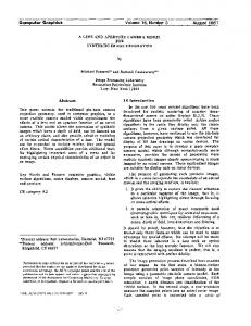
Fig. 3. Visualization of the revision graph of a biological model. The base visualization is showing the branching temporal aspect as an overview, whereby color corresponds to the structural complexity of each model revision. Two selections are made on a number of consecutive time steps of branch7, each showing a supergraph visualization of these model revisions. A fisheye is utilized to enlarge these selections. An initial simulation parameter for this model is mapped on the color of the nodes. Nodes of interest are selected and thus substituted with a time-value-plot – in two cases using eccentric positioning.
the temporal aspect, as shown in Figure 3, it is now possible to get a good overview of the complex temporal development of the model. It can be seen, that multiple versions of this model have been branched out, generating their own time line with revisions to only that particular branch. The structural aspect of the model at each revision is reduced to a numerical graph complexity value that is color-coded at the individual time steps. It is clearly visible that the structural complexity of the model is increasing over time on all branches, before it then remains nearly constant at the end. To discover what exactly has changed in between the different versions, a more detailed view is needed. We open up this detailed view as an in situ view by making a rectangular selection on branch7 and switching to a graph view inside that selection. It displays the supergraph of the model over the selected revisions. To take a look at details of the individual nodes, we can select them and embed detail views – in this case time-value-plots showing the initial simulation parameter. It is clearly visible from the plots that in different revisions of that model, different parameter settings have been tried in order to adapt the behavior of the model to fit the natural behavior of the biological system it encodes. A second selection at the end of that branch confirms this finding. When starting on the other hand with an overview of the structural aspect as the base visualization, it is possible to support the search for a specific revision. If for instance all versions containing a specific reaction have to be found, we can select this specific reaction in the supergraph of the base visualization and embed a view showing the branching time of the versioned model. The following example, which is roughly at the factor of 10 larger, shows that the in situ strategy scales up to such larger data sets as well. 5.2
Mesh Networks
In mesh networks each node corresponds to a network device, which can be routers, hubs, workstations, etc., and each edge describes a connection between two such devices. These connections can be established wirelessly or via cable, resulting in different connection qualities. If some of these connections fail, entire subnetworks can be cut off depending on the resilience of the network topology. This is a problem especially of wireless connections for which the quality can be subject to change at any time depending on factors such as interferences or even the current weather. To maintain the com-
munication between all network nodes, it is important for the operators of such networks to find weak points in the network topology in beforehand so that the network can be enhanced at these points by establishing new physical connections. One such network is operated around the city of Rostock, Germany by the Opennet Initiative (see http://www.opennet-initiative.de) a free communication platform established 2005. It is based on wireless connections between the participants to improve the overall network quality. The Opennet Initiative logs all connections and tries to identify the said weak spots of the infrastructure in order to find ways to improve it. For this example, we used the logs of only one day (01/16/11), which contains 239 nodes and 960 edges with one parameter describing the changing connection quality over the course of 1,440 time points (one for every minute of that day), which sums to 1,382,400 data entries overall. Due to the geography of the city, the nodes of this network are very irregularly distributed: there are dense clusters of nodes in the inner city and in the villages around Rostock, whereas in between there are no nodes and thus only sparse connections. Already at the first step of the analysis, one can choose between two very different perspectives by focusing either on the temporal aspect or on the structural aspect for the overview in the base visualization. On one hand, by focusing on the time and showing the graph structure merely as a complexity value we are able to select time intervals of low structural complexity, which are especially of interest, as it is at these times where not enough redundant connections are present and bottlenecks emerge. On the other hand, by starting with an overview of the structural aspect using a supergraph view as the base visualization all connections available during that day can be shown for a more thorough analysis. As the network nodes have geographical positions, these can be used to layout the graph as it is done in Figure 4. The connection quality is color-coded onto the edges. While this allows for a very natural orientation in the network, the dense clusters make a detailed visual analysis difficult. Yet, our in situ strategy makes it possible to change the representation of the clusters to another one which better reflects the structure, as it is done for the three villages around Rostock using different in situ visualizations and the available empty space around. However, for a detailed view of the city center, where no additional space is available, different adaptations have to be used such as fish-
Fig. 4. Visualization of the Opennet mesh network on 01/16/11. The base visualization shows the network overview on top of a map. Nodelink and matrix visualizations are embedded to better reflect the structure of spatially clustered subgraphs in the villages around Rostock. The overlay capability of the in situ strategy is used to maintain the connections across different representations. Individual nodes of interest are shown in even more detail in further embedded in situ views.
eye transformations or eccentric positioning. The reliability of the individual nodes can then be inspected with further in situ detail views, as it is done in the view embedded at the bottom left: a 1.5D view is shown with the time axis running vertically. In this example it becomes clear that this node was only online for two very short periods of time around noon and midnight of that day, making it rather unreliable. Yet, the connection of the village with the mesh network did not break up, because the other connecting route on the right side was of good average quality throughout the day, as it can be seen from the time-value-plot thumbnails. 5.3
User Feedback
The previous sections described two use cases utilizing our in situ visualization. In this section the results of a first user study are presented. Therefore, we performed a qualitative user study with 13 participants including nine experts from both domains and four visualization experts. The user study started with a brief introduction and training phase with our in situ visualization as well as a multiple coordinated views system, both using the same techniques. The multiple coordinated views system was simulated by opening a new window for each selection made. After the training phase, the participants were asked to complete a couple of tasks, e.g., identifying unreliable access points in the Opennet network or comparing the model structure of two different versions of a biological model. During the user study they were encouraged to think loud and comment what they like and dislike for
both systems. The following lists noteworthy observations from this user study: Most candidates preferred to start with our in situ visualization as they felt it was more intuitive and flexible. The data I want to see is where it is was stated by multiple candidates. Especially for the Opennet data set, they appreciated the direct embedding as it maintained the spatial relations between the nodes and thus supporting their orientation in the data. Generally, the overlay of connections between base and embedded visualization was highlighted by many participants as this also supported them in maintaining their overview. They also favored the lens like behavior where no switching from one view to another is necessary allowing them a fast exploration of the data. One participant compared multiple views and in situ to the interaction with mouse and touch pad: it just feels more immediate. Yet, some of the candidates felt a bit overwhelmed by the freedom our in situ visualization provided them and indicated that they need more training to use its full potential. Overall, all candidates liked to see the detailed view of the selected data next to the selection. However, some complained that they want to see both the embedded view as well as the base visualization as they were unsure if both views really show the same data and therefore preferred the eccentric positioning of the detail views. Also, when comparing different parts of the data, many participants used the eccentric positioning to move detail views of these parts closer together creating their own multiple views arrangement. In general, our in situ visualization and multiple coordinated views performed equally well. Identification tasks were solved slightly faster with our in situ visualization whereas multiple views performed better when comparing different subsets of the data. Yet, almost all participants said that they want to have the choice at any moment to switch from multiple views to in situ and vice versa. While these results are far from being statistically conclusive, they already indicate that our in situ visualization represents a useful complement for common approaches such as multiple coordinated views. It also highlights the importance of eccentric positioning which can be a possibility to combine the intuitive access to the data given by in situ visualizations with the comparability of multiple coordinated views. 6
C ONCLUSION
In this paper, we have presented a flexible strategy for the visual exploration of large dynamic networks. For giving a compact overview of the available techniques we introduced a new classification based on how they approach the two major aspects of dynamic graphs – the graph structure and the temporal domain. This classification has shown how diverse the field of dynamic graph visualizations is and that it is unreasonable to try to unify them into a one-view-fits-all visualization that serves analysis needs in the structural and in the temporal domain equally well. To resolve this problem we proposed a novel strategy, the in situ visualization, which not only allows to combine different existing techniques but also to support the mental map during visual analysis proceeding from an overview all the way to the details. In addition, it allows the user to shift seamlessly between different analysis foci and visual representations at any time. Limitations regarding the available screen space can often be resolved by employing standard algorithms and heuristics from algorithmic geometry or by using distortion techniques. The resulting scalability of our strategy was shown in two different use cases. As the last use case dealing with mesh networks has already demonstrated that our strategy handles networks with spatial references well, it remains to be investigated whether our strategy can be even extended for spatio-temporal data. Another useful extension would be a method for predicting if a prospective visualization will be visually cluttered as this can support the choice of a suitable technique. ACKNOWLEDGMENTS We thank Ron Henkel and Till Wollenberg for their valuable input considering the use cases. This work was funded in part by the DFG graduate school dIEM oSiRiS and the FFG project #385567 InGenious.
R EFERENCES [1] A. Aggarwal and S. Suri. Fast algorithms for computing the largest empty rectangle. In Proc. of Symposium on Computational Geometry, pages 278–290, 1987. [2] D. Archambault. Structural differences between two graphs through hierarchies. In Proc. of Graphics Interface, pages 87–94, 2009. [3] D. Archambault, T. Munzner, and D. Auber. TopoLayout: Multilevel graph layout by topological features. IEEE TVCG, 13(2):305–317, 2007. [4] R. Bade, S. Schlechtweg, and S. Miksch. Connecting time-oriented data and information to a coherent interactive visualization. In Proc. of Conference on Human Factors in Computing Systems, pages 105–112, 2004. [5] M. Bastian, S. Heymann, and M. Jacomy. Gephi: An open source software for exploring and manipulating networks. In Proc. of International AAAI Conference on Weblogs and Social Media, 2009. [6] E. A. Bier, M. C. Stone, K. Pier, W. Buxton, and T. D. DeRose. Toolglass and Magic Lenses: The see-through interface. In Proc. of Conference on Computer Graphics and Interactive Techniques, pages 73–80, 1993. [7] D. Bonchev and G. A. Buck. Quantitative measures of network complexity. In D. Bonchev and D. H. Rouvray, editors, Complexity in Chemistry, Biology, and Ecology, pages 191–235. Springer, 2005. [8] U. Brandes and S. R. Corman. Visual unrolling of network evolution and the analysis of dynamic discourse. Information Visualization, 2(1):40–50, 2003. [9] J. Branke. Dynamic graph drawing. In M. Kaufmann and D. Wagner, editors, Drawing graphs: Methods and models, chapter 9, pages 228– 246. Springer, 2001. [10] R. Brockenauer and S. Cornelson. Drawing clusters and hierarchies. In M. Kaufmann and D. Wagner, editors, Drawing graphs: Methods and models, chapter 8, pages 193–227. Springer, 2001. [11] D. Brodbeck and L. Girardin. Trend analysis in large timeseries of highthroughput screening data using a distortion-oriented lens with semantic zooming. In Poster Compendium of IEEE Symposium on Information Visualization, pages 74–75, 2003. [12] M. Burch and S. Diehl. TimeRadarTrees: Visualizing dynamic compound digraphs. Computer Graphics Forum, 27(3):823–830, 2008. [13] K. L. Daniels, V. Milenkovic, and D. Roth. Finding the maximum area axis-parallel rectangle in a polygon. In Proc. of Canadian Conference on Computational Geometry, pages 322–327, 1993. [14] S. Diehl and C. G¨org. Graphs, they are changing dynamic graph drawing for a sequence of graphs. In Proc. of Graph Drawing, pages 23–31, 2002. [15] S. Diehl, C. G¨org, and A. Kerren. Preserving the mental map using foresighted layout. In Proc. of Joint Eurographics IEEE TCVG Symposium on Visualization, pages 175–184, 2001. [16] J. Dill, L. Bartram, A. Ho, and F. Henigman. A continuously variable zoom for navigating large hierarchical networks. In Proc. of IEEE Conference on Systems, Man, and Cybernetics, pages 386–390, 1994. [17] J. Ellson, E. R. Gansner, E. Koutsofios, S. C. North, and G. Woodhull. Graphviz and Dynagraph – static and dynamic graph drawing tools. In M. Junger and P. Mutzel, editors, Graph Drawing Software, pages 127– 148. Springer, 2003. [18] N. Elmqvist and J.-D. Fekete. Hierarchical aggregation for information visualization: Overview, techniques, and design guidelines. IEEE TVCG, 16(3):439–454, 2009. [19] T. Falkowski, J. Bartelheimer, and M. Spiliopoulou. Mining and visualizing the evolution of subgroups in social networks. In Proc. of IEEE/WIC/ACM International Conference on Web Intelligence, pages 52–58, 2006. [20] C. Friedrich and P. Eades. The Marey graph animation tool demo. In Proc. of Graph Drawing, pages 396–406, 2001. [21] Y. Frishman and A. Tal. Dynamic drawing of clustered graphs. In Proc. of IEEE Symposium on Information Visualization, pages 191–198, 2004. [22] Y. Frishman and A. Tal. Online dynamic graph drawing. IEEE TVCG, 14(4):727–740, 2008. [23] G. W. Furnas. Generalized fisheye views. In Proc. of Conference on Human Factors in Computing Systems, pages 16–23, 1986. [24] M. Gaertler and D. Wagner. A hybrid model for drawing dynamic and evolving graphs. In Proc. of Graph Drawing, pages 189–200, 2006. [25] E. R. Gansner, Y. Koren, and S. C. North. Topological fisheye views for visualizing large graphs. IEEE TVCG, 11(4):457–468, 2005. [26] S. Hadlak, C. Tominski, H.-J. Schulz, and H. Schumann. Visualization of attributed hierarchical structures in a spatio-temporal context. International Journal of Geographical Information Science, 24(10):1497–1513,
2010. [27] N. Henry, J.-D. Fekete, and M. J. McGuffin. NodeTrix: A hybrid visualization of social networks. IEEE TVCG, 13(6):1302–1309, 2007. [28] B. W. Herr, W. Ke, E. Hardy, and K. B¨orner. Movies and actors: Mapping the internet movie database. In Proc. of Information Visualisation, pages 465–469, 2007. [29] M. R. Jakobsen and K. Hornbæk. Transient visualizations. In Proc. of Australasian Conference on Computer-Human Interaction, pages 69–76, 2007. [30] M. John, H.-J. Schulz, H. Schumann, A. M. Uhrmacher, and A. Unger. Exploring time-varying hypergraphs. In Poster Compendium of IEEE Conference on Information Visualization, 2009. [31] D. A. Keim, F. Mansmann, J. Schneidewind, and H. Ziegler. Challenges in visual data analysis. In Proc. of Information Visualisation, pages 9–16, 2006. [32] Y. K. Leung and M. D. Apperley. E3 : Towards the metrication of graphical presentation techniques for large data sets. In Proc. of International Conference EWHCI’93, pages 125–140, 1993. [33] C. Li, M. Donizelli, N. Rodriguez, H. Dharuri, L. Endler, V. Chelliah, L. Li, E. He, A. Henry, M. Stefan, et al. BioModels Database: An enhanced, curated and annotated resource for published quantitative kinetic models. BMC Systems Biology, 4(1):92, 2010. [34] A. MacEachren, D. Xiping, F. Hardisty, D. Guo, and G. Lengerich. Exploring high-D spaces with multiform matrices and small multiples. In Proc. of IEEE Symposium on Information Visualization, pages 31–38, 2003. [35] M. J. McGuffin and I. Jurisica. Interaction techniques for selecting and manipulating subgraphs in network visualizations. IEEE TVCG, 15(6):937–944, 2009. [36] P. McLachlan, T. Munzner, E. Koutsofios, and S. North. LiveRAC: Interactive visual exploration of system management time-series data. In Proc. of Conference on Human Factors in Computing Systems, pages 1483– 1492, 2008. [37] C. Olston and A. Woodruff. Getting portals to behave. In Proc. of Symposium on Information Visualization, pages 15–25, 2000. [38] M. Pohl and S. Diehl. What dynamic network metrics can tell us about developer roles. In Proc. of Cooperative and Human Aspects of Software Engineering, pages 81–84, 2008. [39] H. Purchase, E. Hoggan, and C. G¨org. How important is the “mental map”? An empirical investigation of a dynamic graph layout algorithm. In Proc. of Graph Drawing, pages 184–195, 2007. [40] S. Rufiange, M. J. McGuffin, and C. Fuhrman. Visualisation hybride des liens hi´erarchiques incorporant des treemaps dans une matrice d’adjacence. In Proc. of Conference on Association Francophone d’Interaction Homme-Machine, pages 51–54, 2009. [41] P. Saraiya, P. Lee, and C. North. Visualization of graphs with associated timeseries data. In Proc. of IEEE Symposium on Information Visualization, pages 225–232, 2005. [42] D. Schaffer, Z. Zuo, S. Greenberg, L. Bartram, J. Dill, S. Dubs, and M. Roseman. Navigating hierarchically clustered networks through fisheye and full-zoom methods. ACM Transactions on Computer-Human Interaction, 3(2):162–188, 1996. [43] L. Shi, C. Wang, and Z. Wen. Dynamic network visualization in 1.5D. In Proc. of IEEE Pacific Visualization Symposium, pages 179–186, 2011. [44] B. Shneiderman and A. Aris. Network visualization by semantic substrates. IEEE TVCG, 12(5):733–740, 2006. [45] F. Steinbr¨uckner and C. Lewerentz. Representing development history in software cities. In Proc. of Software Visualization, pages 193–202, 2010. [46] A. Telea and D. Auber. Code Flows: Visualizing structural evolution of source code. Computer Graphics Forum, 27(3):831–838, 2008. [47] C. Thiede, G. Fuchs, and H. Schumann. Smart Lenses. In Proc. of Symposium on Smart Graphics, pages 178–189, 2008. [48] Y. Tu and H.-W. Shen. Visualizing changes of hierarchical data using treemaps. IEEE TVCG, 13(6):1286–1293, 2007. [49] Y. Tu and H.-W. Shen. Balloon Focus: A seamless multi-focus+context method for treemaps. IEEE TVCG, 14(6):1157–1164, 2008. [50] F. van Ham and J. J. van Wijk. Beamtrees: Compact visualization of large hierarchies. In Proc. of IEEE Symposium on Information Visualization, pages 93–100, 2002. [51] A. Woodruff, C. Olston, A. Aiken, M. Chu, V. Ercegovac, M. Lin, M. Spalding, and M. Stonebraker. DataSplash: A direct manipulation environment for programming semantic zoom visualizations of tabular data. Journal of Visual Languages & Computing, 12(5):551 – 571, 2001.