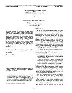
Teaching Computer Graphics with Spreadsheets
Abstract
Spreadsheets are a great way to introduce computer graphics concepts to computer science students. Through direct manipulation of numbers, students develop a more concrete understanding of the data they compute from the formulas they derive and use. This paper presents some experiences using spreadsheets for in-class demonstrations and homework assignments. Background
The introductory course at Pace University is offered as an elective to undergraduate students enrolled in the CSAB accredited BS and non-accredited BA degrees in computer science. Typical textbooks used in the course are Computer Graphics by Donald Hearn and Pauline Baker, Computer Graphics by Francis Hill, and Computer Graphics: A Programming Approach by Steve Harrington. Prerequisites for the course include completion of a computer science core including C++ programming, data structures and algorithms, computer architecture, and operating systems. The mathematics prerequisite is two semesters of calculus. Most juniors and seniors who enroll in computer graphics have completed courses in discrete mathematics and statistics. A single, two-semester laboratory science sequence such as chemistry or physics is required for the BS degree but not the BA degree. Because of scheduling requirements, the laboratory science sequence is frequently deferred until a student’s senior year. A student entering the computer graphics course with such a background exhibits one significant deficiency: inability to visualize the kinds of numbers that enter into and arise from the equations they derive and program. There are two reasons for this deficiency. First, computer science courses concentrate on symbol manipulation
84
Educators Program
and processing. Numerical methods are barely considered at all. Second, the numerical data processing skills taught in chemistry and physics courses, especially through their laboratory components, have not been cultivated in these students. Since computer graphics is part data structures and algorithms and part mathematical methods, the student deficient in numerical data processing skills is unprepared for half the computer graphics course. The programming process compounds this problem, with its design, code, debug, and test cycle, by short circuiting a student’s attempt to gain a feel for the mathematical methods and the numbers arising from them. To solve this problem, spreadsheets have been integrated into lectures and homework assignments, covering topics such as: absolute and relative addressing, twoand three-dimensional transformations, parametric functions, window-viewpoint mapping, and parallel and perspective projections. Spreadsheets are excellent tools for data visualization because they allow data to be easily input, dynamically updated, and readily viewed. Formulas can be created that include any combination of the spreadsheet’s built-in functions, including trigonometric functions. These formulas are easily examined, tested, and changed. Their output values are automatically updated when
Francis T. Marchese Pace University
[email protected]
the cells upon which they are constructed have their data values changed. Spreadsheets can contain dynamically linked charts, which are automatically redrawn when the data upon which they are based is changed. In addition, changing the position of data points in charts by using the mouse causes the data to be updated in the cells upon which they are based. Finally, spreadsheets, such as Microsoft Excel, are ubiquitous, included with the purchase of most computers. Therefore, spreadsheets can be thought of as a simple interactive graphic environment where data is input, equations are entered, and charts are built and interactively explored. Using Spreadsheets
Spreadsheets are used to augment lecture demonstrations and as homework assignments. Incorporated into lectures, they are linked to derivations of formulas for two- and three-dimensional geometric transformations, window-viewpoint mappings, and projections. For lectures on parametric curves, spreadsheets are integrated into class presentations and discussions. For example, in a lecture about composite two-dimensional transformations, such as rotation about an arbitrary point in two-dimensional space, the students are led through the concepts of deriving a composite transformation with the sequence of steps: translation to origin, rotation about origin, and translation back. Matrices are
Figure 1 Excel spreadsheet demonstrating two-dimensional scaling transformations.
Conference Abstracts and Applications
written on the blackboard and multiplied to create the final composite transformation matrix. Finally, the programmable equations are extracted from the matrix transformations. At this juncture, the instructor builds a spreadsheet using sample data, such as the unit square. Different angles are fed into the formulas and the output of each is discussed. At the end of the class session, students are handed screen dumps of the spreadsheet containing sample input data, output data, and the corresponding charts. They are expected to recreate the spreadsheet at home. The spreadsheet formulas that they have created become starting points for their programming exercises. The numerical output data become test cases.
Excel’s charting wizard is invoked to create two charts in the scatterplot chart format. Each scatterplot is constructed by Excel connecting each pair of data points in the sequence with a line. The coordinates of four points defining a unit square are placed in cells B25:C29 in clockwise order. The first point is replicated at the end of the list. This addition ensures that the polygon will be drawn with four sides. Each chart contains two polygons. The blue polygon is the original data. The red polygon is the transformed data. These charts are dynamic entities. They are automatically adjusted when there is a change in the contents of the cells
Rotation About an Arbitrary Point in the Plane
Figure 2 displays a spreadsheet for a 2D rotation of a unit square about a point xc, yc. As with the scaling example, an x, y scatterplot has been prepared to visualize the effect of changing the angle of rotation. The highlighted cell contains the transformed x coordinates of the first data point. Its equation is revealed at the top of the figure. Note calls to built-in sine, cosine, and pi functions. Note as well the conversion of the input angle from degrees to radians, a process mirrored in a student’s implementation of the transformation equation in a programming language.
Sample Applications
Four sample applications of spreadsheets are presented below: scaling transformations, rotation about an arbitrary point in the plane, parametric curves, and perspective projections. Scaling Transformation
Figure 1 displays an Excel spreadsheet that has been constructed to demonstrate the effects of absolute and relative scaling transformations on geometric data. Absolute scaling not only enlarges the object but effects a translation, while a relative scaling transformation enlarges the object in place. This latter composite transformation results from a derivation where an object is translated to the origin, scaled, and translated back. The spreadsheet is laid out so the columns containing the original x,y coordinates are parallel with the x’,y’ counterparts that result from application of the transformation formulas for absolute and relative scaling. The highlighted cell (H25) has its formula displayed at the top of the figure, revealing its dependency on the x coordinate scale factor in cell C21, and the original x coordinate data in cell B25.
Figure 2 Excel spreadsheet demonstrating two-dimensional rotation about an arbitrary point.
from which they are built. If either scale factor is adjusted, formulas recompute the scaled coordinate values, and the chart is immediately redrawn. The standout point about this spreadsheet is that it is an interactive textbook page. Instead of viewing static textbook images and relying on associated descriptive text, the student can alter input data to see the effects of both transformations side-by-side.
It is possible to change a cell’s contents by direct manipulation of its corresponding plotted point. The second chart found within this spreadsheet is a bar chart of the rotation angle. For example, by double clicking the mouse on the bar chart of the angle, and dragging its top boundary, the bar may be slid up and down. Angle data in cell C4 is simultaneously updated, which, in turn, updates the data points and their graphical representation.
Conference Abstracts and Applications
Educators Program
85
Teaching Computer Graphics with Spreadsheets
Parametric Curves
One example of the strength of this method is in the teaching of parametric equations such as Bezier curves. The screen dump of a Microsoft Excel session is shown in Figure 3. The chart contains four control points connected by three straight lines and the smooth curve the control points generate. The control points reside in the cells above the plot. Computed x, y values for the smooth curve are in the cells to the plot’s left. The spreadsheet was created in a matter of minutes with the definition of cells for control points and inputting of two formulas. The plot was created by highlighting the range of cells below the column headings P(x), P(y) and executing Excel’s chart wizard. The most interesting part of this spreadsheet is that new shapes of the Bezier Curve may be created by clicking on the control points in the plot and
dragging them to any location. This process updates the control point data in the cells above the plot and in turn, updates the P(x), P(y) values. Perspective Projection
An Excel screen dump from a lecture demonstration on perspective projection in presented in Figure 4. The original database defining a wireframe representation of a cube resides in cells C9:F16. The projected points are in cells H9:J16. Center-of-projection coordinates are found in cells H6:J6. Below the projected vertices are cells containing these points reassembled into front and rear polygons, followed by four line segments that connect them to complete the cube. The Excel scatterplot for the perspective projection appears to the right of the wireframe data. It contains xc, yc,
Figure 3 Excel spreadsheet for Bezier curve.
86
Educators Program
Conference Abstracts and Applications
the x, y location of the observer, marked on the chart by a triangle, and the wireframe model of the cube.To create the wireframe image, it was necessary to group the datapoints, separating them by rows of empty cells. This was done because Excel connects each point in sequence. If left to its own devices, Excel’s rendering would contain unwanted cross connections among points. Blank cells act as delimiters, telling Excel to stop connecting the dots. When a subsequent filled cell is encountered, Excel begins drawing anew. Hence, this data arrangement instructs Excel to draw two polygons and four line segments. Below the original vertex data is a chart displaying a sideview rendering of the viewing environment containing data culled from all the spreadsheet’s cells. From left to right, the chart contains: the viewer’s position in the nega-
tive z direction, viewplane projected points at z=0, and line segments depicting front and rear cube faces. This chart complements the perspective projection by showing the viewer’s station point relative to the data and viewplane. It also shows the y values of each data point projected onto the viewplane. Notice that rear-face vertices are marked with filled diamonds and front vertices with filled circles. Most students have difficulty visualizing three-dimensional shapes. Their problems are compounded through projective transformation, which distorts these shapes in the projection plane. By using the spreadsheet to create multiple viewpoints, the student can better sense the dimensions of the visual space and the portions of this space occupied by the object, the viewer, and the projection plane. This spreadsheet works well as part of a lecture demonstration, where the
instructor may move fluidly between object and projection changing parameters at will. Conclusion
The strength of the spreadsheet approach is that the spreadsheet is an interactive visualization tool or scratchpad. Students can work out an understanding of their formulas and derivations, then build their programs. The use of spreadsheets can be easily taught as in-class demonstrations and integrated into the equation derivation process. The computer graphics topics amenable to the use of spreadsheets are: absolute and relative addressing, visualization of parametric equations including Bezier curves, window-viewport mapping, two- and three-dimensional transformations, and parallel and perspective projections.
Figure 4 Excel spreadsheet for perspective projection.
Conference Abstracts and Applications
Educators Program
87