Rendering Color Information Using Haptic Feedback Satyajit Chakrabarti*, Sukanta Pramanik*, David Du**, Rajashree Paul*** *Department of Computer Science, University of British Columbia, Canada **Department of Mechanical Engineering, University of British Columbia, Canada ***School of Computing Science, Simon Fraser University, Canada
[email protected],
[email protected],
[email protected],
[email protected]
Color rendering, sinusoidal detent, haptics, rotary display, user testing, multimodal input, sensory substitution.
used to change the amplitude and frequency of the sinusoidal detent to generate the color/haptic stimuli pairs. We started with a two-color system and gradually increased the number of colors to 16. In each step the users were presented with a color-strip over which he can move the pointer using the same rotary display device we are using. The sinusoidal detent he feels while moving depends upon the color of the pixel he is currently upon. The color-strip was divided into eight random regions of different colors. The users had to associate each of these haptic stimuli with their corresponding color. They also had to detect the edge between two consecutive regions. The remainder of the paper is organized as follows. In section 2 the physiology of human fingers has been explained, and in section 3 the color perception theory of humans has been given. In section 4 previous works in this field are reviewed. In section 5 we discussed our approach to the color-to-haptic mapping. The design principles and prototypes are explained first, followed by a brief description of the apparatus we used, and then we have given the experiment details. In section 6 we have stated our experimental results and statistical analysis. Concluding remarks and future directions are given in section 7 and 8 respectively.
1. INTRODUCTION
2. PHYSIOLOGY OF HUMAN FINGERS
ABSTRACT This paper investigates a novel approach to rendering color information from pictures as haptic feedback at the fingers. Our approach uses a 1D haptic rotary display to render the color information to the fingers using sinusoidal textures of different frequency and amplitude. We tested 12 subjects on their ability to associate colors laid out in a spatially irregular pattern with haptic feedback displayed to their fingers, with the numbers of color/haptic stimuli pairs presented increasing in successive trials. The experiment results suggest that subjects are able to comfortably learn and distinguish up to 8 color/haptic stimuli pairs based on this particular mapping; and with some effort, many can distinguish as many as 16 pairs. The results also raise key issues for further investigation in subsequent studies including the role of multimodal inputs like audio along with haptics.
Keywords
One way of enhancing and improving the lives of humans is to restore aspects of functional vision to the visually impaired. Although physically replacing a dysfunctional eye with a working eye might be infeasible with today's computing technology, ways for using image processing to provide information about a scene using different senses like touch, hearing, etc. may also be effective. We used a 1-degree of freedom haptic rotary display to render color information to a user through sinusoidal textures of different frequency and amplitude. Representing color information in this way is a challenging issue as it needs a careful balance of the force feedback mapped to different colors, total number of color/texture pairs used in the system, display characteristics of the device used and also human perceptual and associative capability. The scope of this study was to determine the feasibility of using an inexpensive device for the rendering and explore the capability of the users to successfully interpret the colors represented by it. Since finding blind subjects was difficult, we studied the feasibility of our Haptic feedback system on subjects who were not shown the actual colors and were given the task to identify color information through Haptic feedback and some audio inputs only. In this paper we tried to develop a workable mapping of the 16 CGA colors to our simple haptic display. We indexed the colors based on their position in the color wheel [16]. This index is then
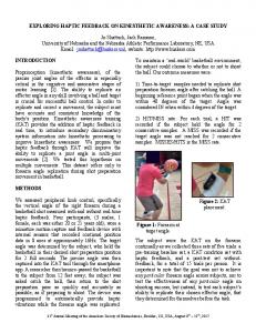
Figure 1: A cross-section of human glabrous skin.
There are about 17,000 mechanoreceptors in the grasping surfaces of the human hand (Fig.1 , [2]), which are composed of five major types of receptors: free receptors, Meissner corpuscles, Merkel’s disks, Pacinian corpuscles, and Ruffini corpuscles. They are found at all depths below the skin surface. Each receptor has its functional task. Free Receptors. They permeate the entire thickness of the dermis and lie perpendicularly to the skin surface. Meissner Corpuscles. They are found at the border of the corium and epidermis of the frictional surface of the digits. They are velocity detectors, since they provide the best reception of movement across the skin.
Grassmann's Laws provide a quantitative description of color matching data (Grassman 1855). They hold up well within a prescribed set of conditions (with respect to brightness, adaptation of the observer, size of the field, etc). Grassmann's Laws are useful in quantifying color matching data. All colors can be fully specified in terms of their hue, lightness and saturation. The Munsell system has three dimensions: hue, value and chroma. These three dimensions correspond to the three perceptual attributes of human color vision.
Merkel’s Disks. They are only found in the basal layer of the epidermis of the ridges in the fingers. They provide excellent detection of intensity and thus are pressure receptors. Pacinian Corpuscles. They lie in the deeper parts of the dermis and appear to have only an incidental connection with the skin. They are acceleration detectors and provide vibration reception. Ruffini Corpuscles. They are composed of a fusiform structure with a definite capsule in the subcutaneous tissue of the pulp of the human finger. They are detectors of intensity or pressure and are also responsible for detecting shear on the skin. On the palm, the shallowest and the deepest mechanoreceptors (Meissner corpuscle and Pacini corpuscle, respectively) lie below the surface at about 0.7 mm and 2 mm, respectively. This paper deals with the tactile feelings caused by stimulating the shallow and the deep receptors. Vibration is sensed only by Pacinian corpuscles when the stimulus frequency exceeds 60 Hz. At lower frequencies, several types of mechanoreceptors are activated simultaneously. This theory about the physiology of human fingers is relevant to our work since it explains some theoretical reasons behind perception of Haptic feedback in human fingers.
3. COLOR PERCEPTION IN HUMANS Color vision processing in the primate visual system is initiated by absorption of light by three different spectral classes of cones. Consequently, color vision is described as being trivariant or trichromatic, and initial psychophysical studies demonstrated that colors could be matched by the use of three different primaries. In 1802, Thomas Young proposed a model that perception of color can be coded by three principal color receptors rather than thousands of color receptors coding for individual colors. Studies on color perception in humans can be found in [3]. Three classes of cones in the human retina have been isolated from the various techniques. These three classes of cones are the short-wavelength sensitive (S-cones), middle-wavelength sensitive (M-cones) and long-wavelength sensitive (L-cones), and all have different but overlapping spectral sensitivities. The spectral sensitivity of S-cones peak at approximately 440 nm, Mcones peak at 545 nm and L-cones peak at 565 nm. The trichromatic nature of color vision will enable almost any color to be matched by a mixture of three colors. This trichromacy of vision is also linear.
Figure 2: Munsell top showing location of the different colors. The three dimensions of the Munsell color system are: 1. Hue: Related to wavelength or dominant wavelength. Hue is denoted by a combination of letters and numbers making up a 100 step scale. There are ten letter categories used to denote hue, with each of these further subdivided (by the use of numerals 1 to 10) into ten subgroups. If the numeral denoting the hue subgroup is 5, then it can be omitted (eg. 5R is the same hue as R). 2. Value: Value is specified on a numerical scale from 1 (black) to 10 (white) and this attribute is related to reflectance and luminosity (or lightness). 3. Chroma: Chroma is the Munsell term corresponding to saturation. It is indicated numerically on a scale of 0 to the various maxima dependent on the saturation obtainable with available pig ments. The trichromatic theory was first proposed by Thomas Young in 1802 and was explored further by Helmholtz in 1866. This theory is primarily based on color mixing experiment and suggests that a combination of three channels explain color discrimination functions The opponent color theory was first proposed by Hering in 1872. At the time, this theory rivalled the well accepted trichromatic theory which explains the trichromasy of vision and predicts color matches. Hering's opponent color theory suggests that there are three channels: red-green, blue-yellow and blackwhite, with each responding in an antagonist way. That is, either red or green is perceived and never greenish-red. Stage Theory: This has led to the modern model of normal color vision which incorporates both the trichromatic theory and the opponent color theory into two stages. The first stage can be considered as the receptor stage which consists of the three
photopigments (blue, green and red cones). The second is the neural processing stage where the color opponency occurs. The second stage is at a post-receptoral level, and occurs as early as the horizontal cell level.
of the image. Each pixel of the image is associated with a sound, where the brightness of the pixel determines the amplitude of it and the vertical position of the pixel corresponds to the frequency.
Trichromatic color matches using three colors can be illustrated on Newton's color circle (Figure 4). Newton's color circle provides a qualitative description of color matches and can be used to explain why two colors may not be sufficient to make color matches and also the use of 'negative' colors. When the third primary is added to desaturate the color mixture, negative tri-stimulus values result.
SoundView, developed by Van den Doel [10], allows the exploration of color images through touch and hearing. Instead of touching the actual image the user uses a pointing device that acts like a virtual gramophone needle. Both the color of the image at a particular location and the speed of the motion are used to produce the sound that is heard.
This theory about color perception in humans is relevant to our current work since it gives some justification behind the color mapping scheme we employed in rendering Haptic feedback to the fingers.
4. PREVIOUS WORK Asamura et. al. [24] proposed a method to selectively stimulate superficial and deep mechanoreceptors to try to get the sensation of touching particular objects. Their work concluded that though humans can clearly discriminate a small difference in pressure distribution within a small area on the skin given a different stimulus amplitude to shallow and deep receptors, the discrimination ability degraded when only shallow receptors were stimulated. Some of the open questions were: How wide a range of tactile feeling can be covered by preparing temporal signal form patterns for the stimulators. Campbell et. al. [28] investigated the effect of tactile feedback in isometric control devices and interplay of tactile and visual information. Hughes and Forrest [29] instrumented a standard desktop mouse with vibration elements and discuss its application to multivariate map exploration. There has been a significant amount of research addressing the substitution of vision for the visually impaired people. Blind persons normally rely upon other modes of perception in lieu of sight. One common method of presenting visual images is the use of tactile graphics [1],[14],[17] which renders a visual item as a raised version of the item. Another approach is to use textual information and Mikovec et al. [4] defined a XML based grammar to describe the picture in a textual form. Petrie et. al. [25], [26], [27] presented multimodal inputs for perception of graphical interfaces by blind people.
Research on presenting information via sound can be found in the works of Sara Bly [11],[12]. Attempts of making visual information available through haptic devices include using a three-degree of freedom device called PHANToM™ (Sensable Technologies) to display complex scientific data [5], [14]. Siira et al. [15] used a two-degree of freedom device Pantograph to represent surface roughness or texture. These devices are generally expensive and so are still regulated to a small number of research facilities.
5. APPROACH For a 16-color system we choose the 16 CGA colors. The CGA colors along with their indices are given in Table 1. We mapped the colors to the force feedback of the haptic knob using the color indices. The mapping involves the use of amplitude and frequency of sinusoidal textures to represent the different colors. Our goal is to test the mapping algorithm with the haptic display to see if the users can accurately associate the rendered colors to their force feedback and to see if the users can detect the edges between adjacent colors along a 1-dimensional line.
5.1
Experimental Apparatus
The testing apparatus used for haptic feedback is a simple haptic display, which interfaces to a PC via a parallel port. The haptic display is composed of the motor-encoder pair and a stand to hold them in the desired position. A picture of the device is given in Figure 3. The motor is a Pittman 8324S005 Lo-Cog DC Servo Motor and the encoder is connected to a HCTL 2016 quadrature decoder. The stand firmly holds the motor and allows the motor shaft to be fixed at any angle. The motor is angled at 45 degrees for the experiments. The knob is 50 mm in diameter. The haptic display is firmly clamped to the table on the left side of the keyboard. The haptic display is intended to be used with the left hand for right-handed people (non dominating hand) with the right hand being used to control the mouse.
Lederman et. al. [5], [7], [8] demonstrated that people are remarkably good at identifying common objects using their sense of touch. How the relative order in which 4 property classes of haptically perceived surfaces becomes available for processing after initial contact was studied in [6]. Auditory feedback is also a modality where significant investigations have been made. Meijer [9] has created a timemultiplexed sound representation that performs real-time imageto-sound conversion for a gray level picture. In his system the physical properties of the sound is controlled based on the color
Figure 3: Top View of the rotary Haptic display.
5.2
Initial Prototypes
Our first prototype had a linear mapping between the color indices and the amplitude of the force-feedback. So, as the colors go from Black (index = 0) to White (index = 15), the amplitude of the force feedback get larger. At this step, we only used the color indices to represent the colors. The pilot tests confirmed the intuitive observation that as the number of colors becomes greater, the difference in amplitude between the consecutive color indices plays a larger role in distinguishing them correctly. The difference in amplitude that we used to place all the 16 colors between the maximum torquelimit of the device made it difficult to differentiate between the colors with adjacent indices. We varied the difference quite a few times and from it the not so obvious revelation was that the acceptable difference varied for the low-end and the high-end of the amplitude. As the amplitude becomes bigger we needed to make the difference larger to differentiate between the high amplitudes. This was also verified by Weber’s Law which states The Difference Threshold is the minimum amount by which stimulus intensity must be changed in order to produce a noticeable variation in sensory experience. Weber’s law can be expressed as
Where delta I represents the difference threshold, I represents the initial stimulus intensity and k is a constant depending on the sensory modality of a specific task on which Weber’s law is applied. Our next prototype used the original color names like Black, Blue etc instead of using color indices to remember the color association, which this time was incorporated as a linear change in both the frequency and the amplitude depending upon the indices. The reason for using variation in frequency is explained in the later part of this section. We also tried the option of using a force feedback at the edge between two colors, which we later skipped as this force adversely affected the use of the same device as a pointer to the image.
Table 1: Color indices according to Color Wheel Color Name
Index
Frequency
Amplitude
Black
0
16
1000
Yellow
1
16
1500
Red
2
16
2000
Light Red
3
16
2500
Magenta
4
16
3300
Light Magenta
5
16
4100
Blue
6
16
4900
Light Blue
7
16
5700
Cyan
8
32
4900
Light Cyan
9
48
4100
Green
10
64
3300
Light Green
11
80
2500
Brown
12
96
2000
White
13
112
1500
Light Gray
14
128
1000
Dark Gray
15
144
500
For making the near colors feel similar we decided to do the mapping of the color indices using their position in the Color Wheel. We choose 16 colors from the color wheel – the primary colors Red, Green, Blue, their lighter shades and the more popular colors like Magenta, Cyan, Brown. Also we included the four colors – White, Black, Light Grey and Dark Grey which were a bit outside the mail circle of the Color wheel as shown. The reason for choosing those specific colors were based on the popularity of the color in terms of remembrance since the participants would have to remember the color/texture mapping. Its always easier to remember a new item if it is linked to something already known [ 19, 20, 21, 22]. Hence we wanted the colors to be well known.
Figure 4: RGB Color Wheel [16]
Figure 4 shows a sample color wheel that we used for our indexing. We placed the color that we used in our system on the wheel and indexed the colors as per their spatial position upon it. The new indices are given in the Table 1. Another observation was that we could use the frequency to differentiate between two force-feedbacks having same amplitude. We used this to divide the colors into two groups as separated in table 1. While the group having indices 0-7 had a fixed frequency, the other group with indices from 815experienced a linear increase based on the index value. The reason behind keeping frequency fixed for group 0-7 was that for those only variation in amplitude was sufficient to have a distinct haptic feeling. But since some of the amplitudes were also used in the other group from 8-15, so the frequency had to be increased so give a distinct variation in the Haptic feeling so that they could be identified distinctly. Table 2: Amplitude and Frequency gradient for the color groups
Indices of Colors in Group Amplitude Gradient
0-3
4 -7
8-11
12-15
+500
+800
-800
-500
Frequency Gradient
0
16
Table 3: User answers to the post questionnaire
Agree/ Disagree out of 12 participant
%
Were you able to detect edges confidently without guessing?
11 Agreed
91.6%
Do you agree that Haptics + Audio would be better than only Haptics?
11 Agreed
91.6%
Did you feel any decrease of amplitude during the training mode?
8 Agreed
66.6%
Did you feel any increase of frequency during the training mode?
9 Agreed
75%
Do you think that you could have performed better with more practice?
8 Agreed
66.6%
Do you agree that with more practice you could learn more than 16 colors’ Haptic feedback?
11 Disagreed
91.6%
Do you agree that similar colors like Red and Light Red should be grouped?
10 Agreed
83.3%
Question
Table 4: Results of Analysis of Variance on the User data. Response Variable
Probability (p)
Number of Errors
1.11022 e-15
Number of Edge Misses
0.0006
Sum of index errors in choosing colors
4.36 e-07
Mean index error
4.1863 e –07
In each of these groups amplitude is increased from 0-7 and decreased from 8-15 to represent different colors. The reason behind this steady increase of amplitude for one group and steady decrease of amplitude for the other group was to give the effect of a circular loop, so that the amplitude increased, then reached a peak and again decreased and came back near to where it was started from. Like the colors, the haptic response also wraps around. The incorporation of variable frequency gave rise to different auditory feedback from the Haptic knob at different frequency and amplitude. During the initial prototype phases, we found that the auditory cues acted as a memory and perceptual aid to identifying the different Haptic feedback from the knob. Using a headphone to nullify the auditory feedback did not yield good results, hence we kept the auditory cues as an extra input variable in out experiment. The gradient values that we used for our final prototype are given in Table 2. These values were chosen to keep the device we are using between its operating limits while still maintaining a satisfactory difference in force feedback.
5.3 Designing User Experiment While designing the user study we wanted to test how the the total number of colors-texture pairs in a set affects the user’s ability to discriminate and learn the mappings. Thus we started with a 2-color system and in successive trials, doubled the number of colors in the set up to 16. In each step we chose a subset of the 16 colors that was equally spaced on the color wheel. Thus the two color system constituted Black and Cyan. The 4-color system used Black, Magenta, Cyan and Brown. We used a gradual training process as the number of colors presented at each step always had the same increasing order. Each step was divided into a training phase and a testing phase. In the training phase, the participant was given several minutes to learn the haptic representation of the given colors by pressing on the buttons with the color names, using the mouse. The participant would then rotate the rotary display to and fro with his fingers and feel the sinusoidal detent texture. The training phase was not time controlled and the user was allowed to do the training until (s)he felt comfortable with the haptic representation.
After the training period, the participant was given a blank strip to feel the color-strip concealed behind the blank strip in which there were eight different regions having different colors. Consecutive regions never had the same color. The regions for each replicate had a randomized ordering of color/textures. Both the color and the position of the edges were randomized. How often a particular color appeared on the color strip was totally random. The users were not told the number of regions behind the color strip. The number of regions were chosen as eight and not randomized because we found out from pilot testing that eight was a fair number of regions to test the participants.. participants used the haptic device to control the position of the pointer on the color-strip. A visual representation of a pointer moving along a blank display was provided to the user. While moving on the strip using the device (s)he always felt the sinusoidal texture based on the color of the pixel the pointer was currently upon. Participants had to identify, i) the associated color of a region from the haptic feedback, and ii) the edge between two colors (the transition between two different colors) from the change in feedback. Fig. 5 shows a user testing the haptic knob. We have provided a screenshot of the testing interface in Figure 6. It shows the training mode for the 16-color trial. The buttons were positioned according to their location on the color wheel. Although the users did not know of this arrangement, some of them commented that they remembered the haptic information using the index position
5.4
Participant Comments
Our 12 participants were between the ages of 23 to 35. They were Graduate students in different technical disciplines who had limited prior experience with haptic devices. We gave each participant a post-test questionnaire and asked to write down the comments, if any. Questions were mainly about their experience in using the device and how effectively they understood the mapping of color to haptic that we used. The questions were rated from 1 to 5 with 1 implying strongly disagree and 5 implying strongly agree. The user responses to the questionnaire are given in Table 3. Some of the participants wrote in the comments that they actually did the grouping themselves into color groups like Blue (Blue + Light Blue) and Red (Red + Light Red). All of the participants used the audio cues from the rotating display to learn and distinguish between the different colors, especially in the color index range of 8-15 when the frequencies differed substantially and hence the sounds of each texture also differed substantially.
of the buttons in the Training pad which was laid out as according to the color wheel. This was something we expected them to do some sort of association with the color wheel and they did it.
Figure 5: Participant testing the rotary device.
Figure 6: Screenshot of the program. The participant controls the cursor position (indicated through left-right motion of the black dot in the window labeled “User Testing Strip”) by rotating the knob, and feels textures corresponding to an unseen color map.
6. ANALYSIS OF RESULTS We performed a 1-way Analysis of Variance using the Color as the factor and levels as 2, 4, 8 and 16 colors. Our response variables were number of errors, number of edge misses, sum of index errors in choosing colors and mean index error in choosing colors. In calculating the number of errors we calculated mismatches in colors. When a color stimulus was presented to the participant and the participant identified it as a stimulus for different color this was detected as an error. Again, when a participant failed to identify change in the haptic stimuli then also it was detected as an error as in this case (s)he was identifying the later color as a continuation of the previous color.
Figure 7: Box plot showing Sum of index errors
Similarly there were two different types of edge misses. When the user could not distinguish between the two Haptic stimuli present in the two sides of an edge, (s)he interpreted the two regions as having a single color. The other case is when the user specifies that there is an edge and identifies the same color as two different colors at two different sides of an edge. The index error was defined as the spatial difference of the chosen color from the reference color in the color wheel. Thus, the way we presented it, the index error between Light Blue and Blue would be 1 while the Black and Light Gray would be 2. We calculated the mean index error in choosing colors from a strip of 8 random colors. The sum of index errors was calculated as the sum total of each of the mismatch differences from the 8 colors presented in the testing strip. The probabilities for all the response variables are shown in Table 4. For all the cases p