Color Tutorial
Using Color Effectively in Computer Graphics C
olor is a powerful and attractive aspect of our experience of the world. It shapes our perception, interpretation, and memory of everything we see. Color therefore provides an important dimension in visual communication: when used well, it can greatly enhance the effectiveness of a message, but when used badly it may substantially impair it. Visual communication means the transfer of information from one person to another via a visual medium. Computer graphics and computer-generated imagery constitute one visual-communication In computer graphics, medium in a long list that includes drawing, painting, printing, phojudicious use of colors helps tography, cinema, and television. In every case, the effective use of color to get the message across. depends not only on the particular medium’s affordances (its intrinsic This tutorial provides color strengths and limitations) but also on human factors and the context in selection guidelines based which the audience views the display. Choice of graphic color on biological, psychological, palettes and handling of image color rendering must arise from a and technological user-centered design perspective that considers all aspects of the speconsiderations. cific communication. It follows that we can lay down no strict rules for the use of color in computer graphics, because what works well in one case may prove detrimental in another.
1
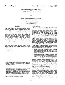
Spectral sensitivities of the three classes of photoreceptors in the retina.
Relative sensitivity
100
Short
Medium
Long
50
0 400
20
July/August 1999
500 600 Wavelength (nm)
700
Lindsay W. MacDonald University of Derby, UK
Using several tasks that engage the user in different ways as examples, this tutorial outlines principles for using color effectively in computer graphics. These principles offer a starting point for color choices in the context of user-centered designs. Each section ends with a few general guidelines for color selection, summarizing the main points discussed. Prototyping and usability assessment will help you refine and verify your own color choices for each application.
Color vision Human color vision is trichromatic because the retina has three classes of color-sensitive photoreceptors. The receptors have broad spectral sensitivities, as shown in Figure 1, which scientists have measured directly on single cells of surgically removed retinas. The maximum absorption probabilities of the three receptor classes occur at long, medium, and short wavelengths—loosely termed red, green and blue—with peaks at wavelengths of about 580, 540, and 440 nanometers (nm). These receptor classes overlap considerably, especially in the long and medium responses, and any single class is “color blind” in the sense that it can produce an output signal for a wide range of wavelengths. Color vision is possible because in combination the three receptor classes produce a unique triplet of responses at each wavelength. The hue that we perceive depends on the ratio of these three responses. Researchers estimate the relative abundances of the three cone types to be in the ratio red:green:blue = 40:20:1. This means that the eye’s overall sensitivity to blue is very much lower than to red and green.1 We can also show the spectral characteristics of the photoreceptors through a color-matching experiment, in which an observer adjusts the intensities of three primary light sources to match a series of monochromatic test stimuli. Results of these experiments, averaged over a number of observers, are called color-matching functions, and they form the basis of all colorimetry.2 However, the concept of a “standard observer” is artificial, a convenience for the purpose of standardization. All real human observers with normal (that is, nondeficient) color vision depart to some degree from the spectral
0272-1716/99/$10.00 © 1999 IEEE
1.0 Relative sensitivity
responses of the standard observer. Hence no two people see a given color stimulus in exactly the same way. V(λ), the spectral luminous efficiency function of CIE (the International Commission on Lighting), describes the relative sensitivity of the eye to monochromatic colors throughout the visible spectrum (see Figure 2). V(λ) peaks at a wavelength of 555 nm, corresponding to a greenishyellow hue. For computer graphics, Table 1 lists the approximate ordering of the relative luminance of the primary and secondary colors (rounded to the nearest 10 percent). This is not the same order as the spectral hue sequence. Light is refracted as it passes though the cornea and lens of the eye, which disperse the spectral components in the same way that a prism does. Normally the eye focuses to bring into sharpest focus yellow wavelengths of 578 nm.3 The longer red wavelengths converge beyond the retinal surface, whereas the shorter green and blue wavelengths converge in front of the retina. To focus on red colors, the lens must become more convex, as if for an object nearer to the observer. Conversely, to focus on blues, the lens must become less convex (more relaxed), as if for an object farther away. These factors contribute to the apparent color-depth effect called chromostereopsis: for the majority of observers, red appears to advance while blue appears to recede.4 To prevent unwanted depth effects on a display, avoid juxtaposing strong red and strong blue. Suppression of the eye’s scanning movements can fixate a strongly colored image on the retina. This temporarily reduces the sensitivity of the photoreceptors, leading to afterimages. Try this by fixing your gaze on the black dot at the center of Figure 3 for 10 seconds or more and then looking away at a sheet of white paper. You should see an afterimage with the same layout as Figure 3 but in complementary colors. In the regions where the image was red, you now see cyan because you have temporarily suppressed the response from your long-wavelength (red) cones, and only the medium
0.5
2
0 400
500 600 Wavelength (nm)
700
Relative sensitivity of the eye to hues throughout the spectrum.
Table 1. Relative luminance ordering of computer graphics primary and secondary colors.
Color White Yellow Cyan Green Magenta Red Blue Black
Primaries
Relative luminance (percent)
R G B R G G B G R B R B —
100 90 70 60 40 30 10 0
(green) and short (blue) cones are responding normally to the white light. For this reason, it’s unwise to use large areas of bright color in a display.5 The signals transmitted via the optic nerve from the eye to the brain are not the basic long-, medium- and short-wavelength responses of the three cone types. Instead they consist of an achromatic (luminance) signal, representing the sum of the cone responses, and two opponent chromatic signals defining the red-green and yellow-blue color differences, as shown schematically in Figure 4. These signals are formed by what is literally a neural network in the retina, consisting of three
Photoreceptors Short Medium Long
Neural channels
3
Strong colors can give rise to complementary afterimages.
+
Achromatic (luminance)
−
Red-green
−
Yellow-blue
4
Interconnections of the retinal cone signals produce achromatic and opponent chromatic signals.
IEEE Computer Graphics and Applications
21
Color Tutorial
Spatial contrast sensitivity for the achromatic and chromatic neural channels.
ment as deuteranopia, and absence of the blue pigment as tritanopia. Dichromats have difficulty in discriminating hues corresponding to the missing pigment from combinations of the other two pigments.8
Luminance
10
Color selection guidelines ■
1
Courtesy Mark Fairchild, RIT
5
Contrast sensitivity
100
Red-green 0.1
Blue-yellow
0.01 −1
0
1
■
■
2
Log spatial frequency (cpd) ■
layers of neurons interconnecting over successively wider regions.6 The color-encoding technique in television transmission (in both the US NTSC and European PAL television standards) employs a similar principle of sums and differences of red, green, and blue signals to make best use of the available bandwidth.7 The neural channels differ in their sensitivity to spatial patterns (known as spatial contrast sensitivity). The achromatic channel is highest, peaking in the range 5 to 8 cycles per degree of visual angle at the eye of the observer. The spatial contrast sensitivity of the chromatic Y-B channel is much lower than that of the R-G channel, as shown in Figure 5. This occurs because the blue cells are relatively scarce in the central fovea and because their signals are pooled over a wider area. For this reason, you should never display fine detail using the blue channel alone. In Europe and North America, approximately eight percent of the adult male population and one percent of the adult female population is color deficient to some degree. This means that, on average, one in every twelve male computer users will not see colors in the same way as the majority. The most common kind of color-deficiency is dichromatism, where a person lacks one of the three normal cone pigments. Absence of the red pigment is known as protanopia, absence of the green pig-
6
Colors look darker and smaller against white and lighter and larger against black.
22
July/August 1999
■
The relative luminance of saturated colors follows the spectral luminous efficiency function (Table 1), not the spectral hue order. Avoid adjacent areas of strong blue and strong red in a display to prevent unwanted depth effects (colors appearing to lie in different planes). Never use the blue channel alone for fine detail such as text or graphics. Do not use, for example, blue text on a black background or yellow text on a white background. Areas of strong color and high contrast can produce afterimages when the viewer looks away from the screen, resulting in visual stress from prolonged viewing. Do not use hue alone to encode information in applications where serious consequences might ensue if a color-deficient user were to make an incorrect selection.
Color perception One consequence of the neural interconnections in the retina is the local adaptation of photoreceptor signals through the pooling of signals from a wider area. Known as lateral inhibition, this process leads to enhancement of localized edge gradients in the perceived image. In simple terms, the neural system “fills in” the area to be consistent with its evaluation of the edge contrast. A color’s appearance thus depends on the lightness and color of the surrounding region(s), an effect known as simultaneous contrast. Colors tend to look darker and smaller against white, and lighter and larger against black, as shown in Figure 6. The apparent changes of size arise, at least in part, from flare in the eye’s optics, which causes light from the bright areas to be scattered into the neighboring dark areas. Colored surrounds can cause a colored region to appear tinged with the complementary hue of the surround, an effect known as chromatic induction. We can use this relativity of color to enrich a display, and it has many applications in art and design. But it can also cause the viewer to see colors differently from the way the designer intended them. Chromatic induction can make the same colors look different (Figure 7) or different colors look the same (Figure 8). With recognizable objects, we make judgments about the color in the present image according to memories we have amassed from our experience of looking at similar objects. Studies have revealed a discrepancy between memory colors and the colors of actual objects,9 and significant changes in saturation may occur in some cases. For example, the prototypical color of the sky is azure blue, so we tend to shift the color of the sky in memory toward “more blue.” For concrete, the prototypical color is a neutral gray, and therefore we shift the memory color for concrete toward “more gray.” Memory can influence preferred colors of reproduc-
7
Simultaneous contrast can make the same colors look different.
8
tions in a similar way. The preferred color for blue sky in photographic prints viewed in daylight is typically somewhat more saturated than real blue sky. The preferred colors for green grass and Caucasian skin have about the same saturation as real grass and skin but are shifted in hue toward yellow.10 Over 100 years ago, the German psychologist Hering proposed a system of six elementary colors arranged in three opponent pairs as the basis of color perception, as shown in Figure 9. The color pairs— white versus black, red versus green, and blue versus yellow—are opposed in the sense that no one would describe a particular color as whitish-black, reddishgreen, or bluish-yellow. Hering’s perceptual primaries correspond closely to the achromatic luminance channel and two opponent chromatic channels generated by the retina’s neural wiring (Figure 4). The three perceptual dimensions corresponding to this color space are lightness, hue, and colorfulness, the last two being polar coordinates in the chromatic plane. A simple perceptual color model can employ words rather than numbers to specify lightness, hue, and colorfulness,11 as shown in Figure 10. Systematic use of everyday parlance lets us define five discrete levels in
the lightness scale between white and black: very light, light, medium, dark, and very dark. We can define three intermediate hues between adjacent primaries in each quadrant of the hue circle. For example, between green and blue lie bluish-green, blue-green (synonymous with cyan) and greenish-blue. The colorfulness scale consists of five levels: gray (zero colorfulness), grayish, moderate, strong, and vivid. This gives a total of 400 (5 × 16 × 5) possible color names, plus white and black. However, of these, we can realize only about 290 as surface colors: There are no such colors, for example, as light vivid blue or very dark strong yellow. Examples of color names under this system would be light moderate yellowish-green and strong dark blue.
Simultaneous contrast can make different colors look the same.
Color selection guidelines ■ ■
■
Surrounding colors, field size, and viewing conditions can all change the appearance of colors. Where accurate visual judgment of a color is necessary, the surround should be a neutral mid-gray to avoid unwanted perceptual color changes. We can describe color more meaningfully in terms of the perceptual dimensions of lightness, hue, and colorfulness than in terms of device signals.
Lightness Greenish yellow
Lightness White
Yellow
Reddish yellow
Red-yellow (orange)
Yellow-green Very light
Yellowish red
Yellowish green
Bluish red
Green
Hue Medium Dark
Colorfulness
Red
Hue
Light
Bluish green
Blue-red (magenta)
Green-blue (cyan)
Very dark
Greenish blue
Reddish blue
Blue
Colorfulness Black Gray
9
The three opponent axes of perceptual color spaces.
10
Grayish
Moderate
Strong
Vivid
A simplified color-naming system.
IEEE Computer Graphics and Applications
23
Color Tutorial
0.0
0.1
0.2
0.3
0.4
0.5
0.6
0.7
0.8
0.8
0.7
0.7
0.6
0.6
Printer Gamut
11
Relative color gamuts of a display and a printer.
0.5
0.5
0.4
0.4
0.3
0.3
0.2
0.2
Monitor Gamut 0.1
0.0
0.0
0.0
0.1
0.2
0.3
0.4
0.5
0.6
0.7
1988 ACM
0.1
Display technology Both television and conventional computer graphics displays evolved from the cathode ray tube (CRT). In this technology, stimulated screen phosphors emit light in the red, green, and blue (RGB) wavelength bands, with a radiant intensity proportional to the power of the incident electron beam. The display’s raster-scanning pattern maintains the excitation of the phosphors. Two integration mechanisms of the human visual system sustain the illusion of the image on the display: spatial integration of the points of light emitted by the phosphor dots and temporal integration of the short pulses of light produced by the stimulated phosphors. New display media, such as liquid crystal displays (LCDs) and projection displays, provide alternatives to the CRT, but for best price/performance and picture quality, CRT technology remains dominant. From a color-imaging viewpoint, we characterize all these display media as additive color devices because the eye sees the summation of the light emitted by the red, green, and blue primaries.12 The intensity of the light that a display produces is a power function of the applied signal voltage with an exponent known as gamma (γ). For most displays, gamma falls between 2.2 and 2.5. Each channel of each display Cyan 1, 1, 0 Green 0, 1, 0
12
The RGB color cube.
White 1, 1, 1
Yellow 0, 1, 1
Blue 1, 0, 0
Black 0, 0, 0
24
Magenta 1, 0, 1
Red 0, 0, 1
July/August 1999
requires an individual gamma measurement because it depends critically on the internal physical structure of the CRT. Gamma can vary from one tube to another, even within batches of the same model from the same manufacturer. Most desktop computers now provide correction for the display gamma through suitable loading of color look-up tables (CLUTs) in the graphics controller. This means that the system can separate workspace parameters seen by application software accessing an RGB image in the frame store from the monitor’s physical parameters. Unfortunately, no standard workspace exists, and different applications and different manufacturers handle gamma correction in different ways.13 The gamut of colors that a display can produce depends on the spectral power distribution of the primaries. These vary from one display to another according to the selected phosphors or filters, manufacturing variations, and aging of the materials. Color gamut is often plotted on the CIE chromaticity diagram, which shows a 2D projection of the 3D gamut volume. Comparing the relative color gamuts of a typical CRT display and a dye sublimation printer, as in Figure 11, we see that neither gamut is a subset of the other.14 That is, some colors can be displayed but not printed (mostly near the red, green, and blue display primaries), and conversely some colors can be printed but not displayed (cyan and yellow). In addition, many saturated colors exist outside both gamuts but within the spectral locus; these would be visible to the eye, but neither device can produce them. Gamut limitations cause difficulties both for the transfer of computer-graphic images from display to print and for “soft proofing”—that is, for simulating the appearance of a printed color image. Both these instances necessitate color gamut mapping techniques.15 A color model, in which we use words or numbers to specify particular colors, provides a formal method of representing the visual relationships of colors. Using a 3D coordinate system to represent the values of three orthogonal components in a color space enables us to apply the entire armory of analytical and visualization techniques in Cartesian geometry to the color model. For a display with additive primaries, the simplest and most obvious model is the RGB cube. This model aligns the device signals red, green, and blue with the geometric X, Y, and Z axes and normalizes them to the range 0 to 1, as shown in Figure 12. We can represent every color that the display can produce as a point within the cube’s volume, with the most saturated colors located on the six faces. The primary colors red, green, and blue lie on the three axes, and the complementary colors cyan, magenta, and yellow lie on the opposite corners across the long diagonals. The fourth long diagonal, from the black corner (0,0,0) to the white corner (1,1,1), traverses gray values for which all three signals are equal. The advantage of this color model, besides its geometric simplicity, is that it affords direct control over the display and thus requires minimal computation. But it suffers from several disadvantages: ■
The RGB color coordinates are device-dependent, so they won’t in general reproduce the same color from one display to another.
■
■
■
The model isn’t perceptually uniform, meaning that one unit of coordinate distance doesn’t correspond to the same perceived color difference in all regions of the color space. It’s difficult to relate this model to color appearance because its basis is device signals (drive voltages) and not display luminance values. The RGB cube doesn’t easily lend itself to perceptual tasks because it doesn’t correspond to the human dimensions of color perception (as described in the previous section).
Size Shape
■
■
They remain device-dependent because they are defined directly in terms of the display RGB drive signals. None of the three axes is perceptually uniform, which makes it difficult to predict how adjusting the controls by a given amount will affect a color. The three axes are not perceptually independent, so a change in one component usually affects the appearance of the others.
Better color models, such as CIELAB and CIELUV, employ the uniform color spaces defined by the CIE. These models draw on proven principles of color science and thus provide true device independence together with better perceptual uniformity and orthogonality.17
Color selection guidelines ■
■
■ ■
RGB display signals are device-dependent, and the color they produce will generally differ from one display to another. When you need to render colors accurately, use a calibrated display and gamma correction software for best results. Some colors may be impossible to reproduce exactly if they lie outside the display’s color gamut. Use perceptual color models based on CIE uniform color spaces instead of the simplistic color models based on device-dependent RGB signals.
13
The visual variables that are available to the graphic designer.
Position
Computer graphics applications commonly employ two other color models: HSV (hue, saturation, and value) and HLS (hue, lightness, and saturation).16 Although these provide better approximations to the perceptual dimensions of color than the simple RGB model, they still have serious limitations: ■
Value
Texture
Orientation Color
■
cators, menu selection, information structures, links, navigation aids. Presentation—layers, composition, regions of interest, form, tone, typography, color.
Color serves as one of several presentation-level visual variables that can enhance the effectiveness of visual communication. Effective visual communication, in turn, can enhance the interaction and contribute to the satisfaction of user and application needs. A skilled graphic designer achieves a memorable result through economy of means. For effective design of presentations on computer displays, use color in conjunction with the other visual variables18 of position (x,y coordinates), value (lightness), size, shape, orientation, and texture, as shown in Figure 13. This will help a color-deficient person to interpret the display, even when he (fewer than one percent of women are color deficient) cannot distinguish the color codes. A good principle is first to ensure that the layout works in monochrome, then to add color sparingly to reinforce the message (see Figure 14). Graphic designers, caricaturists, engravers, typographers, and photographers all achieve very effective results using only black and white
Design principles Color in a display cannot be specified in isolation but must be considered as one aspect of a user-centered design process. Analysis and design choices must take place at several levels: ■
■
■
14
A little color can be more effective than a lot.
Application—organizational context, business needs, object life cycles, transactions, database structures, compatibility, conventions. User needs—task requirements, physical and visual ergonomics, viewing environment, motivation, experience, level of education, cultural background. Interaction—dialogue design, controls, response indi-
IEEE Computer Graphics and Applications
25
Color Tutorial
15
Color similarity can change meaning.
or grayscale. In fact, the absence of color may enhance human perception in the other visual dimensions— nuances of tone, sharpness, texture, and so on. You can discover much about a design’s effectiveness by examining how its visual elements are grouped and how you perceive them as a whole. The Gestalt laws of proximity, similarity, continuity, closure, and figureground provide powerful organizing principles that apply to all aspects of design, including color.19 Specifically, you can use color for both association, indicating that certain elements in a design have common properties (Figure 15), and for differentiation, indicating that certain elements differ in their properties from the others (Figure 16). Association works on other levels besides visual similarity. Many colors have certain qualities associated with them because of their natural occurrence or cultural usage (see Table 2). We commonly associate green, for example, with vegetation, and hence with country sports and environmental awareness. Blue is the color of the sky and the sea, and hence has associations of depth and stability. These qualities make blue a popular color in national flags and the logos of “blue-chip” companies. You can create harmony in a design by using a limited group, or palette, of colors that look pleasing in combination. Theories abound on how to choose harmonious combinations of colors according to their relative positions in color space.20 A useful starting point is to choose
a small number of hues in a specified relationship to one another from a 2D hue circle (see Figure 17). You can then vary these hues in lightness and saturation and combine them with shades of gray to produce the desired palette. Generally, the color palette should contain contrast—both between light and dark tones and between pastel and saturated colors. If most of the colors are of similar lightness, the overall effect will be bland. All hues fall into one of two groups on the basis of their perceived color temperature, or their associations with coolness or warmth from the natural world. Cool colors are blue, turquoise, and violet; warm colors are yellow, orange, and red, as well as brown. Achromatic colors (white, gray, and black) may take on either a warm or cool character with just a hint of color. Another approach to palette design is to select colors according to a theme—a season, a geographical region, or a historical era, for example—so that the grouping conveys the desired mood or feel. Such palettes commonly appear in mix-and-match “color ways” in fashion patterns for textiles and in finishes on consumer products such as kitchenware. In general, for a set of colors to work well in a design, some unifying attribute should tie them together, following the Gestalt law of closure (completeness). This could be a particular hue or range of saturation or lightness that appears throughout the composition, relieved by small areas of a contrasting accent color. Artists have often employed this technique to create a chromatic unity in their paintings, most notably Titian, Caravaggio, and Velázquez.21 In one of many paintings of his Japanese garden (Figure 18), Monet rendered the scene in the yellowish light of a summer afternoon. The shadows in the complementary contrast color, a light blue-mauve, provide the unifying attribute, scattered across the water and under
Dyad-complementary
Triad-primary
180°
120°
Triad-split
Tetrad-opponent
60°
90°
16
Color can draw attention to an element.
17 26
July/August 1999
Selection of hue harmonies.
Table 2. Common color associations. Positive Associations
Negative Associations
Red Green Yellow Blue White Gray Black
Passion, strength, energy, heat, love Nature, spring, fertility, safety, environment Sun, summer, gold, harvest, optimism Sky, sea, stability, peace, unity, depth Snow, purity, peace, cleanliness, innocence Intelligence, dignity, restraint, maturity Coal, power, formality, depth, solidity, style
Blood, war, fire, danger, anger, aggression Inexperience, decay, envy, misfortune Cowardice, treason, hazard, illness, folly Depression, obscenity, conservatism, passivity Cold, clinical, surrender, sterility, death, banality Shadow, concrete, drabness, boredom Fear, void, night, secrecy, evil, anonymity
the bridge and threaded up through the trees. The picture is enlivened by bright yellow reflections and the vivid red and white accents of the water lilies. The patches of color serve not only to depict the scene but also to establish for the whole picture a coherence, or “perceptual envelope” as Monet himself called it. In the design of graphic displays, we distinguish the intents of decorative color from those of functional color. Decorative color enhances a display by making it more aesthetically appealing, creating a mood, or establishing a characteristic style. Functional color conveys information explicitly or provides the user with some other operational benefit.22 Independently, we can classify the color relationships within the display either as absolute color, where each color stimulus is precisely specified, or as relative color, where the meaning arises from the interplay between colors—for example, foreground/background, center/surround, or juxtaposition. The two dimensions produce a helpful categorization matrix of color usage, shown as Table 3. The proper choice of individual colors and the treatment or rendering of the colors in a graphic design or image depend crucially on the application area, user expectations, and task characteristics. The remaining sections of this tutorial address the general needs of graphic user interfaces and then five specific tasks for which the criteria for display color selection differ substantially: text, information, advertising, visualization, and imaging.
Color selection guidelines ■ ■ ■ ■ ■
Treat color design as part of a user-centered design process. Get it right in black and white, then add color sparingly. Use color for association and differentiation of a design’s elements. Choose a harmonious palette of colors for use throughout an application. Unify each design by using common thematic color(s).
Courtesy the Trustees of the National Gallery, London
Color
18
“The Water Lily Pond,” Claude Monet.
Graphic user interfaces A graphic user interface (GUI) assists the user in viewing and interacting with an application. It must therefore provide all the necessary functionality, yet remain unobtrusive. It should help the user to perform the appropriate tasks without distracting attention from the content. The general rule is to make form indicative of function. The designer should create all the components of a GUI, such as window frames, sliders, buttons, icons, and dialogue boxes, in monochrome and then add color with discretion to enhance usability. Understatement of the design is preferable, with unnecessary embellishment kept to a minimum. Strong color may be effective in small regions (up to 2 mm in diameter), but should be avoided in large regions. Take icons as an example. An icon is a symbol that looks like what it represents. Icons are widely used because users can immediately recognize them, provided that they’re well designed; not too many of them
Table 3. Color relationship vs. color intent. Color Relationship Color Intent Decorative Functional
Absolute
Relative
Textiles, fashion palettes Corporate logos, warning signs
Art paintings, image rendering Text, icons, maps, charts
IEEE Computer Graphics and Applications
27
Color Tutorial
19 Discreet use of color to enliven an icon. The pixel array (left) may differ significantly from its appearance on the screen (right).
Color selection guidelines ■
Courtesy Apple Computer
■
appear on the same screen; they are consistent throughout an application; and their functional behavior is congruent with that of the metaphorical object. Design of an effective icon within the confines of a small grid of pixels requires clarity, simplicity, and careful consideration of what the user will see at the normal viewing distance. Line and form are more important than tone and color. Indeed, color should be the last component added, and then used only minimally to reinforce the symbolism, as shown in Figure 19. The choice of colors for a GUI is less important than their consistent use throughout all screens. You should make every effort to achieve both internal consistency within the application and external consistency with other applications, systems, and real-world conventions.23 The “principle of least astonishment” that guides dialogue design applies equally to color. The user should quickly recognize each functional element and not get confused by unexpected changes in the assignment of different colors to similar functions. Details such as this contribute significantly to a GUI’s overall stylistic integrity—its “look and feel.” A limited palette of distinctive colors—no more than about 10—suffices to provide the in-fills for all icons and graphical symbols. When chosen consistently, these colors also help to establish a harmonious visual style. If the application lets the user choose colors through control panel settings—for example, for title bars, menus, and backgrounds—you should provide readymade schemes of harmonious colors wherever possible. Some rule-based systems generate such schemes automatically.24
20
Advertising An advertising display first attracts attention and then persuades the viewer to buy, do, or believe something. Color can be very effective for both these phases, and the rules that govern its use differ substantially from those of information display or prolonged interaction. Visual engagement with an advertisement must be very rapid, within the fraction of a second that the observer is receptive. We see examples of this in roadside billboards, packaging of products on supermarket shelves, exhibition stands, and magazine spreads. The need for rapid engagement also applies to computer graphics displays in multimedia kiosks, broadcast television and video, animations, and especially Web site banner pages, where browsing users flick from one page to another. Bright colors clamor for attention, and, if sustained against a dark background, they can excite or arouse the observer like neon signs or discotheque lighting. Designers achieve this “Las Vegas effect” by using pure primary and secondary colors on a black background (see Figure 20). Bright color should not be sustained for long, however, because it loses its effect as the eye rapidly becomes fatigued. So bright color should give way to a more balanced color scheme within which the advertiser conveys the qualities of the product by informing or entertaining the viewer. Colors themselves can help to persuade, through their associated qualities and the emotions they elicit (both positive and negative). These qualities, listed in Table 2, derive from natural occurrence, cultural norms, and conventional usage. Packaging designers use color psychology extensively in choosing suitable color schemes for consumer products.25 At the end of the period of engagement (usually less than one minute) the viewer should retain something memorable. Memory usually idealizes colors as brighter and purer than they actually are, as mentioned earlier, but the cumulative effect depends on an advertisement’s graphic composition and its palette of colors. The Web is an important new medium for computer graphics, in which colors on the screen depend on the originator (author) of the pages, the person viewing the pages via a browser, and the software tools and graphics hardware used for encoding and display. Most contemporary desktop computers have 8-bit graphics, allowing the display of up to 256 different colors simultaneously, but not all codes are available on all platforms. A subset of 216 (63) colors, known as the browserCourtesy Cyberville Radio
Bright colors on a dark background are dramatic and eye catching.
■
Use color consistently throughout all screens in an application. Use strong color in small details only, such as icons and graphical indicators. Use a limited palette of colors and offer predefined harmonious combinations.
28
July/August 1999
safe palette, has become the de facto standard for encoding color graphics and images for Web display (see Figure 21). Careful use of this palette can substantially improve the color quality of both graphics and images.26 The Web is a tabloid medium in terms of its vastness of extent, its millions of users, its low information content per page, and its “in-your-face” presentation style. And, like other tabloid media such as newspapers and television, it has a variety of purposes, including entertainment, advertising, and the conveyance of graphical information and text passages. Guidelines for the use of color in Web page design must therefore depend, as always, on the communication purpose of the particular page (see Figure 22).
21
Organization of colors in the browsersafe palette.
■ ■ ■
Use bright, highly saturated colors to grab attention, but not for prolonged viewing. Take advantage of the psychological associations of colors. For Web graphics, use colors from the browser-safe palette.
Text
important—color either the text or the background, but not both. Attention to presentation and font design will help you achieve satisfactory legibility. You can use color to good effect for differentiation—for example, highlighting in yellow the results of a word-search. In such applications, the color should appear to be a light transparent dye, like a highlighter pen on a paper document. The exact color is relatively unimportant, provided that it doesn’t detract from the legibility of the text, yet is conspicuous enough to be seen easily. Legibility also depends on text size. The optimum size
22
Minimal color usage and high legibility suit a Web newspaper.
Courtesy The Guardian
In all systems in which the user’s principal task is reading or processing text, legibility is the most important criterion. Legibility is the ease with which the user can read text or other symbolic information on the display. Most human-computer interfaces employ text in various ways, so legibility always poses an important design issue.27 The principal determinant of legibility is the luminance contrast ratio between foreground and background, which should be a minimum of 3:1 and preferably at least 10:1. Generally, the best text displays for sustained viewing—for example, in a word processing application—should use black text on a light gray background. Avoid large areas of white on the screen because the glare may lead to visual fatigue, increase the chances of the viewer’s seeing flicker in the periphery, and also reduce the life of the display. For colored text on a colored background, you should consider the relative luminance of the different hues.28 Figure 23 (next page) shows the eight colors attainable in the simplest color graphics, with the red, green, and blue primaries on or off (see also Table 1). Clearly, combinations near the diagonal, where the relative contrast is low, are difficult to read. The most legible combinations have the highest contrast, such as black or blue on white or yellow, and vice versa. Certain combinations, particularly those involving red, green, and magenta, produce unpleasant visual “vibrations,” which make reading more difficult. Always avoid these combinations for bodies of text. In general, a good rule is never to use colored text on a colored background where legibility is
Courtesy Rick Levine, Sun Microsystems
Color selection guidelines
IEEE Computer Graphics and Applications
29
Color Tutorial
easier to interpret. The principles of good graphic design apply just as much to computer displays as they do to more traditional media. Key issues to consider are clarity, comprehensibility, and how well the user will be able to pick out the desired information and understand its significance. Contributory factors include
23
Effect of text and background color on legibility.
■ ■ ■
24
Effect of text color and size on legibility.
depends on the foreground-background color contrast, as shown in Figure 24. For achromatic text (black on white) the peak visual sensitivity occurs at about 5 cycles per degree subtended at the eye, equivalent to a line width of 0.1 mm at a viewing distance of 60 cm from the screen. The optimum character height recommended27 at this viewing distance is 3.5 mm, equivalent to a 14point font size.
Color selection guidelines ■ ■ ■
Ensure good legibility by providing adequate contrast between text and background. Avoid colored text on a colored background. Use the metaphor of a highlighter pen to draw attention to areas of text.
Information Color can provide a very effective means of increasing the information content of a display or making it
25
30
Courtesy London Underground
Nominal color coding.
July/August 1999
discernibility—how easy it is to distinguish an item from its background; conspicuity—how obvious the item is relative to its neighbors; and salience—how well the item “pops out” from the display as a whole.
Tufte advises using strong colors sparingly on or between dull background tones: “Color spots against a light gray or muted field highlight and italicize data, and also help to weave an overall harmony.”29 With nominal color coding, we assign a set of unique color codes to the different parts or states of a system. Such a code is nominal in the sense that it neither indicates differences in value nor implies an order of priority. Two human factors constrain the maximum number of colors for unambiguous color codes: first, the observer’s ability to discriminate visually between the different colors; second, the observer’s ability to remember the meanings of the colors and to associate those meanings correctly with the visual stimuli. Both factors lead to the same conclusion, that we should limit the number of colors to five to seven.30 The London Underground map (Figure 25) offers a good example of nominal color coding. The separate colors for each railway line make them easy to identify and trace through the network. The original version used just seven colors, but with the opening of additional lines this has now expanded to eleven colors. Consequently, the lines are now more difficult to distinguish from one another. Ordinal color coding uses a graded sequence of colors to represent the value of one or more variables. The perceptual ordering of colors for the variable(s) should be unambiguous. Color can be very effective when it draws on natural or application-related associations, such as the ordering of colors in natural phenomena. The hues of the rainbow, for example, form the familiar spectral sequence from red to violet. The color of a radiating body changes from black through red to yellow, white, and blue as the temperature increases. Figure 26 shows two views of a myocardial perfusion map from a gamma camera, in which the color represents the normalized tracer activity. The resting polar map (right) shows prevailing normal activity (yellow-red), with a central apical perfusion defect (blue). In the stress polar map (left), severe uptake defects (blue) appear in the anterior (upper part) and inferior (lower part) left ventricular wall. The key is included alongside the display to aid interpretation, as it should be for all color-coded displays. We can combine two separate ordinal color scales to produce a bivariate display,31 as in Figure 27. The upper left shows a univariate map of terrain elevation, using tonal value with white representing the highest point and black the lowest, emphasized by an illumination
model that produces highlights and shadows to throw the elevation contours into relief. The upper right shows a univariate map of magnetic field strength over the same terrain, using a yellow-blue hue axis with yellow representing the highest field strength and blue the lowest. The lower image shows the bivariate combination, from which we can quickly determine which hills have a high concentration of the magnetic ore, making them suitable candidates for mining. The term satin finish refers to the diffused rendering of specular highlights in the image. Color transparency can add dimensions to information display. Figure 28 shows graphically how the French artist Leseur changed his mind on the position of the face in his painting “Clio, Euterpe, et Thalie.” The blue and green channels contain the visible components of the painting, but the red channel contains the monochromatic X-ray image in geometric register. The X-ray indicates that the artist had painted an earlier version of the muse’s face in near profile and later painted over it to give a more frontal view. In this visualization, color shows the extent of the modification much more clearly than two separate images would do.
100 80 60 40
26 Two polar maps derived from myocardial perfusion studies.
20 0 Courtesy R. Sciagra, University of Florence, Italy
■ ■ ■ ■ ■ ■
Use color in conjunction with other visual variables for effective presentation. Use strong colors sparingly on or between muted background tones. Limit the number of colors in nominal coding to seven or fewer. Use natural or application-related associations for ordinal coding. Always include a color key or scale with a color-coded display. Use color transparency to show overlays of related structures.
Courtesy Phil Robertson, CSIRO, Australia
Color selection guidelines
27 Bivariate ordinal color coding, showing the combination of two univariate ordinal color scales.
Visualization means the bringing out of meaning in data by providing graphic representations that facilitate the visual communication of knowledge. This has much in common with information display, and hence all the principles of the preceding section apply here as well. Keller advises against introducing color that does not add or support meaning, because unrelated color can cause confusion as the viewer tries to discern its meaning.32 But visualization goes further than simple information display to provide simulations of real-world objects, structures, or systems, allowing the user both to see and to interact. We can therefore use color in two ways—first to emphasize the desired information, and second to render the environment presented to the user. Monitoring applications present the user with a graphical representation of the state of a real-time system, such as the parameters of an industrial plant or the physiology of a medical patient. It’s important to choose colors that enable the user to interpret correctly the meaning of the information displayed. It’s also important to conform to the cultural or technical norms of the application. Under normal operating conditions, colors should be lowkey (that is, low in saturation), with the main emphasis
Courtesy Fabrice Heitz, INRIA, France
Visualization
28
Underpainting revealed through color display.
IEEE Computer Graphics and Applications
31
Courtesy Tessella Limited, UK
Color Tutorial
29
Industrial monitoring of an acid-alkaline neutralization process.
on the legibility of essential data. Only in exceptional conditions, such as when an alarm threshold has been exceeded, should strong color come into use. In Figure 29 the red and blue regions in the mixing tank represent acid and alkaline solutions, with the ordinal color scale in the bottom left corner denoting molarity. The green, yellow, and red color bands on the drain fluid temperature dial (lower right) show the safe, marginal, and dangerous operating regions. Two alarm panels, normally neutral in color, have turned bright red to
indicate overflow and over-temperature conditions. We can also use color to produce a layering effect in maps and displays that stack objects above a background. Figure 30 shows a design for an air traffic control display.33 The display includes six conceptual layers for aircraft plus a seventh layer for the cursor, which must always remain visible. Each layer has a separate color palette. Background map areas are low in saturation and of medium lightness, with transparent in-fills to indicate airspace corridors, control zones, danger areas, and so on. Each aircraft is represented by a symbol, accompanied by a rectangular data block containing the call sign and altitude. The display groups the aircraft into low and high foreground, the former being partially grayed out to indicate that they aren’t of immediate interest. This system can also present aircraft at two levels of alert, by the use of strongly saturated colors in the code blocks. Bright red, orange, and yellow are reserved for cases of emergency and conflict alert. In modeling applications, the display represents the appearance of an object or scene, with the purpose of predicting how it will look when constructed. For best rendition, such applications should use a large number of colors to provide continua of tone, hue, and saturation, but taking care not to use color to excess. Figure 31 shows the appearance of a proposed redevelopment of Paternoster Square, near St. Paul’s Cathedral in London, rendered by a computer-aided design package. The subtle coloration enhances the scene without distracting attention from the architectural line, form, and proportion. Such considerations become more important still in virtual-reality displays, where color cues must remain consistent with the structure and depth of the virtual world in which the user is immersed.
Color selection guidelines ■ ■ ■ ■
Don’t use color that doesn’t support or add to the meaning of the information displayed. Use color in monitoring applications to indicate changes of state. Use color saturation to depict depth layering and priority of object categories. In modeling applications, use only enough color to create a realistic effect.
Courtesy National Air Traffic Services, UK
Imaging
30 Color coding creates a layering effect in this experimental air traffic control display. 32
July/August 1999
Imaging displays include one or more photorealistic images as the primary elements. Examples of applications include desktop publishing, product catalogues, photo libraries, and virtual galleries. The images may be digitized from photographic originals, captured directly from original scenes, or generated by computer graphic modeling techniques, such as ray tracing. The purpose of an imaging display must be clearly understood. Is it to portray a real-world scene, object, or product as realistically as possible, or is it to influence the observer into believing something about the product represented by the image? The most important criterion is to preserve the intended appearance of the image, which requires a quiet background and absence of any bright graphics that would disturb the visual perception of, or distract attention from, the image itself.
Courtesy Arup Associates, London
The background should always be a neutral gray to prevent unwanted simultaneous color contrast effects, as shown in Figure 32. Photographic viewing standards recommend a background luminance of 20 percent of the white level, corresponding to a perceived lightness of approximately 50 percent. Light backgrounds make images look darker and lower in contrast. Dark backgrounds make images look lighter and higher in contrast. Text captions should be black or white, to optimize legibility depending on the lightness of the background. A narrow (3-mm to 6-mm) white border around an image has the effect of isolating it from the background and providing a white reference for more accurate visual judgment. Accurate color reproduction of an image requires knowledge of its origin (the medium, how it was digitized, and how it was encoded), the characteristics of the display, and the reproduction objectives.34 Frequently, the reference color primaries and encoding method are not known, so images processed for one workspace gamma may be displayed with a quite different gamma, causing significant changes in the tonal rendering.13 This problem will be resolved only when all computer operating systems provide reliable color management facilities, with means for calibrating displays and compensating for the source image characteristics.35 The International Color Consortium (ICC, http://www.color.org) has made significant achievements in this area.
31
Computer-aided architectural visualization.
32
Photo library images against a neutral background.
Color selection guidelines ■ ■ ■
Always use a neutral gray background when displaying color images. Put a narrow white border around an image to stabilize its color appearance. Use color management software when accurate color reproduction is required.
Summary—five golden rules
■ ■ ■ ■ ■
Take account of human visual needs and expectations. Conform to the color conventions for the application. Design the screen layout considering all available visual variables. Be consistent in the use of color throughout all screens in an application. Use color sparingly, never more than is necessary for the task ■
Courtesy Alta Vista Inc.
Using color effectively in computer graphics is a complicated subject because so many different factors influence how the color will be seen: the type of display device, the viewing environment, the visual capabilities of the user, the task and application requirements, the juxtaposition of other graphical windows and displays, and so on.36 There are no easy formulas guaranteed to work in all circumstances. Still, by following the five golden rules for color selection you’ll certainly produce more effective displays than you would without them:
IEEE Computer Graphics and Applications
33
Color Tutorial
Further Reading L. De Grandis, Theory and Use of Colour, Blandford Press, Poole, UK, 1984. M.D. Fairchild, Color Appearance Models, Addison-Wesley, Reading, Mass., 1997. R.N. Jackson, L.W. MacDonald and K. Freeman, Computer Generated Color, John Wiley & Sons, Chichester, UK, 1994. T. Lamb and J. Bourriau, eds., Colour: Art and Science, Cambridge University Press, Cambridge, UK, 1995. A. Marcus, Graphic Design for Electronic Documents and User Interfaces, ACM Press, New York, 1992. K. Nassau, ed., Color for Science, Art and Technology, Elsevier, Amsterdam, 1998. R.B. Norman, Electronic Color: The Art of Color Applied to Graphic Computing, Van Nostrand, Reinhold, N.Y., 1990. L.G. Thorell and W.J. Smith, Using Computer Color Effectively, Prentice Hall, Old Tappan, N.J., 1990. D. Travis, Effective Color Displays, Academic Press, London, 1991.
16.
17.
18. 19. 20. 21.
22.
23.
References 1. R.W.G. Hunt, Measuring Colour, 3rd ed., Fountain Press, Kingston-upon-Thames, UK, 1998, p. 23. 2. Colorimetry, 2nd ed., CIE Publication 15.2, Vienna, 1982. 3. B.A. Wandell, Foundations of Vision, Sinauer Associates, Sunderland, Mass., 1995, pp. 40-41. 4. P. Thompson, K. May, and R. Stone, “Chromostereopsis: A Multicomponent Depth Effect,” Displays, Vol. 14, No. 4, 1993, pp. 227-234. 5. G. Murch, “Physiological Principles for the Effective Use of Color,” IEEE Computer Graphics and Applications, Vol. 4, No. 11, Nov. 1984, pp. 49-54. 6. B.A. Wandell, Foundations of Vision, Sinauer Associates, Sunderland, Mass., 1995, pp. 128-150. 7. R.W.G. Hunt, “Why Is Black-and-White so Important in Color?” Color Imaging: Vision & Technology, L.W. MacDonald and M.R. Luo, eds., John Wiley & Sons, Chichester, UK, 1999. 8. G.W. Meyer and D.P. Greenberg, “Color-Defective Vision and Computer Graphics Displays,” IEEE Computer Graphics and Applications, Vol. 8, No. 5, Sept. 1988, pp. 28-40. 9. P. Siple and R.M. Springer, “Memory and Preference for the Colors of Objects,” Perception and Psychophysics, Vol. 34, 1983, pp. 363-370. 10. R.W.G. Hunt, I.T. Pitt, and L.M. Winter, “The Preferred Reproduction of Blue Sky, Green Grass and Caucasian Skin,” J. Photographic Science, Vol. 22, 1974, pp. 144-149. 11. T. Berk, L. Brownston, and A. Kaufman, “A New Color-Naming System for Graphics Languages,” IEEE Computer Graphics and Applications, Vol. 2, No. 3, May 1982, pp. 37-44. 12. L.W. MacDonald, “Color in Visual Displays,” Color Physics for Industry, 2nd ed., R. Macdonald, ed., SDC Press, Bradford, UK, 1997, pp. 373-425. 13. C.A. Poynton, A Technical Introduction to Digital Video, John Wiley & Sons, Somerset, N.J., 1996, pp. 91-113. 14. M.C. Stone, W.B. Cowan, and J.C. Beatty, “Color Gamut Mapping and the Printing of Digital Color Images,” ACM Trans. Graphics, Vol. 7, No. 4, Oct. 1988, pp. 249-292. 15. J. Morovic, “Developing Color Gamut Mapping Algorithms,” Color Imaging: Vision & Technology, L.W. Mac-
34
July/August 1999
24.
25.
26.
27.
28.
29. 30.
31.
32.
33. 34. 35. 36.
Donald and M.R. Luo, eds., John Wiley & Sons, Chichester, UK, 1999. J.D. Foley et al., Computer Graphics: Principles and Practice, 2nd ed., Addison-Wesley, Reading, Mass., 1990, pp. 590-595. P.K. Robertson, “Perceptual Color Spaces,” IEEE Computer Graphics and Applications, Vol. 8, No. 5, Sept. 1988, pp. 50-64. J. Bertin, Semiology of Graphics, trans. W.J. Berg, Univ. of Wisconsin Press, Madison, Wis., 1983, pp. 60-97. R.D. Zakia, Perception and Imaging, Focal Press, Boston, 1997, pp. 31-79. W. Wong, Principles of Color Design, Van Nostrand, Reinhold, N.Y., 1987, pp. 50-52. B. Riley, “Colour for the Painter,” Colour: Art and Science, T. Lamb and J. Bourriau, eds., Cambridge University Press, Cambridge, UK, 1995, pp. 31-64. M. Blair, A Constraint-Based Approach to Dynamic Color Management for Windowing Interfaces, master’s thesis, University of Waterloo, Canada, 1991. W.A. Kellogg, “Conceptual Consistency in the User Interface: Effects on User Performance,” Proc. Interact’87, North-Holland, Amsterdam, 1987. B.E. Rogowitz, “Craft: A Tool for Customizing Color and Font Selections Guided by Perceptual Rules,” Proc. First IS&T/SID Color Imaging Conf., Soc. Imaging Science and Tech., Springfield, Va., 1993, pp. 140-143. E.P. Danger, The Colour Handbook—How to Use Colour in Commerce and Industry, Gower Technical Press, London, 1987. L. Weinman and B. Heavin, , New Riders Publishing, Indianapolis, Ind., 1997; http://www.lynda.com. ISO 9241, Ergonomic Requirements for Office Work with Visual Display Terminals, Part 3, “Visual Display Requirements,” ISO, Geneva, Switzerland, 1992. ISO 9241, Ergonomic Requirements for Office Work with Visual Display Terminals, Part 8: “Requirements for Displayed Colors,” ISO, Geneva, Switzerland, 1996. E.R. Tufte, “Color and Information,” Envisioning Information, Graphics Press, Cheshire, Conn., 1990, pp. 81-95. ISO 9241, Ergonomic Requirements for Office Work with Visual Display Terminals, Part 12: “Presentation of Information,” ISO, Geneva, Switzerland, 1998. P.K. Robertson and J.F. O’Callaghan, “The Generation of Color Sequences for Univariate and Bivariate Mapping,” IEEE Computer Graphics and Applications, Vol. 6, No. 2, Feb. 1986, pp. 24-32. P.R. Keller and M.M. Keller, Visual Cues: Practical Data Visualization, IEEE Computer Society Press, Los Alamitos, Calif., 1993, p. 20. L. Reynolds, “Colour for Air Traffic Control Displays,” Displays, Vol. 15, No. 4, 1994, pp. 215-225. R.W.G. Hunt, The Reproduction of Colour, 5th ed., Fountain Press, Kingston-upon-Thames, UK, 1995, pp. 222-241. L.W. MacDonald, “Developments in Colour Management Systems,” Displays, Vol. 16, No. 4, 1996, pp. 203-211. L.W. MacDonald, “Using Colour Effectively in Displays for Computer-Human Interface,” Displays, Vol. 11, No. 3, 1990, pp. 129-141.
Lindsay MacDonald is Professor of Multimedia Imaging at the Colour & Imaging Institute of the University of Derby, UK. Previously, he worked for 18 years for Crosfield Electronics Ltd. in the design and development of electronic imaging products for the professional graphic arts industry. His research interests are in color science, color image technology, image quality assessment, and human-computer interface design. Lindsay MacDonald has coauthored or coedited five books on various aspects of color, and he is a fellow of the Institution of Electrical Engineers, the British Computer Society, and the Royal Society for the Arts. He was technical cochair in 1996 and general cochair in 1997 of the IS&T/SID Color Imaging Conference, and he chairs CIE Technical Committee TC8-05 on “Transforms and transportability of color images.” He also runs his own consultancy company, MacColour Ltd., through which he has produced the educational resource pack “Colour in Computer Graphics.” Readers may contact Lindsay MacDonald at the Colour and Imaging Institute, University of Derby, Kingsway House, Kingsway, Derby DE22 3HL England, UK, e-mail at
[email protected] or lm@ maccolour.co.uk.
Deformable Models in Medical Image Analysis Ajit Singh, Dmitry Goldgof, and Demetri Terzopoulos The book focuses on the theoretical and practical aspects of deformable model, recent developments in novel deformable modeling techniques, and the use of medical images to illustrate the capabilities of their algorithms. 400 pages. 81/2" x 11" Softcover. October 1998. ISBN 0-8186-8521-2 Catalog # BP08521 — $50.00 Members / $60.00 List
Online Catalog http://computer.org +1 800.CS.BOOKS
Virtual Worlds on the Internet
w!
no ock
t
In s
John Vince and Rae Earnshaw This book examines how the latest developments in virtual environments, computer animation, communication networks, and the Internet are being configured to create revolutionary tools and systems. 360 pages. 7" x 10" Softcover. January 1999. ISBN 0-8186-8700-2 Catalog # BP08700 — $44.00 Members / $55.00 List
Online Catalog Browse • Search • Shop • Secure Ordering
http://computer.org
IEEE Computer Graphics and Applications
35